This article starts from a simple product truth: once an iPad is paired with a trackpad, users expect focus, lift, and hover feedback to tell them what is clickable.
Pointer support on iPad is not only about making a cursor visible. It is about giving controls enough visual response that they feel intentional under a trackpad or mouse, especially when the app was designed primarily for touch.
This article splits the problem into the right three levels: the easy SwiftUI path, the almost no-code storyboard path for buttons, and the lower-level UIKit path when you want to define a custom pointer style or react when the pointer enters and exits a region.
In SwiftUI, the fast path is just adding .hoverEffect() to the control you want the pointer to emphasize.
The example in this article uses a plain button with an SF Symbol and applies a highlight-style hover effect:
struct ContentView: View {
    var body: some View {
        Button(action: {}, label: {
            Image(systemName: "square.and.arrow.up")
        })
            .font(.system(size: 50))
            .foregroundColor(.blue)
            .hoverEffect(.highlight)
    }
}
That alone enables trackpad-aware emphasis for the view. The article then shows the two built-in looks most
people start with: .highlight and .lift.

.hoverEffect(.highlight) gives the control a focused emphasized state as the pointer moves over it.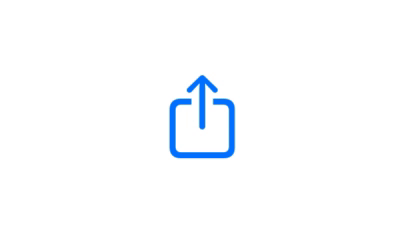
.hoverEffect(.lift) adds a more lifted treatment that feels closer to a picked-up control.If the control is already a storyboard UIButton, the shortest route is often just turning pointer interaction on in Interface Builder.
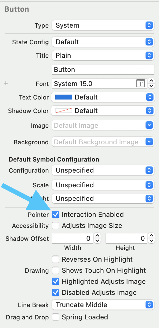
This article points out that you do not need custom code for the basic case. In the button inspector,
the Pointer section includes an Interaction enabled checkbox.
For other UIKit views, the article moves to UIPointerInteraction and wires it up explicitly.
The first step is to keep a reference to the target view and create the interaction object itself:
@IBOutlet weak var button: UIView!

var interaction: UIPointerInteraction!

override func viewDidLoad() {
    super.viewDidLoad()
    interaction = UIPointerInteraction(delegate: self)
}
Once the interaction exists, attach it to the target view:
button.addInteraction(self.interaction)At that point, pointer behavior is available, but the app still needs delegate methods to describe what the pointer should do around that view.
The key delegate method is styleFor region, where you return the pointer effect you want for the hovered view.
extension ViewController: UIPointerInteractionDelegate {

    func pointerInteraction(_ interaction: UIPointerInteraction, styleFor region: UIPointerRegion) -> UIPointerStyle? {
        if let view = interaction.view {
            let preview = UITargetedPreview(view: view)
            return UIPointerStyle(effect: UIPointerEffect.lift(preview))
        }
        return nil
    }

}
This article calls out three common effect families you can return from here:
UIPointerEffect.highlight(preview),
UIPointerEffect.lift(preview), and
UIPointerEffect.hover(preview, preferredTintMode: .overlay, prefersShadow: true, prefersScaledContent: true).
It also shows the two lifecycle hooks that run when the pointer enters or exits the region, which is where you can animate or toggle additional state if needed:
func pointerInteraction(_ interaction: UIPointerInteraction, willEnter region: UIPointerRegion, animator: UIPointerInteractionAnimating) {
    if let view = interaction.view {
        // TODO
    }
}

func pointerInteraction(_ interaction: UIPointerInteraction, willExit region: UIPointerRegion, animator: UIPointerInteractionAnimating) {
    if let view = interaction.view {
        // TODO
    }
}
Finally, if the automatic target area is not the one you want, you can override the region itself:
func pointerInteraction(_ interaction: UIPointerInteraction, regionFor request: UIPointerRegionRequest, defaultRegion: UIPointerRegion) -> UIPointerRegion? {
    if let view = interaction.view {
        // TODO
    }
}
That is the hook to use when the pointer should react to a smaller hotspot, a larger affordance area, or a region that does not simply match the view's default bounds.
The article's overall point still holds up well: pointer support on iPad is cheap to add in the simple cases, and worth customizing in the more complex ones.
If you are already in SwiftUI, start with .hoverEffect(). If you are dealing with storyboard
buttons, use the built-in toggle. If the target is a custom UIKit view, move to
UIPointerInteractionDelegate and define the style, enter and exit behavior, and region shape
deliberately. That gives trackpad users a clearer sense of what in the app is meant to be interacted with.