SF Symbols are more flexible than a single monochrome glyph. The useful part is knowing which rendering API matches the visual effect you want.
This article frames the topic as a practical customization guide for both SwiftUI and UIKit. It is not only about changing an icon's size. It is about choosing the right rendering mode for each case: plain symbol images, text embedding, font-driven scaling, hierarchical emphasis, single-tint coloring, Apple's preset multicolor symbols, and fully custom palette colors.
The entry point is the same idea in both frameworks: load a symbol by name, then place it like any other image.
SwiftUI uses Image(systemName:):
Image(systemName: "swift")The UIKit equivalent is just as direct:
let img = UIImage(systemName: "swift")
let imageView = UIImageView(image: img)
imageView.center = .init(
    x: view.bounds.width / 2,
    y: view.bounds.height / 2
)
view.addSubview(imageView)
When the icon should read as part of a sentence, SwiftUI and UIKit both support inline symbol insertion instead of forcing a separate image view.
The SwiftUI example is compact because Image can interpolate inside Text:
Text("You can put a symbol \(Image(systemName: "swift")) within a text.")
UIKit takes the attributed-string route with NSTextAttachment:
let imgAttachment = NSTextAttachment(
    image: UIImage(systemName: "swift")!
)
let labelText = NSMutableAttributedString(
    string: "Favorite programming language: "
)
labelText.append(
    NSMutableAttributedString(attachment: imgAttachment)
)
labelText.append(NSAttributedString(string: "Swift"))

let label = UILabel()
label.attributedText = labelText
label.center = .init(x: 0, y: view.bounds.height / 2)
label.sizeToFit()
view.addSubview(label)
Symbol size is tied to typography, so the most natural control surface is a text style or a font size.
In SwiftUI, you can use a preset text style or specify an exact size:
// A larger SF Symbol
Image(systemName: "swift")
    .font(.title)

// A specific symbol size
Image(systemName: "checkmark")
    .font(.system(size: 30))
UIKit exposes the same concept through UIImage.SymbolConfiguration:
let largeImg = UIImage(
    systemName: "swift",
    withConfiguration: UIImage.SymbolConfiguration(textStyle: .largeTitle)
)

let customFontSizeImg = UIImage(
    systemName: "swift",
    withConfiguration: UIImage.SymbolConfiguration(
        font: .systemFont(ofSize: 60)
    )
)
You can combine size and weight to make the symbol feel like it belongs to a specific typographic voice rather than only scaling it up.
The SwiftUI pattern is concise:
Image(systemName: "checkmark")
    .font(.title.weight(.black))
    .foregroundColor(.green)
UIKit builds that configuration in pieces and then applies them together:
let weightConfigBlack = UIImage.SymbolConfiguration(weight: .black)
let fontConfigLargeTitle = UIImage.SymbolConfiguration(textStyle: .largeTitle)
let largeBoldConfig = weightConfigBlack.applying(fontConfigLargeTitle)

let largeBlackImg = UIImage(
    systemName: "checkmark",
    withConfiguration: largeBoldConfig
)
This is the point where SF Symbols stop feeling like generic icons and start matching the typographic emphasis of the surrounding UI.
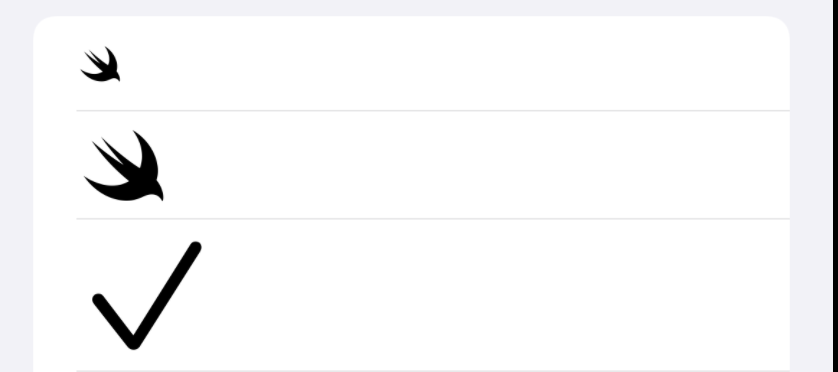
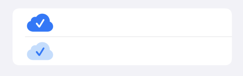
Some symbols have layered structure, and hierarchical rendering lets you emphasize the front layer instead of tinting every shape equally.
The SwiftUI comparison in this article uses the same symbol twice, with and without hierarchical rendering:
Section {
    Image(systemName: "checkmark.icloud.fill")
        .font(.largeTitle)
        .foregroundColor(.blue)

    Image(systemName: "checkmark.icloud.fill")
        .font(.largeTitle)
        .foregroundColor(.blue)
        .symbolRenderingMode(.hierarchical)
}
UIKit exposes the same effect through a hierarchical color configuration:
let frontHighlightedIcon = UIImage(
    systemName: "checkmark.icloud.fill",
    withConfiguration: UIImage.SymbolConfiguration(
        hierarchicalColor: .systemBlue
    )
)
If you only want one color across the entire symbol, use a single tint instead of a layered rendering mode.
SwiftUI keeps that simple:
Image(systemName: "checkmark")
    .foregroundColor(.green)
UIKit uses the symbol image and applies a tint color:
let blueInternetImg = UIImage(systemName: "network")?
    .withTintColor(.systemBlue)
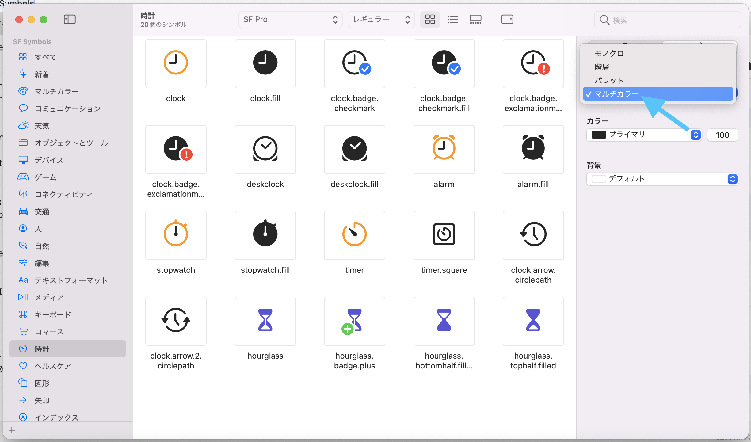
For the most expressive symbols, you have two options: use Apple's built-in multicolor design where available, or define your own palette colors per layer.
This article first points out that some symbols already carry Apple's own color recipe.
In SwiftUI, you can request that preset with .multicolor:
Image(systemName: "checkmark.circle.trianglebadge.exclamationmark")
    .font(.largeTitle)
    .symbolRenderingMode(.multicolor)
UIKit has the equivalent convenience configuration:
let multiColorImg = UIImage(
    systemName: "gear.badge.checkmark",
    withConfiguration: UIImage.SymbolConfiguration.preferringMulticolor()
)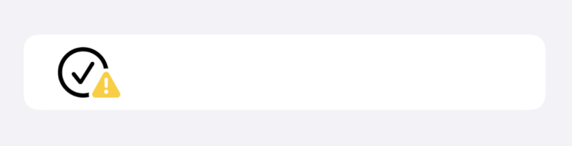
If you want full control, switch to palette rendering and specify each layer yourself:
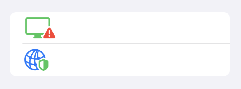
Image(systemName: "display.trianglebadge.exclamationmark")
    .font(.largeTitle)
    .symbolRenderingMode(.palette)
    .foregroundStyle(.red, .green)

Image(systemName: "network.badge.shield.half.filled")
    .font(.largeTitle)
    .symbolRenderingMode(.palette)
    .foregroundStyle(.green, .blue)
UIKit does the same through paletteColors:
let multiColorImg = UIImage(
    systemName: "gear.badge.checkmark",
    withConfiguration: UIImage.SymbolConfiguration(
        paletteColors: [.systemGreen, .systemBlue]
    )
)
The important idea is not memorizing every rendering mode. It is recognizing which visual goal you are aiming for, then choosing the matching API.
Use the plain symbol initializer when you only need the icon. Use text interpolation or attachments for inline symbols. Use font-driven sizing and weight when the icon should match typography. Use hierarchical, multicolor, or palette rendering when the symbol has meaningful layers.
That is the practical path this article lays out for both SwiftUI and UIKit.