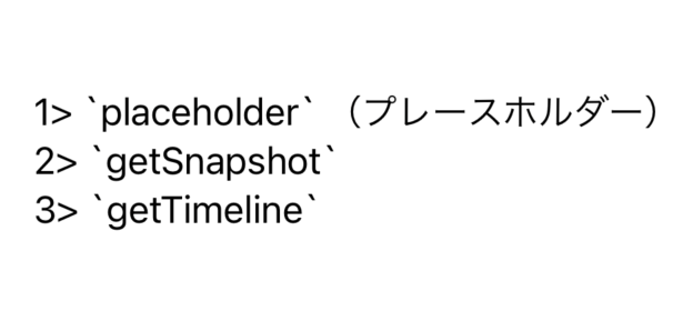
This article is not trying to teach one advanced pattern. It is trying to give new SwiftUI users a map of the common components they will touch first.
That makes it useful even now. Instead of treating SwiftUI as one giant undocumented surface, the post breaks the framework down into recognizable groups: text, images, lists, navigation, input controls, stacking layouts, alerts, view modifiers, and UIKit wrappers.
Since the article was written in 2020, some APIs have evolved since then. But as a beginner-facing mental model it still holds up well: learn the common building blocks first, then learn how state and previews make them reactive.
Every SwiftUI screen starts from the same shape: a View type with a body that describes the visible tree.
The article's basic template keeps the focus where it belongs: the content lives inside
var body: some View, and any local state or dependencies live above it as stored properties.
import SwiftUI

struct TextField_Example: View {

    // Variables

    var body: some View {

        // UI components
        // Text, Image, Form, VStack, List, ...

    }
}
That is the beginner habit the whole article reinforces: focus on the body as a declarative composition of view pieces rather than thinking in terms of manual layout code.
The article starts its gallery with several controls that felt especially visible around the iOS 14 SwiftUI era.
These examples show SwiftUI reaching further into common app UI: multiline editing, color picking, progress indicators, collapsible groups, system map embedding, and Sign in with Apple.
TextEditor covers multiline text input.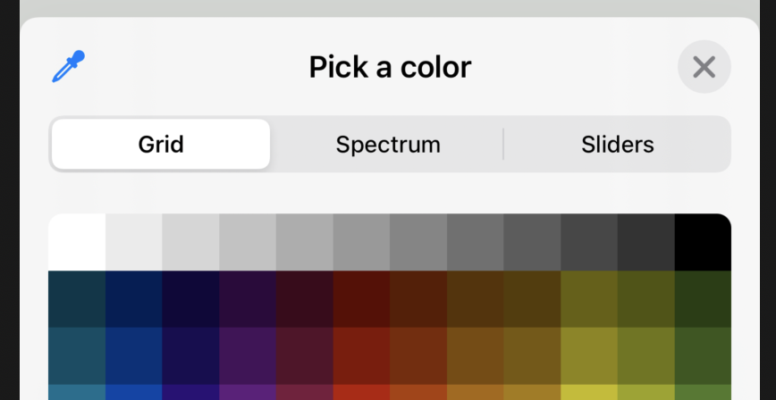
ColorPicker gives SwiftUI an easy color-selection control.
Map embeds map content directly in SwiftUI.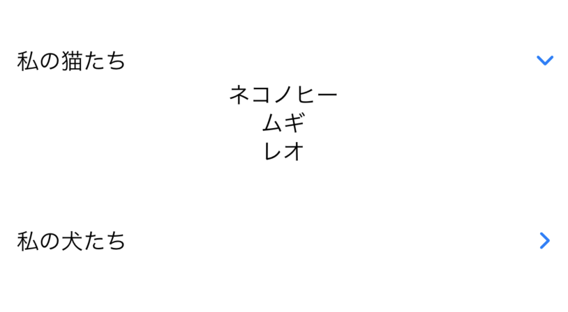
DisclosureGroup expands and collapses nested content.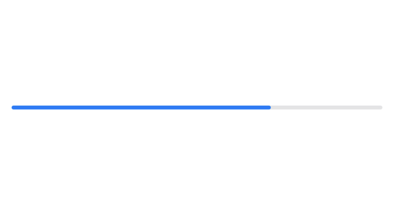
ProgressView handles loading and task progress states.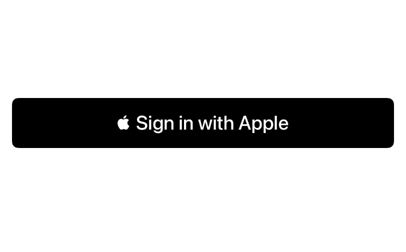
SignInWithAppleButton keeps the Apple-auth flow native.For beginners, the first useful SwiftUI views are usually still the simplest ones: labels and fields.
The article groups text display and text entry together. Text shows static or formatted
strings. TextField handles visible user entry. SecureField covers password-style input.

Text is the core display primitive.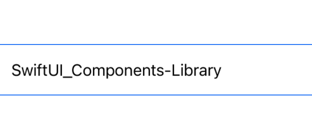
TextField binds editable text to state.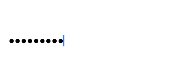
SecureField is the password-oriented sibling of TextField.Once text is covered, the next useful layer is usually visual assets and scrolling data containers.
The image examples in the article separate app-bundled images from SF Symbols. The list examples contrast
a plain List with a form-style grouped container.

Image("...") for bundled assets.
Image(systemName:) for SF Symbols.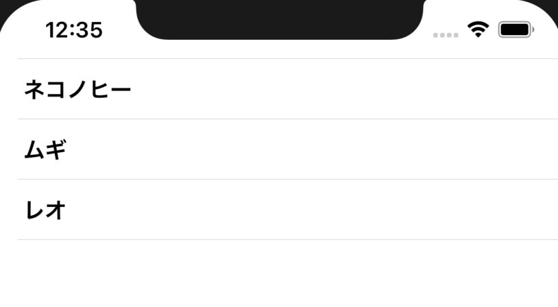
List is the standard scrolling container for row-based data.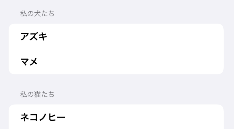
Form is useful when the rows are really settings or structured inputs.Beginners usually need four navigation ideas early: a container, a trigger, a presented screen, and top-level tabs.
The article covers all of those. NavigationView provides the container. A
NavigationLink pushes a destination. A sheet presents a separate modal surface. A tab bar
switches between peer sections of the app.
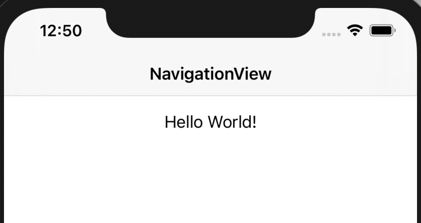
NavigationView gives hierarchical screens a container.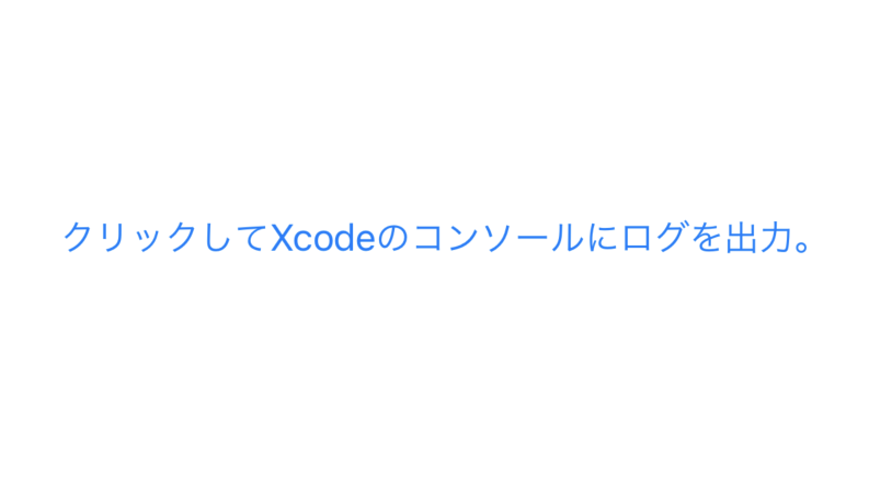
Button is still the main action trigger even in declarative UI.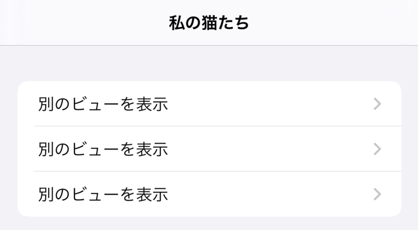
NavigationLink pushes into another view.
TabView structures peer-level destinations into a tab bar.Two other beginner topics show up quickly in real apps: how to choose values and how to place multiple views on screen together.
The article pairs controls like Toggle and Picker with the stack family that
defines SwiftUI layout: horizontal, vertical, and layered composition.
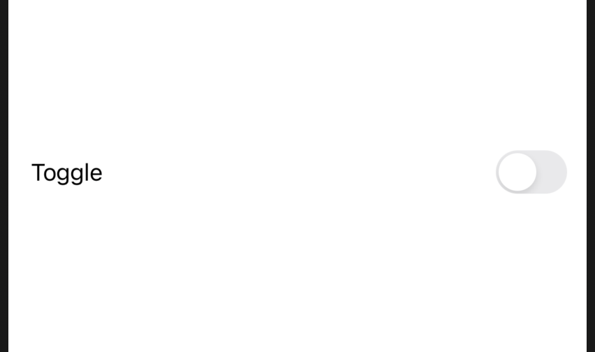
Toggle is the standard Boolean switch.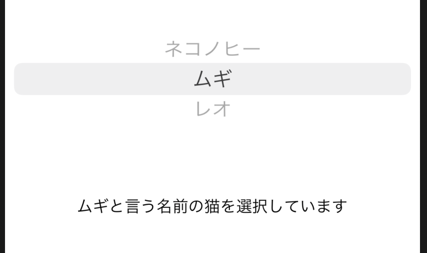
Picker selects one value from several choices.
HStack arranges children horizontally.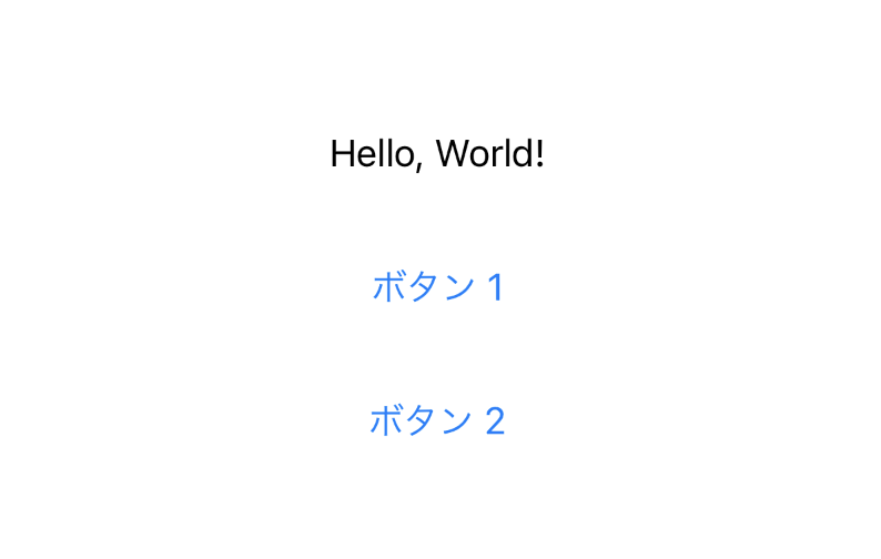
VStack arranges children vertically.
ZStack layers views on top of one another.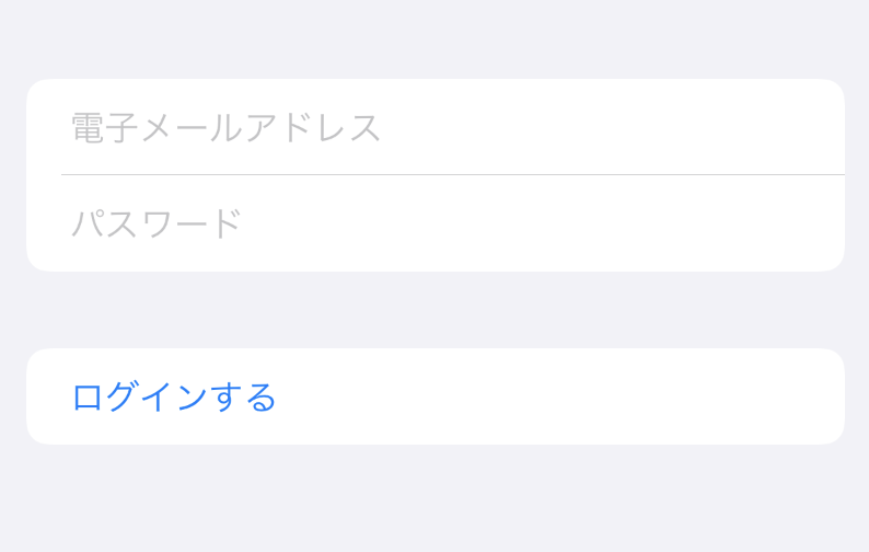
SwiftUI is not only about choosing the right base view. A lot of the final result comes from modifiers applied on top.
The article highlights alert surfaces and also shows how modifiers stack onto a base view to change size, color, and presentation without changing the underlying type.
Image(systemName: "wand.and.stars")
    .font(.largeTitle)
    .foregroundColor(.blue)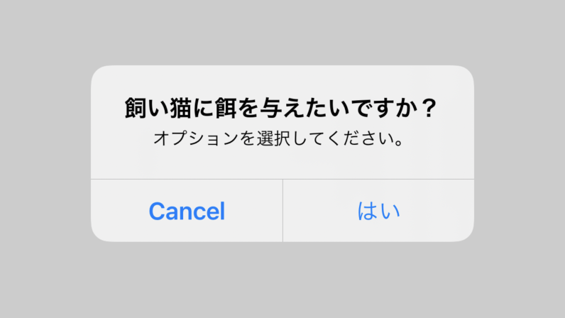
Alert handles simple message-and-action interruptions.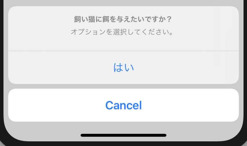
ActionSheet was the older menu-style action surface shown in the article era.The article also points out something beginners run into fast: SwiftUI does not replace every UIKit API immediately, so bridging matters.
One direction is simple: put a SwiftUI view inside UIKit with UIHostingController.
let swiftuiView = Map_Example()
let uiKitViewController = UIHostingController(rootView: swiftuiView)
self.present(uiKitViewController, animated: true, completion: nil)
The other direction uses UIViewControllerRepresentable when UIKit still owns the more mature implementation.
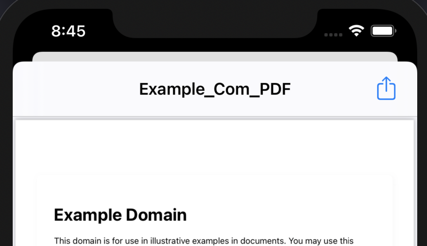
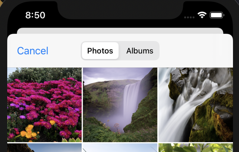
The examples in the article include preview, photo picking, Safari presentation, and file browsing wrappers.
UIViewControllerRepresentable example.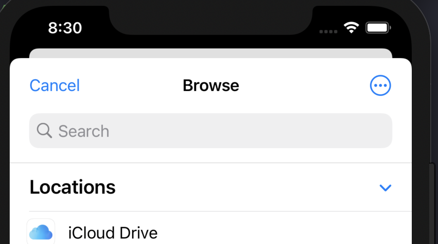
The last beginner concepts in the article are not visual widgets at all. They are the rules that make the widgets reactive and easy to test while building.
The post contrasts @State with ordinary stored values. @State changes can alter
the visible UI, which is why it is used for things like showing a modal sheet.
struct ButtonSheet_Example: View {

    @State var showAnotherView: Bool = false

    var body: some View {
        Button(action: {
            self.showAnotherView = true
        }, label: {
            Text("Show another view")
        })
        .sheet(isPresented: $showAnotherView, content: {
            AnotherView(textContent: "Hello World.")
        })
    }
}
By contrast, a normal stored closure or value does not automatically drive the screen refresh:
struct ButtonSheet_Example: View {

    var userTappedButton: () -> Void

    var body: some View {
        Button(action: {
            self.userTappedButton()
        }, label: {
            Text("Show another view")
        })
    }
}
The preview section is equally important for beginners because it shortens the feedback loop:
struct TextField_Example_Previews: PreviewProvider {
    static var previews: some View {
        TextField_Example(textEntered: "SwiftUI_Components-Library")
    }
}
That combination of body, @State, and PreviewProvider is really the basic learning loop behind the whole article.
The article works best as a first-pass visual map of SwiftUI: learn the common pieces, then learn how composition and state make them work together.
For a beginner, the biggest win is not memorizing every component at once. It is recognizing the common categories: display text, accept input, show images, render lists, navigate, choose values, stack content, present alerts, apply modifiers, and bridge into UIKit when SwiftUI does not yet cover the whole job by itself.