A monthly calendar is mostly a date-range problem. The grid part is the easy half.
This article keeps the implementation intentionally small. Instead of starting with a large reusable component, it focuses on the minimum structure needed to render one month correctly in SwiftUI.
That means two things matter most: a fixed 7-column layout for the weekdays, and a date generator that returns not just the days inside the month, but also the leading and trailing days needed to fill out the first and last visible weeks.
Start with a view that accepts any date inside the month you want to render, then build a 7-column LazyVGrid.
The calendar view takes a single Date named monthToDisplay. That does not need to be the first day of the month.
Any date inside the target month is enough, because the date helpers will calculate the visible range from there.
struct CalendarView: View {
let monthToDisplay: Date
init(monthToDisplay: Date) {
self.monthToDisplay = monthToDisplay
}
var body: some View {
LazyVGrid(columns: Array(repeating: GridItem(), count: 7)) {
// Weekday labels and day cells go here.
}
}
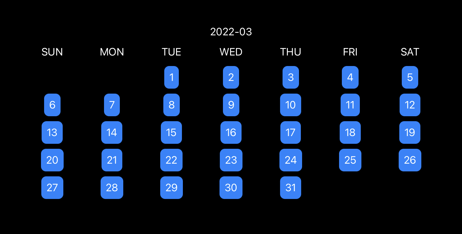
}A 7-column grid maps cleanly to the calendar layout. The first row renders the weekday names, and the remaining rows render day cells.
The useful trick is to generate the whole visible range, from the first displayed week through the last displayed week.
If you only return the literal dates inside the month, the first and last rows will not line up correctly. The post fixes that by asking
Calendar for the month interval, then expanding outward to the week interval that contains the month's start and end.
extension Date {
    func getDaysForMonth() -> [Date] {
        guard
            let monthInterval = Calendar.current.dateInterval(of: .month, for: self),
            let monthFirstWeek = Calendar.current.dateInterval(of: .weekOfMonth, for: monthInterval.start),
            let monthLastWeek = Calendar.current.dateInterval(of: .weekOfMonth, for: monthInterval.end)
        else {
            return []
        }

        return Calendar.current.generateDates(
            inside: DateInterval(start: monthFirstWeek.start, end: monthLastWeek.end),
            matching: DateComponents(hour: 0, minute: 0, second: 0)
        )
    }
}

extension Calendar {
    func generateDates(inside interval: DateInterval, matching components: DateComponents) -> [Date] {
        var dates = [interval.start]

        enumerateDates(
            startingAfter: interval.start,
            matching: components,
            matchingPolicy: .nextTime
        ) { date, _, stop in
            if let date = date {
                if date < interval.end {
                    dates.append(date)
                } else {
                    stop = true
                }
            }
        }

        return dates
    }
}
That gives the grid a complete list of visible dates, including the days borrowed from adjacent months to keep the layout rectangular.
Do not remove non-month dates from the grid. Hide them instead, so the spacing stays correct.
Once the date list includes leading and trailing overflow days, the next question is how to render them. This article keeps those cells in the grid but hides the ones that are outside the current month.
LazyVGrid(columns: Array(repeating: GridItem(), count: 7)) {
    ForEach(["SUN", "MON", "TUE", "WED", "THU", "FRI", "SAT"], id: \.self) { weekdayName in
        Text(weekdayName)
    }

    Section {
        ForEach(monthToDisplay.getDaysForMonth(), id: \.self) { date in
            if Calendar.current.isDate(date, equalTo: monthToDisplay, toGranularity: .month) {
                Text("\(date.getDayNumber())")
                    .padding(8)
                    .foregroundColor(.white)
                    .background(Color.blue)
                    .cornerRadius(8)
                    .id(date)
            } else {
                Text("\(date.getDayNumber())")
                    .padding(8)
                    .foregroundColor(.white)
                    .background(Color.blue)
                    .cornerRadius(8)
                    .hidden()
            }
        }
    }
}
That is the important layout decision in the article. If those dates were removed entirely, the remaining cells would shift left and the calendar would stop reading like a month view. By hiding them, the grid still reserves the space they occupy.
Once the calendar view exists, displaying a month is just a small wrapper around a target date.
The final example creates a target month from the current date, prints a year-month label, and passes that month into CalendarView.
struct ContentView: View {
    var body: some View {
        VStack {
            if let targetMonth = Calendar.current.date(byAdding: .month, value: 0, to: Date()) {
                Text(targetMonth.getYearMonthString())
                CalendarView(monthToDisplay: targetMonth)
            }
        }
    }
}
From there, you can add month navigation, date selection, events, or range highlighting. The article's point is that the foundation does not need to be large before those features become possible.
This is a good example of keeping a SwiftUI component small by separating layout from date math.
The grid itself is straightforward. The more valuable part is the date-generation logic that expands a month into the exact visible weeks needed for a calendar page. Once you have that, the rest becomes standard SwiftUI rendering.
If you are building a custom planner, habit tracker, booking view, or journal interface, this is a clean foundation to start from before you add selection and navigation on top.