Swift Charts mattered because it removed a lot of the old excuse for avoiding in-app charts.
This article was written right after the new framework appeared in the iOS 16 cycle. Its main pitch still holds: for many ordinary product cases, you no longer need to build a chart from custom shapes or adopt a third-party library just to show bars, lines, points, or a small comparison view. The framework is declarative, SwiftUI-native, and close enough to the rest of the view system that it feels like another container rather than a separate rendering world.
This article keeps the article practical. It walks through the model, the Chart container, the basic mark types,
how axis roles work, how to animate dataset changes, how to render multiple series, and how to add simple reference lines or
range overlays with RuleMark and AreaMark.
The simplest chart model is just a named value, plus identity and optional style information.
This article starts with a small ChartEntry type. That is still the right first move. Each plotted item
needs the values you want to chart, and if you are going to feed it into ForEach or Chart(data),
it should be identifiable in the same way many other SwiftUI models are.
struct ChartEntry: Identifiable {
    var title: String
    var value: Double
    var color: Color = .green

    var id: String {
        title + String(value)
    }
}
The extra color property is not required, but it gives you a convenient way to customize a single bar, line segment,
or point when you want a one-series chart with a bit more visual control.
From there, the mental model is close to a SwiftUI list. You either pass an array directly to Chart or create the
marks yourself inside a nested ForEach.
Chart(data) { dataPoint in
// marks go here
}
.frame(height: 200)
Chart {
ForEach(data) { dataPoint in
// marks go here
}
}
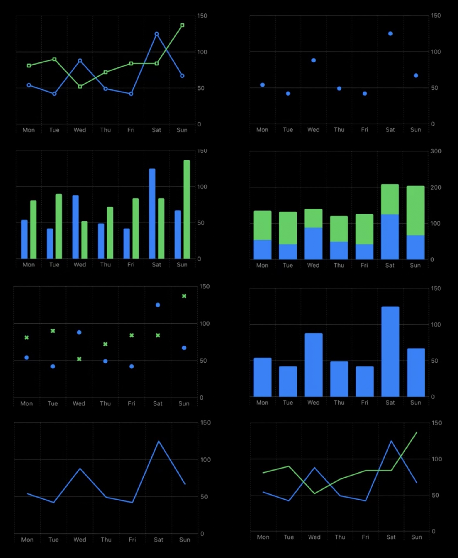
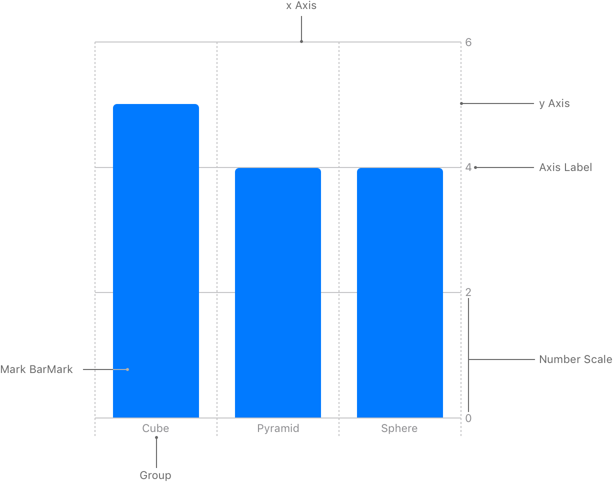
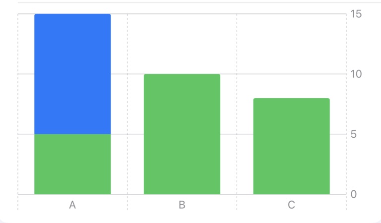
.frame(height: 200)Bar charts are the cleanest starting point because they show how categories and values map into axes.
The first concrete mark in the post is BarMark. A standard vertical bar chart puts the category on the x-axis
and the numeric value on the y-axis. That alone is enough to make the Charts framework click for most people: marks are just
view-like declarations driven by plottable values.
Chart(data) { dataPoint in
    BarMark(
        x: .value("Category", dataPoint.title),
        y: .value("Value", dataPoint.value)
    )
    .foregroundStyle(dataPoint.color)
}
.frame(height: 200)
This article also points out a useful behavior: if multiple entries share the same category label on the x-axis, SwiftUI treats them as belonging to the same category column. That can be a quick way to compare related values without redesigning the chart structure.
Swapping axes is equally direct. If you want a horizontal bar chart, pass the numeric value to x and the category
to y instead.
Chart(data) { dataPoint in
    BarMark(
        x: .value("Value", dataPoint.value),
        y: .value("Category", dataPoint.title)
    )
    .foregroundStyle(dataPoint.color)
}
.frame(height: 200)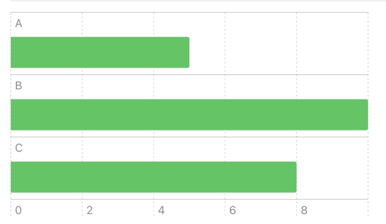
Because the data can live in @State, chart updates can animate like the rest of SwiftUI.
One of the more useful practical sections in this article is the dataset-switching example. Instead of treating the chart as a
static graphic, it stores the current dataset in @State, switches between two arrays from a picker, and wraps the update
in withAnimation. That is a good reminder that Swift Charts is not separate from SwiftUI state flow. It is part of it.
@State private var dataSetSelection = 0
@State private var data: [ChartEntry] = demoData1

Picker("Dataset selection", selection: $dataSetSelection) {
    Text("Dataset 1").tag(0)
    Text("Dataset 2").tag(1)
}
.onChange(of: dataSetSelection) { newValue in
    withAnimation {
        data = newValue == 0 ? demoData1 : demoData2
    }
}
If your app needs to swap time ranges, compare scenarios, or animate between related sets of measurements, this pattern is one of the first things worth carrying forward from this article.
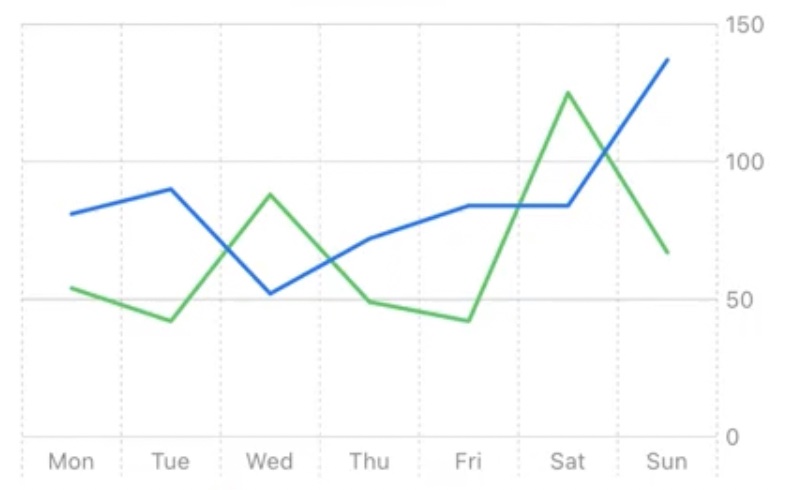
LineMark and PointMark follow the same shape as BarMark, which makes chart variations easy to compose.
After the bar chart foundation, the article moves through the other common mark types. A line chart is usually just the same data mapped
through LineMark. A scatter-style chart uses PointMark. If you want both, you can return both marks inside the same
loop and let the framework layer them together.
Chart {
    ForEach(data) { dataPoint in
        LineMark(
            x: .value("Category", dataPoint.title),
            y: .value("Value", dataPoint.value)
        )
        .foregroundStyle(dataPoint.color)

        PointMark(
            x: .value("Category", dataPoint.title),
            y: .value("Value", dataPoint.value)
        )
    }
}
.frame(height: 200)
The important part is not the syntax itself. It is that the API encourages you to think in layers of marks rather than in one monolithic chart type. Once that clicks, a lot of chart variations become small composition problems instead of separate rendering systems.
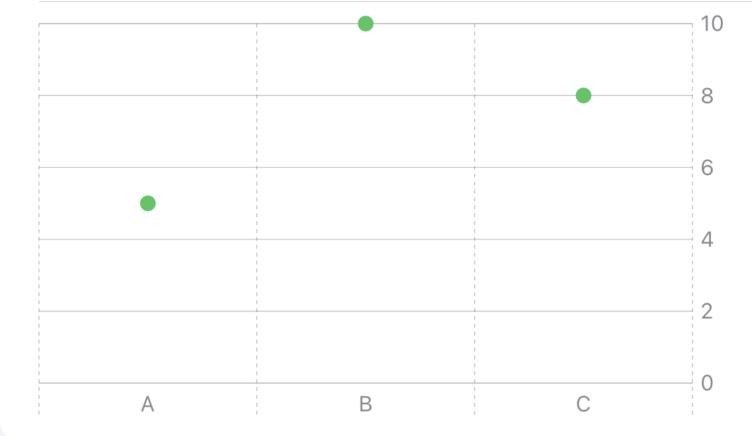
PointMark works well when the individual observations matter more than a continuous visual trace.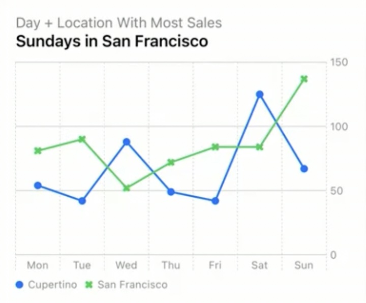
Multiple datasets and reference lines are where the framework starts to feel more product-ready than demo-only.
The post then moves from one dataset to several. Instead of only storing individual points, it introduces a wrapper type such as
DataCollection to hold a series name and the points inside that series. The chart can iterate over collections, then iterate
over the points inside each collection.
struct DataCollection: Identifiable {
    var collectionName: String
    var data: [ChartEntry]

    var id: String { collectionName }
}

Chart(dataCollections) { collection in
    ForEach(collection.data) { dataPoint in
        PointMark(
            x: .value("Category", dataPoint.title),
            y: .value("Value", dataPoint.value)
        )
        .foregroundStyle(by: .value("City", collection.collectionName))
    }
}
.frame(height: 200)
The use of .foregroundStyle(by:) is the key detail. It lets SwiftUI separate each series visually and associate the mark color
with a series label instead of with a hard-coded per-point color.
This article also introduces RuleMark for horizontal or vertical reference lines. That is a simple but useful tool for
averages, thresholds, or targets, especially when the chart should communicate a benchmark rather than only raw values.
RuleMark(y: .value("Average", averageValue))

RuleMark(x: .value("Selected Day", selectedLabel))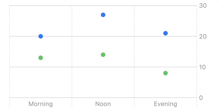
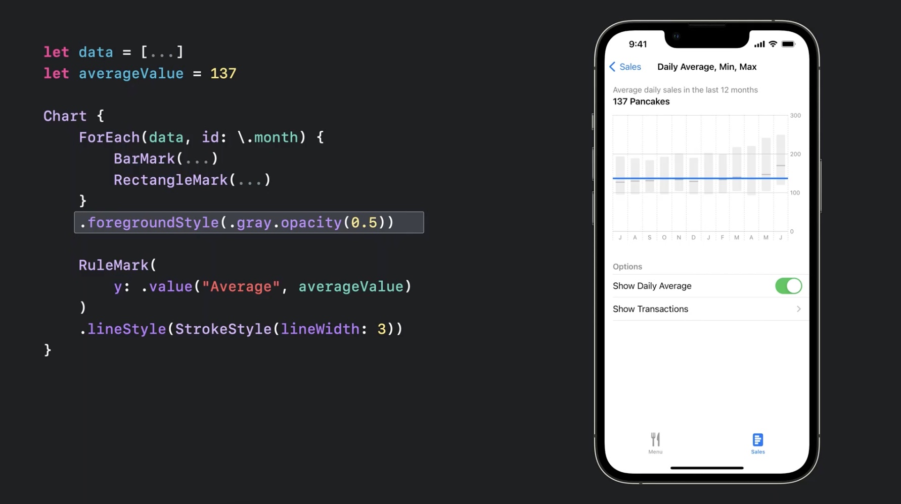
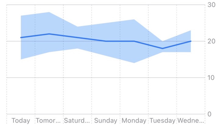
RuleMark is small, but it helps charts explain benchmarks instead of only plotting values.AreaMark is a good example of using Charts for ranges instead of only single values.
The last section of this article points toward richer chart types. The concrete example uses AreaMark to display a
temperature range, with a minimum and maximum band and a separate line for the average. That is a good pattern whenever a single point is
not enough and the range itself is meaningful.
struct ChartEntryMinMax: Identifiable {
    var title: String
    var minY: Int
    var maxY: Int

    var averageY: Int { (minY + maxY) / 2 }
    var id: String { title }
}

Chart {
    ForEach(data) { dataPoint in
        AreaMark(
            x: .value("Category", dataPoint.title),
            yStart: .value("Lowest", dataPoint.minY),
            yEnd: .value("Highest", dataPoint.maxY)
        )
        .opacity(0.3)

        LineMark(
            x: .value("Category", dataPoint.title),
            y: .value("Average", dataPoint.averageY)
        )
    }
}
.frame(height: 200)
The broader lesson is that Swift Charts is not limited to a handful of canned chart screens. Once you start layering marks, you can represent not only totals and points, but also uncertainty bands, ranges, and reference overlays.
The strongest part of Swift Charts is not any one mark. It is how naturally the chart fits into ordinary SwiftUI code.
That is why this early iOS 16 article still reads well. Its examples are small, but they show the right things: model the data cleanly, declare the marks you need, let SwiftUI drive updates from state, and compose more complex visuals by layering marks rather than abandoning the framework.
For many apps, that is enough. And for the cases where it is not, the framework still gets you much closer to a good chart without the amount of custom work older Apple-platform apps often had to carry.