Use the system pieces, but keep the final navigation chrome yours.
This pattern works because it does not fight SwiftUI’s navigation primitives. You still use TabView
for page switching, but you stop rendering the standard tab bar and place your own interface above it.
That makes it easy to add richer tab items, custom spacing, and a profile avatar, then extend the same screen with a left-edge drawer menu.
TabView, ZStack, HStack, AsyncImage, GeometryReader, @StateObject, and @GestureState.
Start with a simple enum for the tabs you want to support.
This article begins by defining a small tab model. That gives you typed selection state and keeps the rest of the view code readable.
enum CurrentTab {
    case home
    case settings
    case profile
}

@State private var currentTab: CurrentTab = .home
Bind that state into TabView(selection:) and tag each page with its matching case. The important detail is that you do not add
.tabItem, because the system tab bar is not what you want to show.
TabView(selection: $currentTab) {
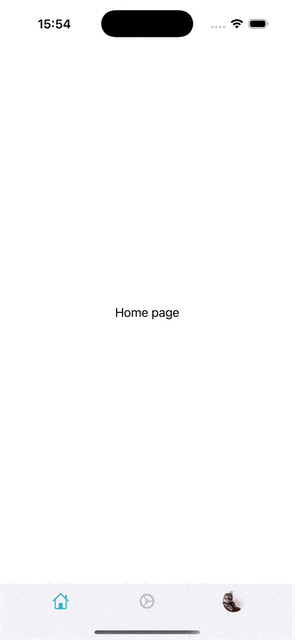
Text("Home page").tag(CurrentTab.home)
Text("Settings page").tag(CurrentTab.settings)
Text("Profile page").tag(CurrentTab.profile)
}Put the TabView underneath, then overlay your own toolbar at the bottom.
The clean structure is a ZStack(alignment: .bottom). Your content stays in the background, and the custom tab bar sits on top.
var body: some View {
ZStack(alignment: .bottom) {
TabView(selection: $currentTab) {
Text("Home page").tag(CurrentTab.home)
Text("Settings page").tag(CurrentTab.settings)
Text("Profile page").tag(CurrentTab.profile)
}
floatingToolBar
}
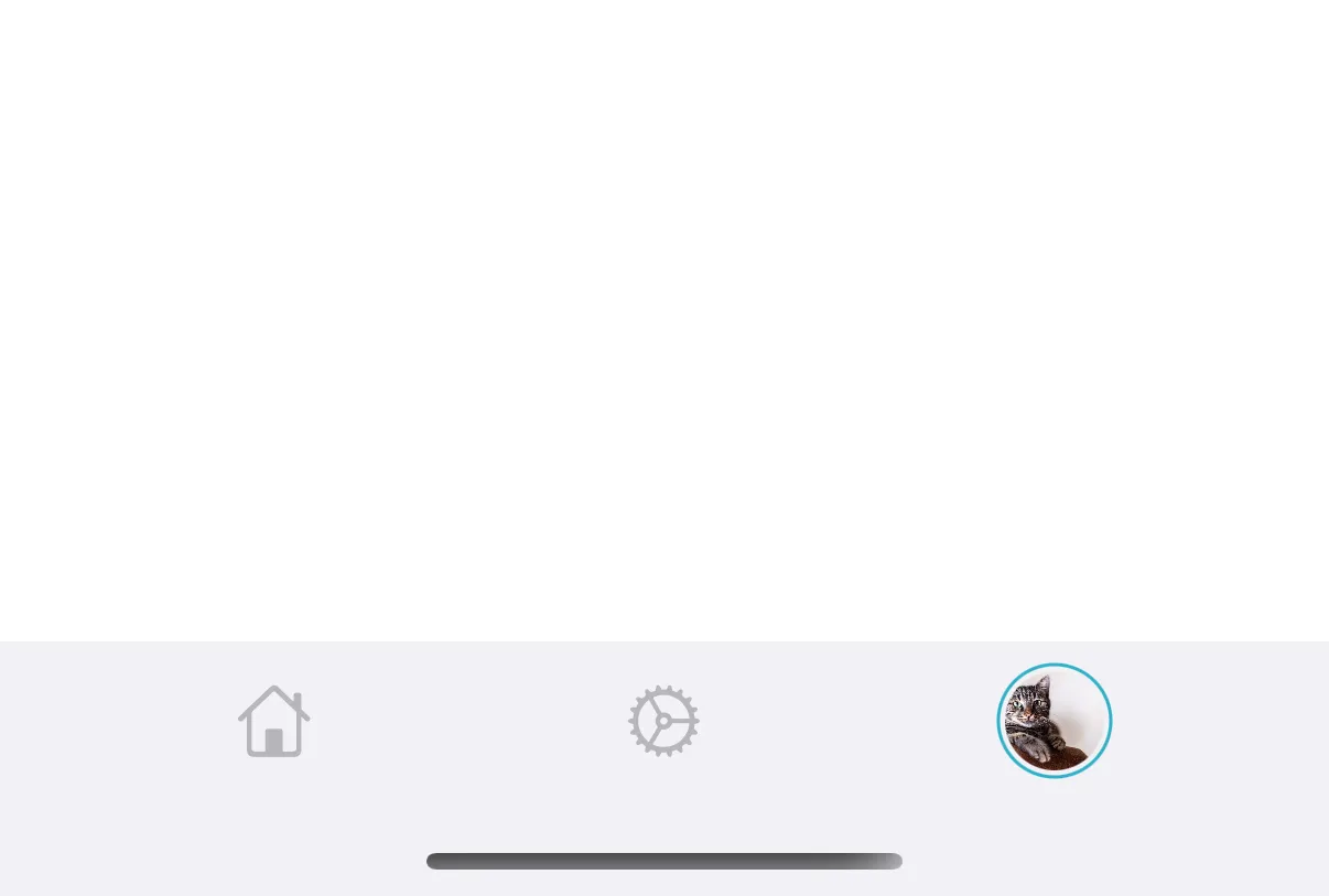
}Each tab button can render through a small reusable view that changes icon color and opacity when active.
func customTabItem(symbolName: String, isActive: Bool) -> some View {
    Image(systemName: symbolName)
        .resizable()
        .foregroundColor(isActive ? .teal : .gray)
        .opacity(isActive ? 1 : 0.6)
        .frame(width: 22, height: 22)
        .frame(maxWidth: .infinity)
        .frame(height: 38)
}
Use AsyncImage when the profile tab should show a live avatar instead of a symbol.
One useful part of a custom bar is that the profile tab does not need to be a plain icon. In the article, the last tab item loads an avatar from a URL, clips it into a circle, and draws an accent ring when that tab is selected.
Button {
    currentTab = .profile
} label: {
    AsyncImage(url: URL(string: avatarURL)!) { loadedImage in
        loadedImage
            .resizable()
            .scaledToFit()
            .clipShape(Circle())
            .frame(maxWidth: .infinity)
            .frame(height: 30)
            .padding(2)
            .background {
                if currentTab == .profile {
                    Circle().stroke(.teal, lineWidth: 1)
                }
            }
    } placeholder: {
        ProgressView()
    }
}
This is the kind of UI detail that is awkward with the stock tab bar and straightforward once the control is yours.
Build the drawer as a wide left column plus a full-width main content view.
The sidebar portion starts with GeometryReader so you can compute the drawer width from the current screen size.
In the article, the sidebar width is the full width minus 100.
GeometryReader { geometry in
    let sideBarWidth = geometry.size.width - 100

    HStack(spacing: 0) {
        SideMenuView()
            .frame(width: sideBarWidth)

        MainContentView()
            .frame(width: geometry.size.width)
    }
}
That layout would normally leave the sidebar visible, so the next move is to shift the whole stack left by the drawer width and then add back the drag offset.
HStack(spacing: 0) {
    SideMenuView()
        .frame(width: sideBarWidth)

    MainContentView()
        .frame(width: geometry.size.width)
}
.offset(x: -sideBarWidth + navigationState.offset)
Keep the drawer behavior inside a small observable state object.
The completed example stores open and closed state, the current offset, and the last snapped position inside a navigation object.
A dedicated handleGestureEnd method decides whether to open or close based on drag distance and velocity.
final class NavigationState: ObservableObject {
    @Published var showMenu = false
    @Published var offset: CGFloat = 0
    @Published var lastStoredOffset: CGFloat = 0

    func handleGestureEnd(value: DragGesture.Value, sideBarWidth: CGFloat) {
        withAnimation(.spring(duration: 0.15)) {
            if value.translation.width > sideBarWidth / 2 || value.velocity.width > 800 {
                openMenu(sideBarWidth: sideBarWidth)
            } else if -value.translation.width > sideBarWidth / 2 || -value.velocity.width > 800 {
                closeMenu()
            } else if showMenu {
                openMenu(sideBarWidth: sideBarWidth)
            } else {
                closeMenu()
            }
        }

        lastStoredOffset = offset
    }
}
That separation is worth keeping. The view stays focused on layout, while the state object owns the snapping rules.
The pattern is straightforward: native containers underneath, custom chrome on top.
If you want a more social-app-like layout in SwiftUI, this is a practical direction. Use TabView for the page model,
overlay a bottom bar with your own buttons and avatar, then place the whole experience inside a gesture-aware sidebar shell.
This article also links to a code repository for the sample: mszpro/Custom-Side-Tab-Bar.