SwiftUI lets you restyle a toggle without rethinking the whole control from scratch.
That is what makes ToggleStyle useful. Instead of replacing a toggle with an unrelated button
and rebuilding all of the semantics yourself, you keep SwiftUI's toggle model and only take over how it is rendered.
This article stays practical: first show the protocol shape, then explain what the
configuration value gives you, and finally build a few concrete styles that move from ordinary to playful.
configuration.label for the descriptive content
and configuration.isOn for the current state. Your style decides how to draw them and when to flip the state.
A custom toggle starts as a type that conforms to ToggleStyle and implements makeBody(configuration:).
This is the smallest possible shape. SwiftUI hands your style a Configuration object, and your job is to
return the view tree that should represent that toggle.
struct NewToggleStyle: ToggleStyle {

    func makeBody(configuration: Configuration) -> some View {
        // Toggle UI components
    }

}
That method is where all the custom layout work lives. The style does not own the state directly, but it does get a handle to the current state through the configuration value.
Once the style exists, using it is just a normal toggle plus .toggleStyle(...).
The rewritten example keeps the state local with @State, then binds that state into the toggle exactly the same way you would with the default system style.
@State var isSwitchOn = false

var body: some View {
    Toggle("Toggle", isOn: $isSwitchOn)
        .toggleStyle(NewToggleStyle())
}
That separation is the important SwiftUI design point: the toggle still owns a boolean binding, while the style only changes appearance and interaction behavior.
The configuration object gives the style access to the toggle's label and on-off state.
In this article, those are the two properties that matter most:
configuration.label is the descriptive view content attached to the toggle.
configuration.isOn is the boolean state the style should reflect visually.
The source also points out the easy-to-miss part: if your custom UI uses a tap gesture instead of the default switch chrome,
you need to flip configuration.isOn yourself.
.onTapGesture(perform: {
    configuration.isOn.toggle()
})
Without that manual toggle, the custom shape might render correctly but never actually update the bound value.
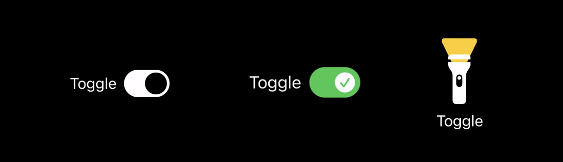
A rounded rectangle track plus an offset circle is enough to build a recognizable custom switch.
The first real example uses a horizontal layout: the label on the left, then a rounded rectangle track with a circle
that slides left or right depending on configuration.isOn.
struct NewToggleStyle: ToggleStyle {

    func makeBody(configuration: Configuration) -> some View {

        HStack {

            configuration.label

            RoundedRectangle(cornerRadius: 25.0)
                .frame(width: 50, height: 30, alignment: .center)
                .overlay((
                    Circle()
                        .foregroundColor(Color(.systemBackground))
                        .padding(3)
                        .offset(x: configuration.isOn ? 10 : -10, y: 0)
                        .animation(.linear)
                ))
                .foregroundColor(Color(.label))
                .onTapGesture(perform: {
                    configuration.isOn.toggle()
                })

        }

    }

}
The entire illusion comes from the offset. When the state changes, the circle shifts to the other side of the capsule.

Once the base geometry works, replacing the thumb with an SF Symbol is just a rendering decision.
The second version keeps the same capsule structure but swaps the moving circle for a symbolic indicator. A filled checkmark circle appears when the toggle is on, and an x-mark circle appears when it is off.
struct NewToggleStyle: ToggleStyle {

    static let backgroundColor = Color(.label)
    static let switchColor = Color(.systemBackground)

    func makeBody(configuration: Configuration) -> some View {

        HStack {

            configuration.label

            RoundedRectangle(cornerRadius: 25.0)
                .frame(width: 50, height: 30, alignment: .center)
                .overlay((
                    Image(systemName: configuration.isOn ? "checkmark.circle.fill" : "xmark.circle.fill")
                        .font(.system(size: 20))
                        .foregroundColor(configuration.isOn ? .white : NewToggleStyle.switchColor)
                        .padding(3)
                        .offset(x: configuration.isOn ? 10 : -10, y: 0)
                        .animation(.linear)
                ))
                .foregroundColor(configuration.isOn ? .green : NewToggleStyle.backgroundColor)
                .onTapGesture(perform: {
                    configuration.isOn.toggle()
                })

        }

    }

}
That is a nice demonstration of what ToggleStyle is really for: not only recoloring the system switch,
but changing the character of the control while still preserving the same boolean behavior.

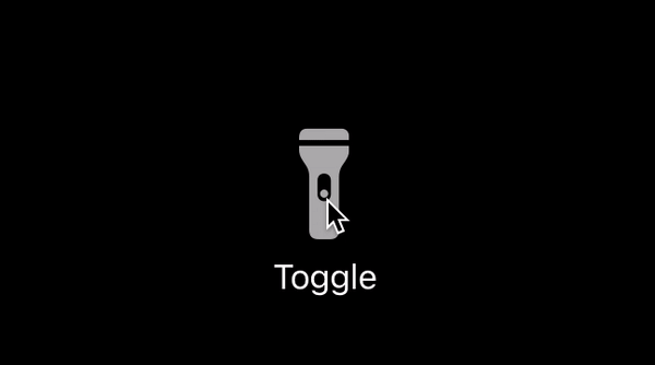
The article ends with the real creative point: a toggle does not have to look like a switch at all.
The flashlight example replaces the usual horizontal control with a stacked mini-illustration. When the state turns on, the flashlight icon changes and a yellow beam appears above it.
struct NewToggleStyle: ToggleStyle {

    static let backgroundColor = Color(.label)
    static let switchColor = Color(.systemBackground)

    func makeBody(configuration: Configuration) -> some View {

        VStack {

            ZStack {
                Image(systemName: "arrowtriangle.down.fill")
                    .frame(width: 30, height: 30, alignment: .top)
                    .font(.system(size: 50))
                    .offset(y: -30)
                    .foregroundColor(.yellow)
                    .opacity(configuration.isOn ? 1 : 0)
                    .animation(.easeInOut)

                Image(systemName: configuration.isOn ? "flashlight.on.fill" : "flashlight.off.fill")
                    .font(.system(size: 50))
                    .opacity(configuration.isOn ? 1 : 0.7)
                    .animation(.default)
            }
            .onTapGesture(perform: {
                configuration.isOn.toggle()
            })

            configuration.label

        }

    }

}
This is less about shipping a flashlight control specifically and more about the design freedom the API gives you. If a boolean state in your app is better represented as a lamp, lock, speaker, or some other visual metaphor, the style layer is where you can explore that idea cleanly.
The practical lesson is simple: keep the boolean binding, use the style to own the visuals, and remember to update configuration.isOn when your custom body handles taps itself.
That pattern scales from minor brand polish all the way to whimsical controls. This article is short, but it explains the important part clearly: a custom toggle in SwiftUI is not magic, it is just a small custom view tree wrapped around the configuration SwiftUI hands you.