This is a small feature, but the clean version matters: store an integer setting once, bind UI to it, and map it to a color scheme in one place.
This article is short and focused. It does not try to build a full settings architecture. It just shows the simplest way to let a SwiftUI app remember whether the user wants to follow the system appearance, force dark mode, or force light mode.
The implementation is split into three pieces: define the setting values, save the selected value with
@AppStorage, then apply the matching preferredColorScheme at the app root.
The stored value is just an enum backed by an integer plus one @AppStorage property named appearanceMode.
The article starts by defining the three states explicitly:
enum DarkModeSetting: Int {
    case followSystem = 0
    case darkMode = 1
    case lightMode = 2
}
Then it persists the selected value through @AppStorage:
@AppStorage(wrappedValue: 0, "appearanceMode")
var appearanceMode
That gives the app a simple preference store without introducing a separate settings object or manual
UserDefaults plumbing.
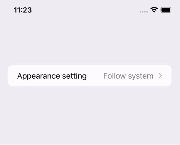
Once the value is in @AppStorage, the settings UI is only a bound picker with three tagged rows.
This article adds the preference directly in a settings-style screen:
Picker("Appearance setting", selection: $appearanceMode) {
    Text("Follow system")
        .tag(0)
    Text("Dark mode")
        .tag(1)
    Text("Light mode")
        .tag(2)
}
Because the picker is bound to @AppStorage, changing the selection updates the saved value
automatically. There is no extra save button and no manual synchronization step.
The important part is to read the stored mode from the App entry point and map it to the right preferredColorScheme.
The article applies the appearance choice in the main app structure, not only inside one screen:
@main
struct SwiftUI_Toggle_DarkModeApp: App {

    @AppStorage(wrappedValue: 0, "appearanceMode")
    var appearanceMode

    var body: some Scene {
        WindowGroup {
            ContentView()
                .applyAppearenceSetting(
                    DarkModeSetting(rawValue: self.appearanceMode) ?? .followSystem
                )
        }
    }
}
The helper function is just a switch that maps the stored enum to .none, .dark,
or .light:
extension View {
    @ViewBuilder
    func applyAppearenceSetting(_ setting: DarkModeSetting) -> some View {
        switch setting {
        case .followSystem:
            self.preferredColorScheme(.none)
        case .darkMode:
            self.preferredColorScheme(.dark)
        case .lightMode:
            self.preferredColorScheme(.light)
        }
    }
}
The naming in the source uses applyAppearenceSetting. You can keep that spelling to match
the sample or rename it locally if you want cleaner naming.
There is one caveat in this article: changing the preferred color scheme can send the app back to its default screen.
That note matters because this setting is applied high in the view tree. If the current navigation state is not being preserved independently, a full appearance change can feel like a lightweight app reset from the user's perspective.
For a small app that may be fine. For a larger app, it is a reminder to test how theme changes interact with navigation, presented sheets, and in-progress form state.
This pattern stays useful because it solves appearance preference end to end without much code: one stored integer, one picker, one app-level mapping.
If you want a SwiftUI app to respect a user-selected appearance override instead of only following the system theme, this is still a clean baseline implementation.