DisclosureGroup gives SwiftUI a built-in way to hide and reveal a section of related content instead of forcing every expand/collapse UI into a custom control.
This article frames this as a new SwiftUI addition from the WWDC 2020 cycle. The point is simple:
if your view has grouped content that should stay collapsed until the user asks for it, you can wrap that
content in a DisclosureGroup and let SwiftUI handle the interaction.
This is useful for menus, settings subsections, grouped metadata, or any screen where showing everything all at once would make the layout noisier than it needs to be.
The pattern is one label, one bound expansion state, and a closure that defines the content to reveal.
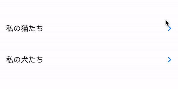
In the article, the grouped content is intentionally small and friendly: one disclosure group for cats and
another for dogs. Each group owns its own @State Boolean so expansion can be controlled independently.
This article's example is small enough that the whole view is the lesson.
struct ContentView: View {

    @State var catMenuExpanded: Bool = false
    @State var dogMenuExpanded: Bool = false

    var body: some View {
        DisclosureGroup("My Cats", isExpanded: $catMenuExpanded) {
            Text("Nekonohi")
            Text("Mugi")
            Text("Leo")
        }
        .padding()

        DisclosureGroup("My Dogs", isExpanded: $dogMenuExpanded) {
            Text("Azuki")
            Text("Mame")
        }
        .padding()
    }
}
The sample labels are cat and dog names, but the structure is what matters: each
DisclosureGroup takes a title, an isExpanded binding, and a content block.
The important part is not only the view type. It is the explicit binding to expansion state.
Because the expansion flag is a normal binding, the open or closed state is fully visible to your view model logic. You are not limited to tapping the disclosure arrow. You can also open or close sections from other events, remember state across updates, or coordinate the behavior with other parts of the screen.
That is what makes DisclosureGroup more than a visual convenience. It is a state-driven SwiftUI
control that fits naturally into the rest of the framework.
This is a tiny article, but it covers a useful SwiftUI control that often replaces custom expand/collapse code.
The value of the post is its restraint. It does not try to turn DisclosureGroup into a large architecture
discussion. It shows the control in one screen, binds it to two pieces of state, and makes the core API obvious.
If you need grouped content that can be shown or hidden on demand in SwiftUI, this is one of the first built-in controls worth reaching for.