The key trick is that the ring is still a circle. You only show the top portion of it.
This article came from a practical UI need: showing AI progress or a score with a more distinctive shape than a full circular ring.
Instead of drawing a new custom path from scratch, the implementation starts with Circle() and only displays a trimmed segment.
That keeps the implementation compact and makes it easy to reuse SwiftUI features like gradient strokes, rounded line caps, and animation.
Use .trim to keep only the arc you want, then rotate the result into place.
The view defines a start trim position of 0.3 and an end position of 0.9.
That keeps only part of the circle, which reads visually as a half-style ring once it is rotated.
Circle()
    .trim(from: Self.circleTrimStartPosition, to: Self.circleTrimEndPositon)
    .stroke(style: .init(lineWidth: 12, lineCap: .round, lineJoin: .round))
    .opacity(0.3)
    .foregroundColor(.gray)
    .rotationEffect(.degrees(55))
The foreground progress ring uses the same geometry, but its end trim changes with the current animated value.
The gradient is an AngularGradient, which gives the ring a more colorful, score-like look.
The sample animates by slowly moving an internal state value until it reaches the target percentage.
Instead of jumping directly to the final number, the view stores a separate currentProgressValue in state.
A timer publishes updates every 0.01 seconds, and the value increments or decrements in small steps until it matches the requested percentage.
.onReceive(timer) { _ in
    withAnimation {
        let convertedProgressPercentage = Float(progressPercentageToShow)
        if currentProgressValue < convertedProgressPercentage {
            currentProgressValue = min(currentProgressValue + 0.006, convertedProgressPercentage)
        } else if currentProgressValue > convertedProgressPercentage {
            currentProgressValue = max(currentProgressValue - 0.006, convertedProgressPercentage)
        }
    }
}
The visible percentage text in the center uses the target value directly, while the ring itself animates toward that number.
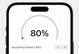
In the preview, a Stepper makes it easy to test the component across values from 0 to 1.
.trim changes what gets drawn, but it does not shrink the original circle's frame.
The article points out one layout detail that matters in real use: the hidden lower part of the circle still influences the view's frame. That means you may see extra empty space underneath the visible semicircle.
A common fix is to place the ring inside a smaller container or overlay it so the unused lower area does not affect the surrounding layout as much. This article keeps the sample simple and leaves that adjustment to the consumer of the view.
The full sample is short enough to drop into a project as-is, then tune for your own sizing, colors, and animation speed.
import Foundation
import SwiftUI

public struct HalfCircularProgressRing: View {

    private var progressPercentageToShow: Double
    @State private var currentProgressValue: Float = 0
    private let timer = Timer.publish(every: 0.01, on: .main, in: .common).autoconnect()

    static let circleTrimStartPosition: CGFloat = 0.3
    static let circleTrimEndPositon: CGFloat = 0.9
    static let colorfulGradientPattern: AngularGradient = .init(gradient: Gradient(stops: [
        .init(color: .red, location: 0.4),
        .init(color: .orange, location: 0.5),
        .init(color: .yellow, location: 0.6),
        .init(color: .green, location: 0.7),
        .init(color: .blue, location: 0.8)
    ]), center: .center)

    public init(progressPercentageToShow: Double) {
        self.progressPercentageToShow = progressPercentageToShow
    }

    public var body: some View {
        ZStack {
            Circle()
                .trim(from: Self.circleTrimStartPosition, to: Self.circleTrimEndPositon)
                .stroke(style: .init(lineWidth: 12, lineCap: .round, lineJoin: .round))
                .opacity(0.3)
                .foregroundColor(Color.gray)
                .rotationEffect(.degrees(55))

            Circle()
                .trim(
                    from: Self.circleTrimStartPosition,
                    to: Self.circleTrimStartPosition
                        + CGFloat(currentProgressValue) * (Self.circleTrimEndPositon - Self.circleTrimStartPosition)
                )
                .stroke(style: .init(lineWidth: 12, lineCap: .round, lineJoin: .round))
                .fill(Self.colorfulGradientPattern)
                .rotationEffect(.degrees(55))

            Text("\(Int(progressPercentageToShow * 100))%")
                .font(.system(size: 60))
                .bold()
        }
        .frame(width: 250, height: 250)
        .onReceive(timer) { _ in
            withAnimation {
                let convertedProgressPercentage = Float(progressPercentageToShow)
                if currentProgressValue < convertedProgressPercentage {
                    currentProgressValue = min(currentProgressValue + 0.006, convertedProgressPercentage)
                } else if currentProgressValue > convertedProgressPercentage {
                    currentProgressValue = max(currentProgressValue - 0.006, convertedProgressPercentage)
                }
            }
        }
    }
}

struct HalfCircularProgressRing_Previews: PreviewProvider {
    struct PreviewContainer: View {
        @State private var currentProgress: Double = 0.8

        var body: some View {
            VStack {
                HalfCircularProgressRing(progressPercentageToShow: currentProgress)
                Stepper("Value is \(Int(currentProgress * 100))%", value: $currentProgress, in: 0...1, step: 0.01)
                Spacer()
            }
            .padding()
        }
    }

    static var previews: some View {
        PreviewContainer()
    }
}This is a clean example of how far basic SwiftUI shapes can go before you need a custom drawing layer.
By combining Circle, .trim, rotation, gradient strokes, and a simple timer-driven state change,
the component ends up looking more custom than it really is.
If you need a quick score ring, progress indicator, or dashboard meter, this is a good starting point. The main follow-up work is usually layout tuning rather than drawing logic.