
The most important thing about this release is how much ordinary interface work stopped needing custom wrappers.
This article lists 26 additions, but the interesting pattern is bigger than the count. SwiftUI in 2022 became noticeably better at real product work: it got new view types, a more serious navigation model, direct access to platform UI like sharing and photo picking, and several utilities that used to push developers back into UIKit or AppKit.
Some examples in this article are iOS specific, while others also touch iPadOS or macOS. That mix is worth keeping. SwiftUI is a cross-platform framework, and the 2022 cycle was when Apple started making that cross-platform story feel less theoretical.
Gauge, MultiDatePicker, Table, Grid, and Charts showed that SwiftUI was starting to cover more than plain forms and lists.
The first category in this article is straightforward: Apple added more ready-made view types for common interface
patterns. Gauge gave progress UIs more structure than a plain progress bar, MultiDatePicker made
calendar-style multi-selection a system feature, and Table plus Grid pushed SwiftUI further into
information-dense layouts. The same release also introduced the Charts framework, which deserved its own deep dive.
@State private var progress = 50.0

Gauge(value: progress, in: 0...100) {
    Text("Build Progress")
} currentValueLabel: {
    Text("\(Int(progress))%")
}
.tint(.mint)
None of these APIs is especially dramatic by itself. Together they matter because they cover UI that developers repeatedly built by hand or borrowed from custom packages. A better built-in baseline is exactly what made SwiftUI more practical release by release.
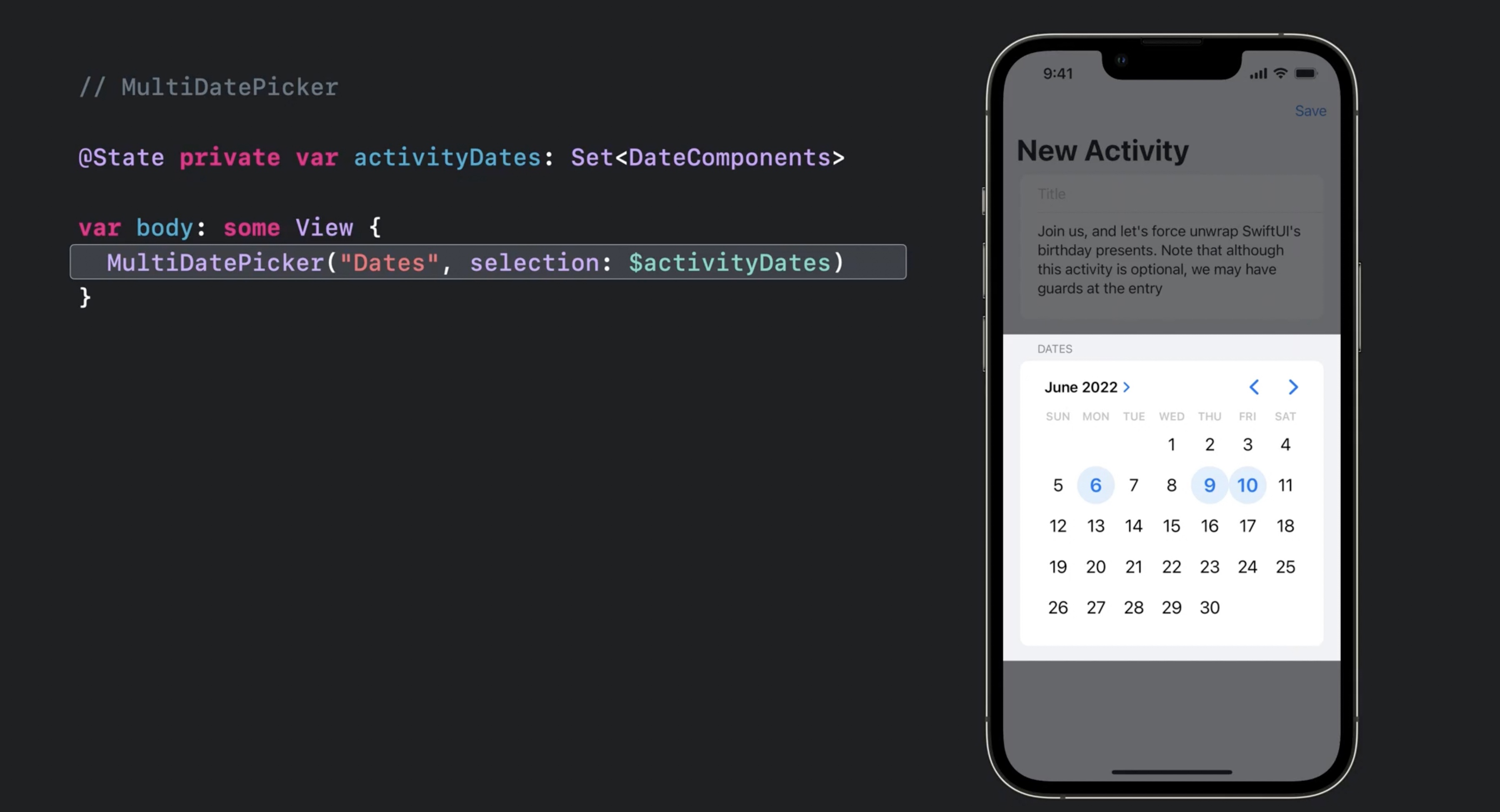
MultiDatePicker turned repeated calendar-selection UI into a native control instead of another custom component.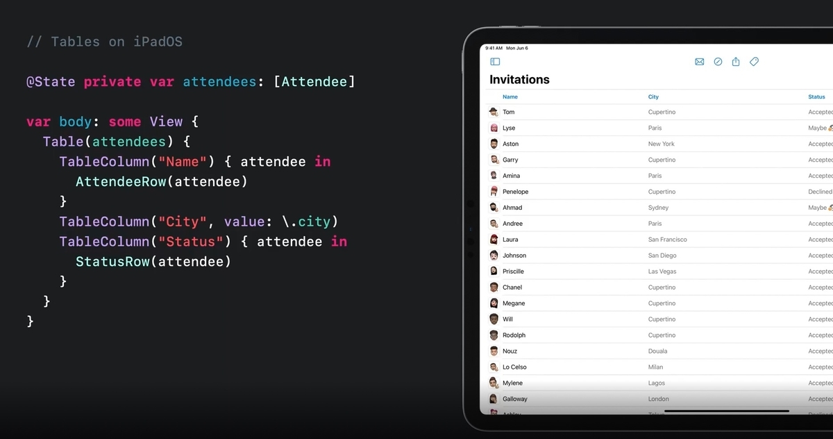
Table mattered most anywhere the app needed denser desktop-style data views instead of a single-column list.
Grid filled an obvious layout gap by making row-and-column composition more direct and less hacky.The 2022 navigation story was really about structure: a cleaner stack model, split navigation, paste support, and a more serious macOS surface.
This part of this article mixes several APIs that all point in the same direction. NavigationStack
and NavigationSplitView were the big ones because they replaced the older, more awkward mental model around
NavigationView. But the release also added smaller pieces that made SwiftUI apps feel more native, including
PasteButton for reading from the pasteboard and MenuBarExtra for lightweight menu bar apps on macOS.
@State private var path: [Item] = []

NavigationStack(path: $path) {
    List(items) { item in
        NavigationLink(value: item) {
            Text(item.title)
        }
    }
    .navigationDestination(for: Item.self) { item in
        DetailView(item: item)
    }
}
The main upgrade here was not just newer names. It was that navigation state became easier to model explicitly, which made deeper flows, split interfaces, and restoration logic less fragile than the old ad hoc patterns.

PasteButton replaced one more UIKit bridge with a direct SwiftUI control.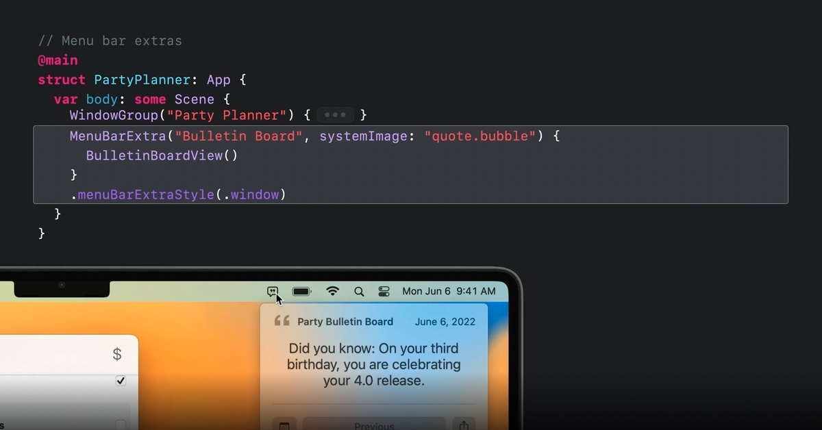
MenuBarExtra made the small, practical macOS utility app much easier to express in SwiftUI.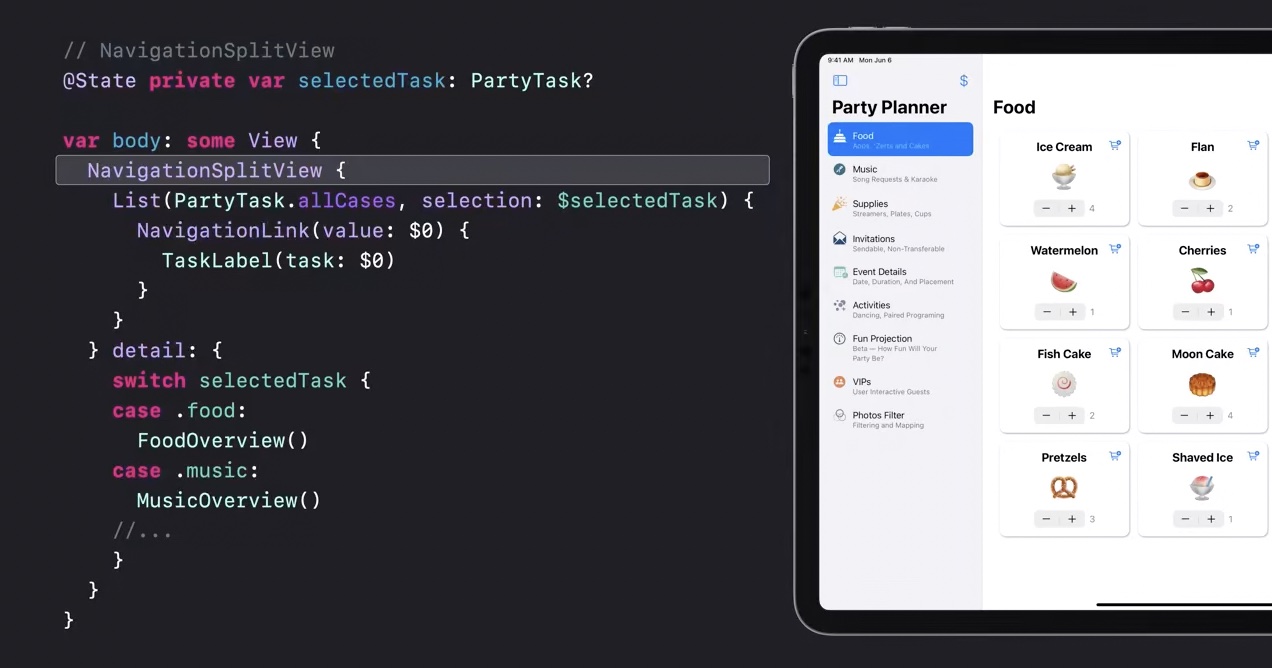
NavigationSplitView was the clearest sign that SwiftUI was finally taking multi-column app structure seriously.SwiftUI also got better where it used to lean on compatibility wrappers: sharing, photo selection, review prompts, and richer visual modifiers.
Before iOS 16, a lot of common platform UI still meant dropping back to a controller wrapper. This article highlights
how much cleaner that became. ShareLink gave sharing a native SwiftUI surface, PhotosPicker exposed
the system photo picker directly, and the review prompt could be requested from SwiftUI through an environment value instead of
a separate imperative bridge.
@State private var selectedPhoto: PhotosPickerItem?
@Environment(\.requestReview) private var requestReview

ShareLink(item: exportURL)

PhotosPicker(selection: $selectedPhoto, matching: .images) {
    Label("Choose Photo", systemImage: "photo")
}

Button("Ask For Review") {
    requestReview()
}
The same release also pushed styling forward. The article calls out gradient generation from colors plus inner and outer shadow modifiers, both of which nudged SwiftUI toward more expressive visuals without forcing every design treatment into a custom drawing layer.


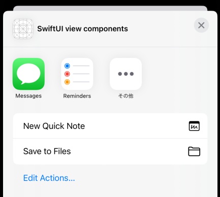
ShareLink was small on paper, but it removed a very common wrapper that many apps carried around.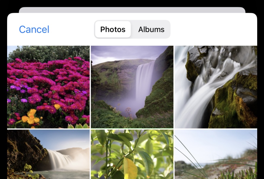
PhotosPicker was another quality-of-life win: direct access to a system picker, but in SwiftUI terms.Some of the most practical changes were not flashy. They made sheets, text input, symbols, and search feel less constrained.
This is the part of the release many product teams felt immediately. presentationDetents made bottom sheets far more useful,
multiline TextField support removed another old limitation, alert text fields closed a long-standing gap, and search scopes helped
filter results inside the built-in search model. This article also calls out new SF Symbol color variants, which improved icon expressiveness
without a custom asset pipeline.
@State private var note = ""

TextField("Write something", text: $note, axis: .vertical)
    .lineLimit(2...6)

.sheet(isPresented: $showSheet) {
    FilterView()
        .presentationDetents([.medium, .large])
}
These are exactly the kinds of features that do not make headlines but do reduce the number of "almost, but not quite" moments when trying to keep an app fully declarative.

presentationDetents made sheets more useful for real apps instead of all-or-nothing modal blocks.
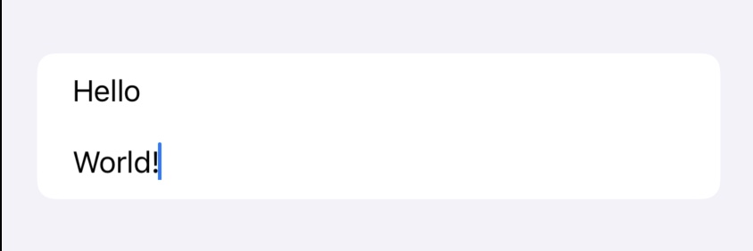
TextField support fixed an old paper cut in note-taking, chat, and form-heavy interfaces.
Image rendering, tap coordinates, focus control, keyboard dismissal, edit actions, and window management rounded out the release.
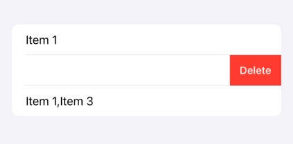
The last group in this article is a set of smaller APIs that each remove a specific annoyance. ImageRenderer
can turn a SwiftUI view into an image for export or sharing. Tap gestures can now report the touch location directly. Focus can be
assigned more cleanly with defaultFocus. Scroll views can dismiss the keyboard automatically. Lists can generate move and
delete actions against bound collections. On macOS, openWindow makes it easier to create or reveal additional windows.
@Environment(\.openWindow) private var openWindow

List($items, editActions: [.delete, .move]) { $item in
    TextField("Name", text: $item.name)
}

Button("Open Inspector") {
    openWindow(id: "inspector")
}
The article closes with a small but useful conditional-modifier pattern for availability checks. That is a good reminder of what this whole roundup represents: not one huge invention, but dozens of points where SwiftUI became easier to keep clean across OS versions.
extension View {
    @ViewBuilder
    func ifAvailableIOS16<Transformed: View>(
        _ transform: (Self) -> Transformed
    ) -> some View {
        if #available(iOS 16, macOS 13, *) {
            transform(self)
        } else {
            self
        }
    }
}
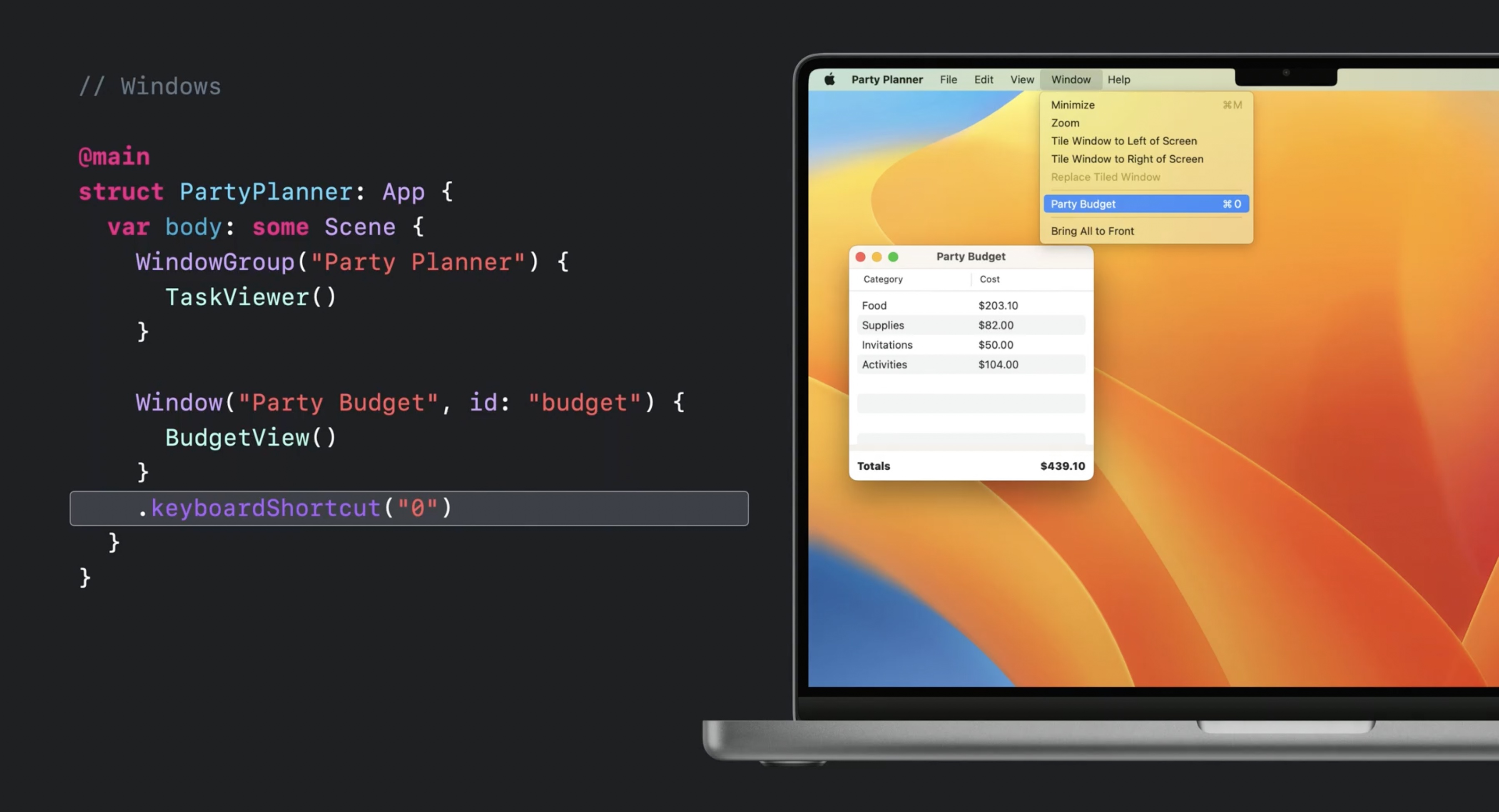
openWindow and related macOS additions helped SwiftUI grow beyond single-window demo apps.The best way to read this release is as a steady reduction in escape hatches.
Some additions were obvious headline features, like NavigationStack or Charts. Others were smaller, like
multiline text fields, photo picking, and edit actions. But the combined effect is why this roundup still matters: SwiftUI became less
dependent on hand-built bridges for everyday app work.
That is the real takeaway from the original 26-item list. WWDC 2022 did not make SwiftUI finished. It made it much easier to stay inside SwiftUI for longer.