TipKit is designed for feature discovery, not for marketing banners or generic messages.
This article is a practical introduction to TipKit as it arrived with iOS 17. The goal is straightforward: help people discover a feature at the moment it matters, instead of burying guidance in onboarding screens or help pages.
The examples stay in SwiftUI and cover the main pieces you actually need:
defining a Tip, presenting it in two different ways, controlling when it appears,
and testing the behavior repeatedly while you build.
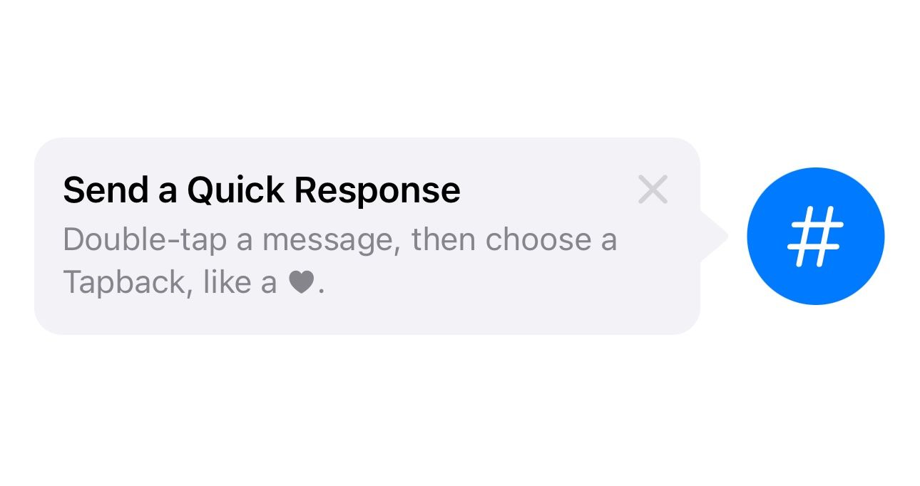
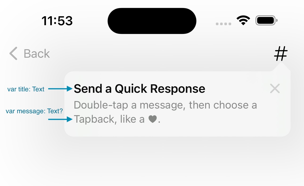
A Tip object is just a small package of content: image, title, message, and optional rules or actions.
The starting point is a type that conforms to Tip. The article uses a quick-response example,
but the structure is generic: a symbol image on the left, a title, and a short message under it.
import TipKit

struct QuickResponseTip: Tip {
    var image: Image? {
        Image(systemName: "star.bubble")
    }

    var title: Text {
        Text("Send a Quick Response")
    }

    var message: Text? {
        Text("Double-tap a message, then choose a Tapback.")
    }
}
That content object can also expose rules and actions, which is what makes TipKit more than a static callout bubble.
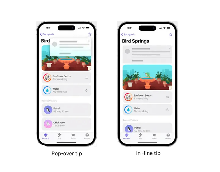
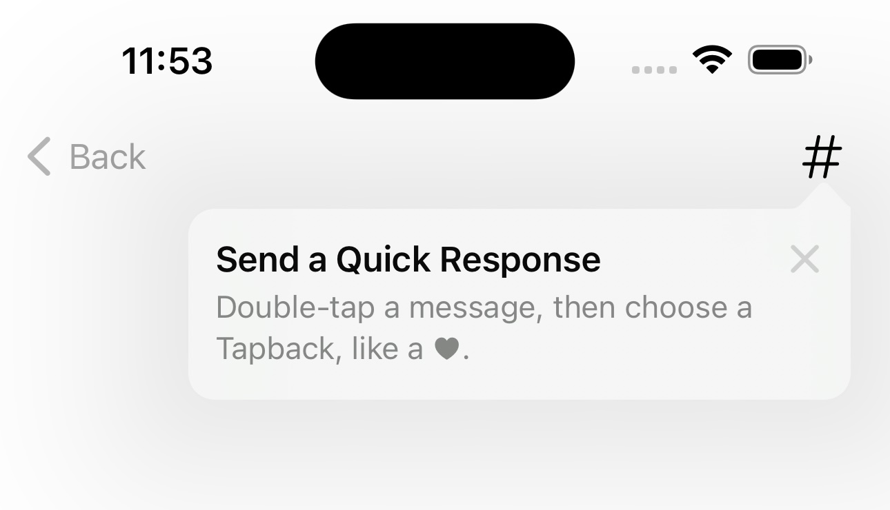
TipKit gives you two main display styles: inline tips inside the layout and floating popover tips attached to a control.
Inline tips are direct. You place TipView in the view hierarchy beside the feature you want to explain,
and optionally choose which side the arrow should point toward.
struct InlineTipExample: View {
    var body: some View {
        HStack {
            TipView(QuickResponseTip(), arrowEdge: .trailing)

            Image(systemName: "number")
                .font(.system(size: 30))
                .foregroundStyle(.white)
                .padding()
                .background { Circle().foregroundStyle(.blue) }
        }
        .task {
            try? Tips.configure([
                .displayFrequency(.immediate),
                .datastoreLocation(.applicationDefault)
            ])
        }
    }
}
Popover tips are better when the control already lives in a toolbar or navigation bar. Instead of placing a new view in the layout, you attach the tip with a modifier.
struct PopoverTipExample: View {
    let quickResponseTip = QuickResponseTip()

    var body: some View {
        Text("Hello world")
            .toolbar {
                ToolbarItem(placement: .navigationBarTrailing) {
                    Image(systemName: "number")
                        .popoverTip(quickResponseTip)
                }
            }
    }
}
If the app still supports older systems, the article suggests wrapping the modifier in a conditional helper so your view code stays readable.
extension View {
    @ViewBuilder
    func tipIfAvailable(with tip: Tip) -> some View {
        if #available(iOS 17, *) {
            self.popoverTip(tip)
        } else {
            self
        }
    }
}
TipKit tracks whether a tip has been shown, and you can tune how aggressively it should reappear.
The configuration in the examples uses .displayFrequency(.immediate), which tells the system to show the tip right away if it has not already been seen.
The article also points out that the default behavior is effectively once per tip, and that other cadences such as .hourly are available.
The same configuration call can also decide where TipKit stores its state with
.datastoreLocation(.applicationDefault).
try? Tips.configure([
    .displayFrequency(.immediate),
    .datastoreLocation(.applicationDefault)
])Tips do not need to be universal. You can gate them behind app state with TipKit parameters and rules.
One of the stronger examples in the article is a tip meant only for premium users.
A static @Parameter holds the relevant state, and a #Rule decides whether the tip is eligible to appear.
struct PremiumOnlyTip: Tip {
    @Parameter
    static var isPremiumUser: Bool = false

    var image: Image? { Image(systemName: "wand.and.rays") }
    var title: Text { Text("Add an Effect") }
    var message: Text? { Text("Choose a Live Photo effect like Loop or Bounce.") }

    var rules: [Rule] {
        #Rule(Self.$isPremiumUser) {
            $0 == true
        }
    }
}
In practice, you update PremiumOnlyTip.isPremiumUser from your app's real purchase or entitlement state.
TipKit then decides whether the tip should be shown.
You can also drive tips from recorded user activity instead of a single boolean flag.
TipKit events work well when the question is not "who is this user?" but "has this user done something often enough?" The article demonstrates an event counter that only unlocks a tip after three recorded interactions.
struct UsageBasedTip: Tip {
    static let numberOfTimesOpened = Event(id: "com.example.TipKit.numberOfTimesOpened")

    var image: Image? { Image(systemName: "star.fill") }
    var title: Text { Text("Tap to download HD picture") }
    var message: Text? { Text("Only for premium users") }

    var rules: [Rule] {
        #Rule(Self.numberOfTimesOpened) {
            $0.donations.count >= 3
        }
    }
}
When the user performs the relevant action, donate the event:
Button("Tap this button 3 times") {
    Task {
        await UsageBasedTip.numberOfTimesOpened.donate()
    }
}
After the threshold is met, the tip becomes eligible. This is a clean way to wait until the user has enough context for a hint to make sense.
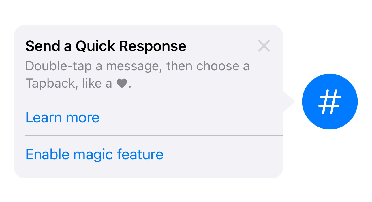
If a tip needs a next step, put that step into custom actions instead of writing a wall of instructions.
TipKit can render buttons directly inside the tip. The example in the article adds two actions: one for learning more and one for enabling a feature.
struct TipWithOptions: Tip {
    var image: Image? { Image(systemName: "star.bubble") }
    var title: Text { Text("Send a Quick Response") }
    var message: Text? { Text("Double-tap a message, then choose a Tapback.") }

    var actions: [Action] {
        [
            .init(id: "learn-more", title: "Learn more") {
                print("Learn more tapped")
            },
            .init(id: "enable-feature", title: "Enable feature") {
                print("Enable feature tapped")
            }
        ]
    }
}
TipKit keeps display state, so development goes much faster once you learn the reset and test helpers.
The article ends with the most practical part for day-to-day work: how to clear stored tip state and force specific tips to show or hide during testing.
try? Tips.resetDatastore()

Tips.showAllTipsForTesting()
Tips.showTipsForTesting([ExampleTip.self])

Tips.hideAllTipsForTesting()
Tips.hideTipsForTesting([ExampleTip.self])
One important detail from this article: call Tips.resetDatastore() before your main
Tips.configure(...) setup if you want a clean slate for the next run.
TipKit works best when tips stay short, actionable, and attached to real controls.
This article closes with a design reminder that matters more than any API detail. Do not use TipKit for promotions, generic error messages, or long setup instructions.
Good tips point at something the user can act on now. If they need an extra decision or a deeper path, use action buttons instead of stuffing the tip with paragraphs.
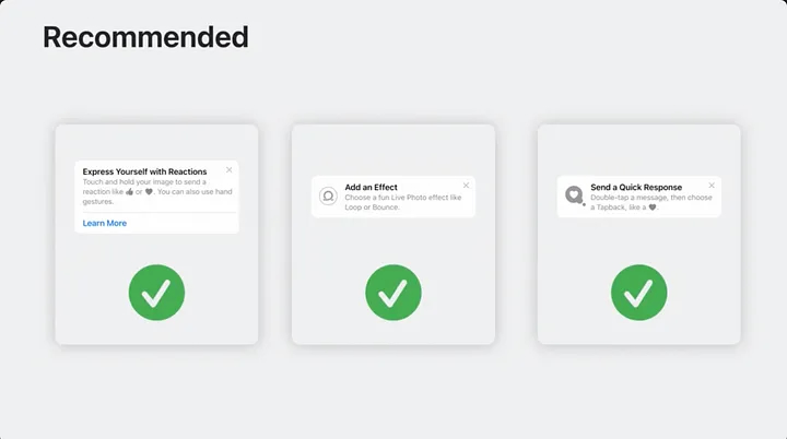
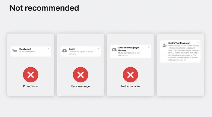
TipKit is most effective when you treat it like contextual product guidance, not a general notification system.
The article is still useful because it shows the whole lifecycle in one place: define the tip, configure presentation, add rules, record events, attach actions, and then reset everything while testing.
That is enough to build a solid first TipKit integration in a SwiftUI app without overengineering it.