Xcode's SwiftUI library is useful even before customization, because it lets you browse views and modifiers without memorizing every symbol name.
This article starts from a simple observation: Xcode already includes a library for SwiftUI elements, and that makes experimentation faster because you can search visually instead of recalling every API from memory.
The more interesting part is that the same library is not limited to Apple's built-in elements. If you are building a project with many reusable views, or shipping a Swift package that contains SwiftUI components, you can surface those custom pieces in the Xcode library as well.
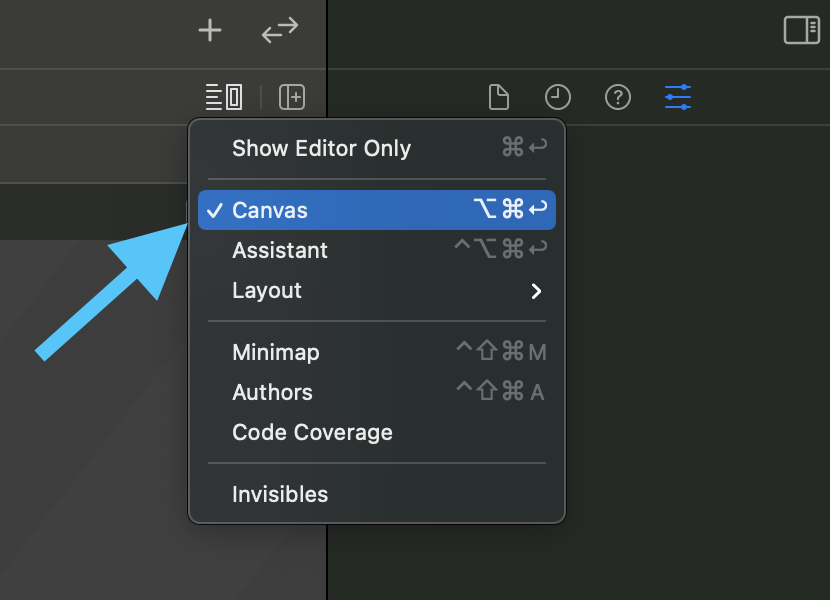
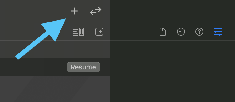
Before using the library, make sure the SwiftUI canvas is visible. Then open the element library from the plus button or with Command-Shift-L.
The article first calls out a small UI prerequisite: if the preview canvas is hidden, toggle it back on from Xcode's layout controls. That gives you the expected SwiftUI editing layout with the canvas on the right.
Once the canvas is visible, open the library from the plus icon in Xcode's toolbar, or use the keyboard shortcut
Command-Shift-L.
The built-in library is split into different tabs, with one for SwiftUI view elements and another for modifiers. Double-clicking inserts code at the current cursor position.
The post highlights the two tabs most relevant for everyday SwiftUI work. The first tab contains view elements, while the second contains modifiers. This makes the library feel less like a long flat list and more like a browsable tool palette.
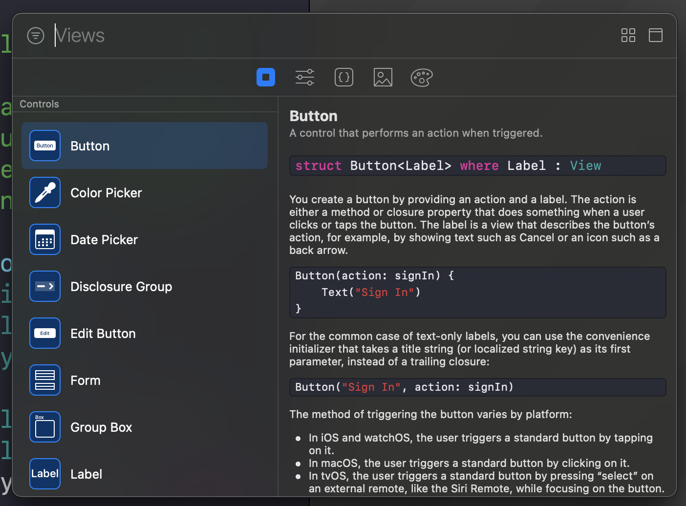
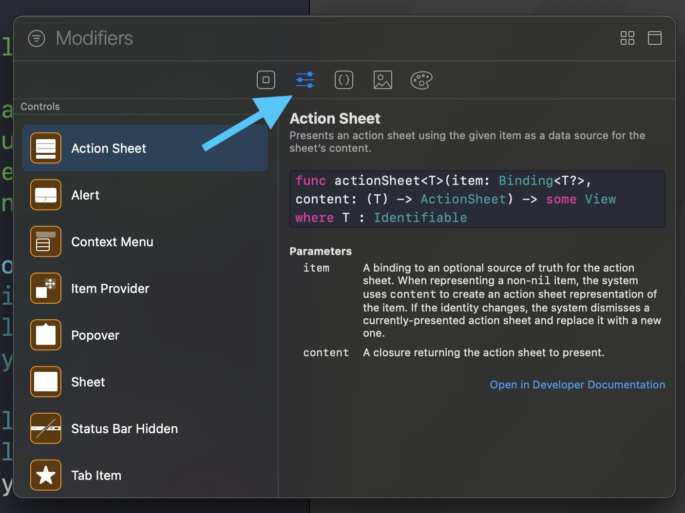
The interaction model is simple: double-click an item and Xcode inserts the corresponding code at your current cursor position.
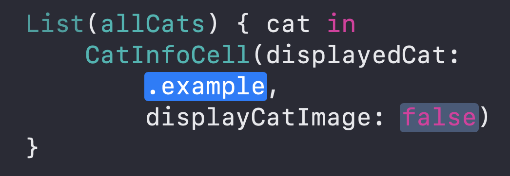
To add your own SwiftUI components to the library, create any type that conforms to LibraryContentProvider and return one or more LibraryItem values.
This article demonstrates this with a custom view named CatInfoCell. The exact struct name
for the provider does not matter. What matters is conforming to LibraryContentProvider and using
@LibraryContentBuilder to define the list of entries you want Xcode to show.
struct CatInfoLibraryContent: LibraryContentProvider {
    @LibraryContentBuilder
    var views: [LibraryItem] {
        LibraryItem(
            CatInfoCell(displayedCat: .example, displayCatImage: false),
            title: "Cat info view",
            category: .control
        )
    }
}
That is enough to make the custom view discoverable from the library, which is especially helpful if your project contains many internal building blocks that other teammates are expected to reuse.
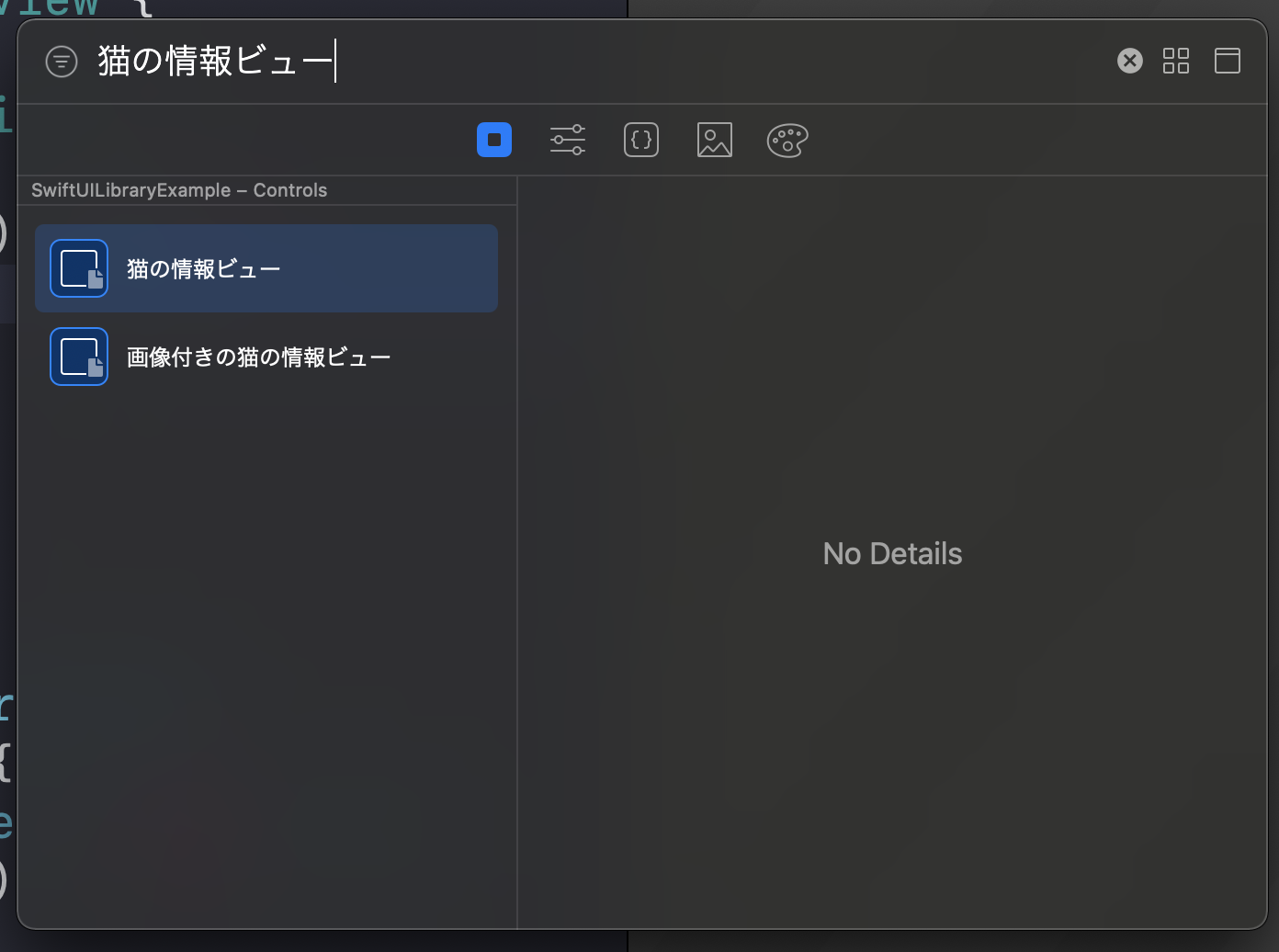
You are not limited to one entry per view type. The article shows the same component exposed multiple times with different preset configurations.
This is the most practical part of the post. Instead of only exposing a raw component, you can register several ready-made variants that reflect the configurations you actually want developers to use.
struct CatInfoLibraryContent: LibraryContentProvider {
    @LibraryContentBuilder
    var views: [LibraryItem] {
        LibraryItem(
            CatInfoCell(displayedCat: .example, displayCatImage: false),
            title: "Cat info view",
            category: .control
        )
        LibraryItem(
            CatInfoCell(displayedCat: .example, displayCatImage: true),
            title: "Cat info view with image",
            category: .control
        )
    }
}
The same provider can also expose your own modifiers, not just your own views.
The article finishes by showing a second builder that returns modifier-oriented library items. In the example,
a custom rounded-button style modifier is attached to a Text base value.
struct CatInfoLibraryContent: LibraryContentProvider {
    @LibraryContentBuilder
    var views: [LibraryItem] {
        // ...
    }

    @LibraryContentBuilder
    func modifiers(base: Text) -> [LibraryItem] {
        LibraryItem(
            base.makeRoundedButton(color: .orange)
        )
    }
}
This lets Xcode surface house-style modifiers in the same place developers already expect to browse view-building tools.
This feature matters most when your project has enough reusable SwiftUI pieces that discoverability becomes a real problem.
If a codebase only has a couple of custom components, manually typing their names may be fine. But once the number grows, adding them to the Xcode library gives the project a much better internal developer experience.
That is the real value of the article: not the mechanics alone, but the idea that reusable SwiftUI components should be made easy to find, preview, and insert.