iOS 17 did not just add new SwiftUI views. It made a lot of common app work less custom and less fragile.
This article is a broad WWDC 2023 roundup, and its value is not any one single API. The interesting part is the pattern: Apple kept moving previously custom work into higher-level system tools. Scrolling became easier to control, StoreKit got presentation views you can drop in directly, persistence became lighter with SwiftData, and view styling reached further into shader-backed rendering.
Some sections also spill outside pure SwiftUI into adjacent frameworks that matter in real apps. That is why this
rewrite keeps SensitiveContentAnalysis, MapKit, symbol effects, and a few tooling updates
in the same pass. They were part of the same development moment even if they do not all live under a single import.
Three of the most practical additions were better scroll targeting, product cards, and subscription screens you no longer had to build from scratch.
The new scroll-position APIs made it easier to jump a ScrollView to a known item without relying on the
older proxy-based pattern everywhere. The core setup is to mark the content with .scrollTargetLayout(),
then bind a position with .scrollPosition(id:).
@State private var selectedID: Int?

ScrollView(.horizontal) {
    LazyHStack {
        ForEach(0 ..< 20, id: \.self) { index in
            CardView(index: index)
                .id(index)
        }
    }
    .scrollTargetLayout()
}
.scrollPosition(id: $selectedID)
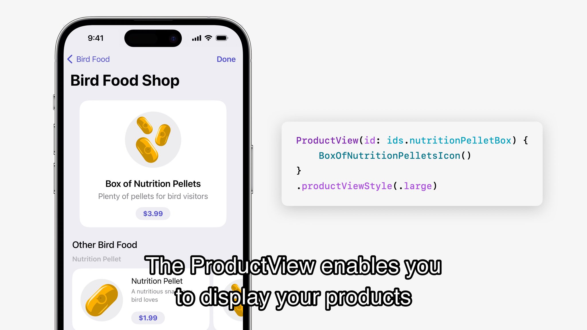
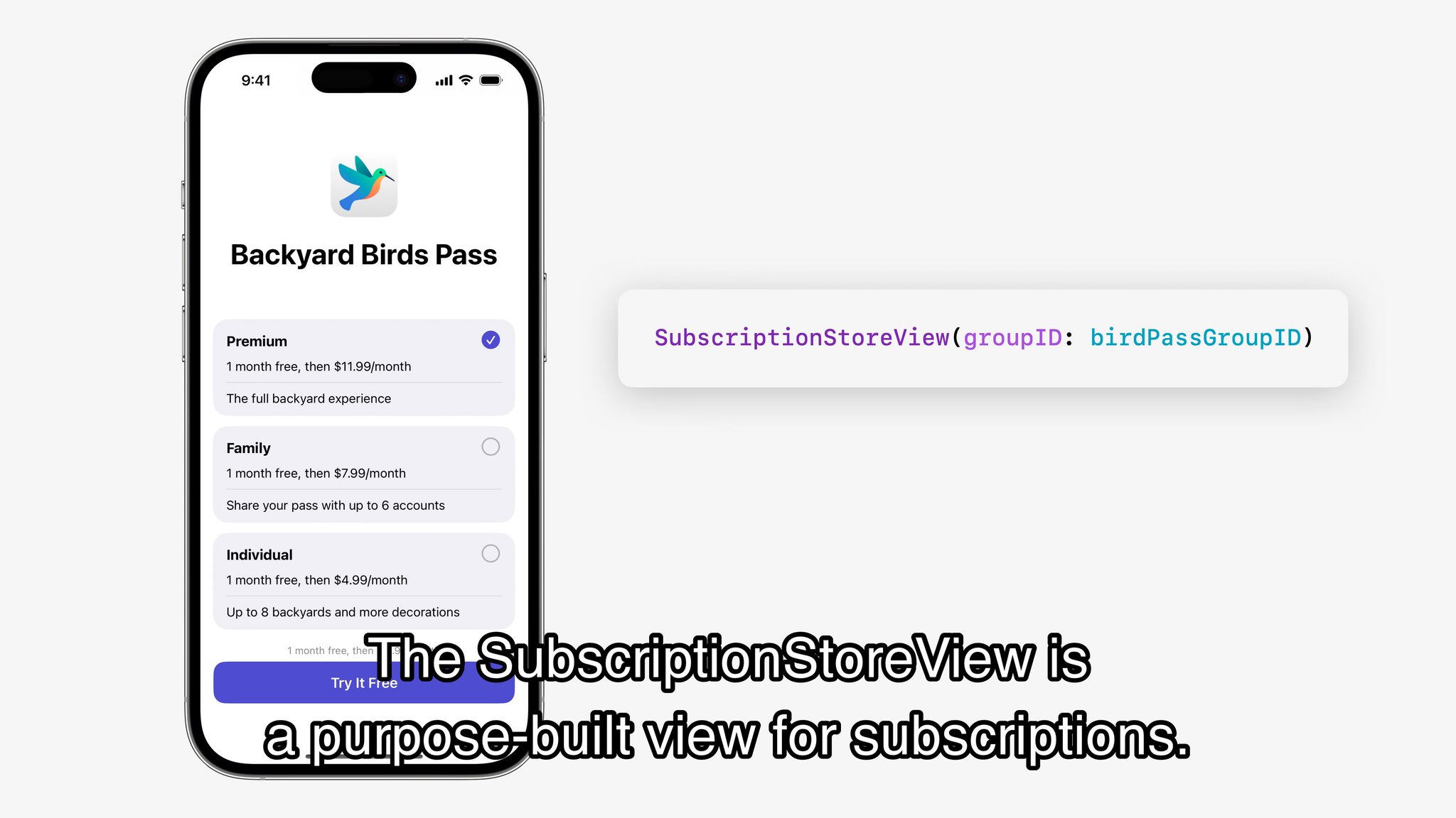
On the commerce side, Apple added presentation views that make many purchase flows dramatically less custom.
ProductView can render a single in-app purchase product, while SubscriptionStoreView
can show an entire subscription group with system-managed pricing and plan switching UI.
ProductView(id: "com.example.pro.monthly")
    .productViewStyle(.large)

SubscriptionStoreView(groupID: "598392E1")
ProductView gives you a polished product card without rebuilding the purchase UI yourself.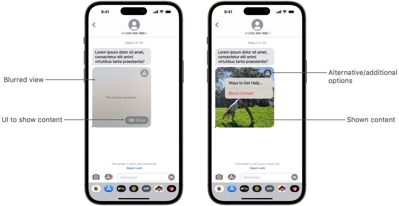
SubscriptionStoreView is the bigger win when the app needs a full subscription screen instead of a single SKU.Sensitive Content Analysis made it possible to inspect images for potentially explicit material before blindly showing them.
This part of this article steps outside SwiftUI proper, but it belongs in the same toolkit category: the system gained a
new high-level service that replaces custom guesswork. With SCSensitivityAnalyzer, you can analyze an image and
decide how aggressively the app should blur, block, or otherwise treat potentially sensitive content.
let analyzer = SCSensitivityAnalyzer()
let response = try await analyzer.analyzeImage(image)

if response.isSensitive {
    // Hide or blur before display
}
In practice this is most relevant for messaging apps, social apps, community products, and any interface that accepts images from other people. The value is not only detection, but the fact that Apple exposed a system-supported path for it.
SwiftData was the headline persistence change because it removed a lot of ceremony for simple local data models.
This article keeps the introduction short, but the main idea is clear: use @Model to declare a data type,
attach a model container near the top of the app, query with @Query, and mutate through
modelContext. That covers a large share of what smaller SwiftUI apps actually need.
@Model
final class Record {
    var timestamp: Date

    init(timestamp: Date = .now) {
        self.timestamp = timestamp
    }
}

@Query(sort: \Record.timestamp) private var records: [Record]
@Environment(\.modelContext) private var modelContext
The attraction was not raw power. It was that SwiftData finally felt shaped around SwiftUI's data flow instead of asking every app to carry a heavier Core Data setup from day one.
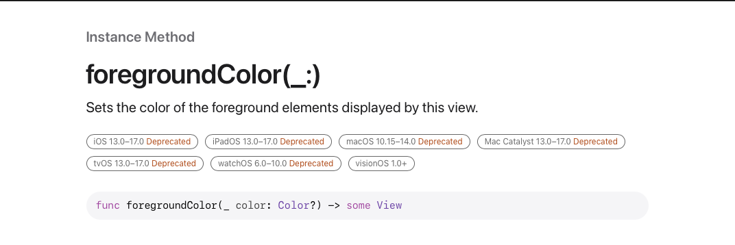
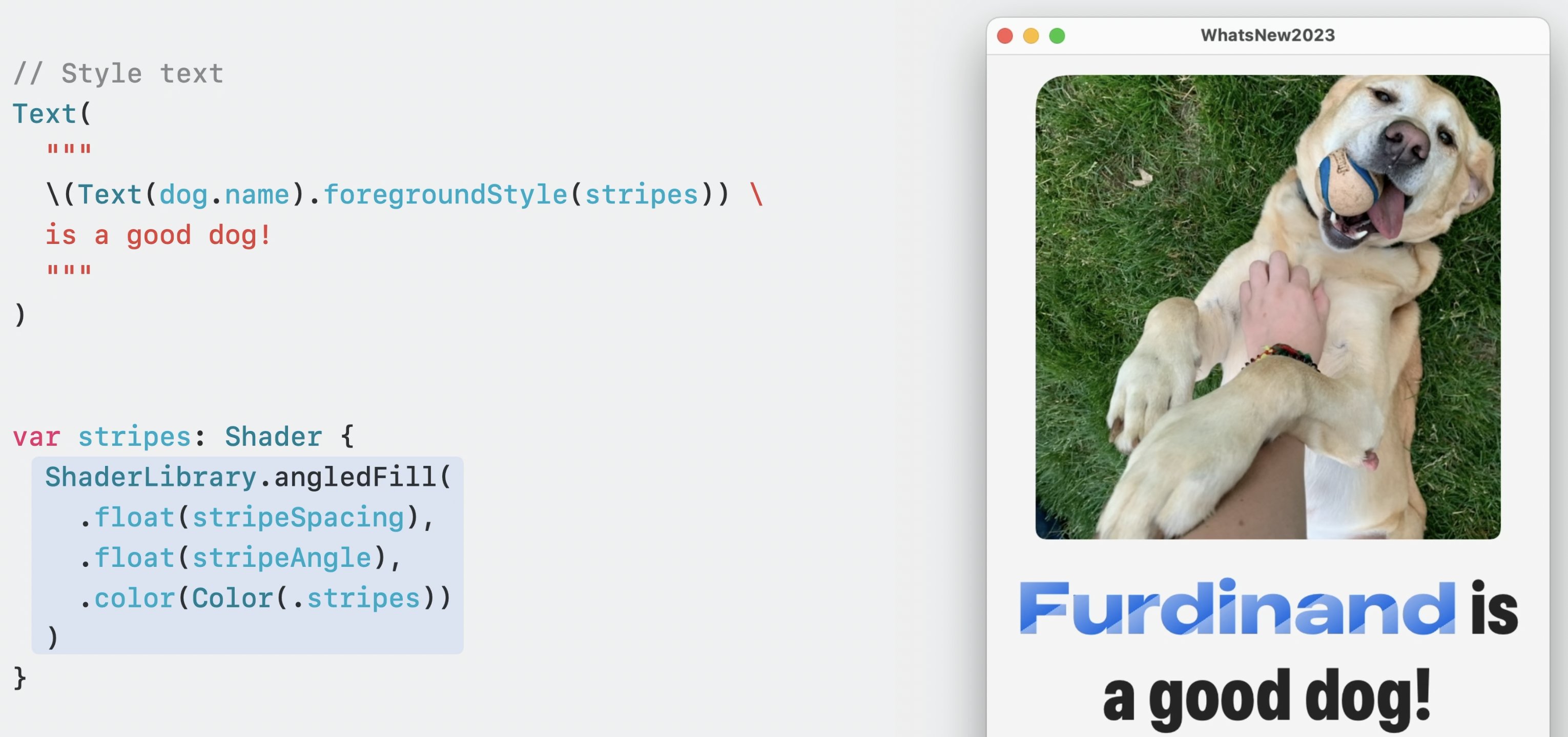
Shader-backed styling pushed SwiftUI visuals further, and it also signaled that old habits like defaulting to .foregroundColor were fading out.
One of the more surprising parts of the release was how far Apple pushed visual styling through
ShaderLibrary. A custom Metal shader could now feed directly into a view's foreground rendering, which
turned text and shape styling into something far more programmable than plain colors or gradients.
let stripes = ShaderLibrary.angledFill(
    .float(10),
    .float(90),
    .color(.blue)
)

Text("Hello")
    .font(.system(size: 44, weight: .bold))
    .foregroundStyle(stripes)
This article also calls out a migration detail developers quickly noticed during the beta cycle:
.foregroundColor was increasingly the old mental model, while .foregroundStyle became the
more flexible path for colors, gradients, materials, and now shader output.
.foregroundStyle.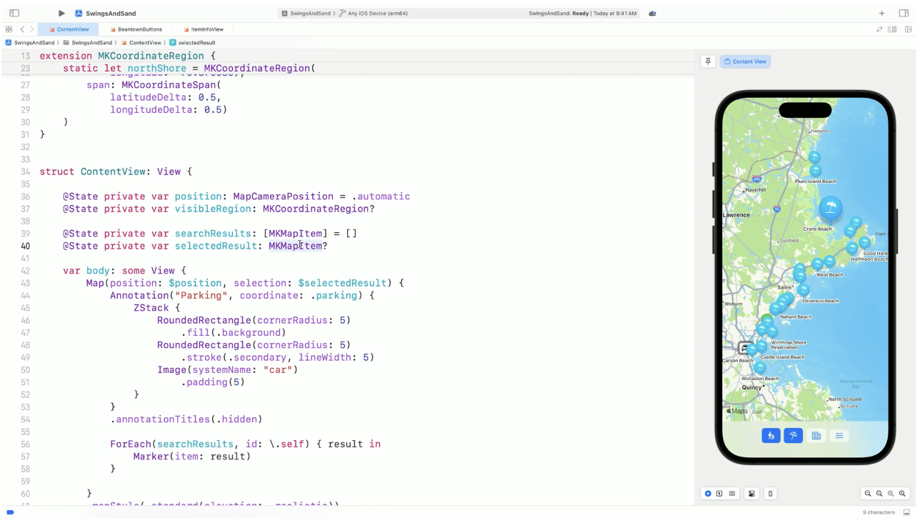
MapKit, symbol effects, and newer gestures all pushed interface polish forward in the same release.
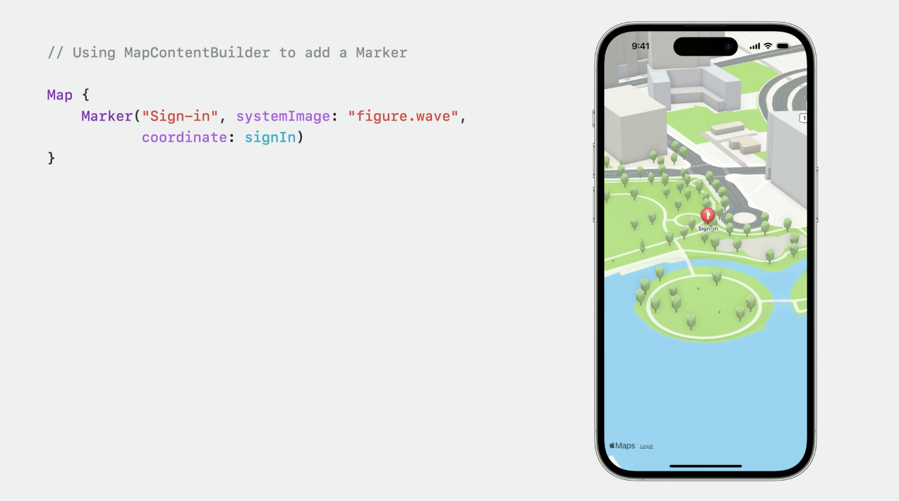
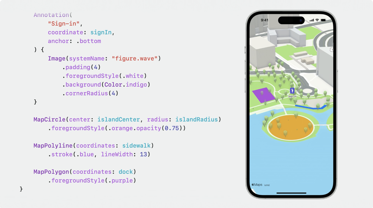
The SwiftUI map APIs became more expressive, making it easier to compose markers, overlays, and selection state directly in SwiftUI code. This article treats this as another example of Apple moving a previously more awkward integration into a simpler declarative form.
@State private var selection: MKMapItem?

Map(selection: $selection) {
    Marker("Apple Park", coordinate: .applePark)
}
On the animation side, SF Symbols gained system effects like .pulse, .bounce,
.scale, .disappear, and symbol-to-symbol replacement transitions. Paired with newer gesture handling such as
rotation gestures, this gave small interface elements much better motion language without custom animation plumbing.
Image(systemName: "wifi")
    .symbolEffect(.pulse)

Image(systemName: isPlaying ? "pause.fill" : "play.fill")
    .contentTransition(.symbolEffect(.replace.downUp))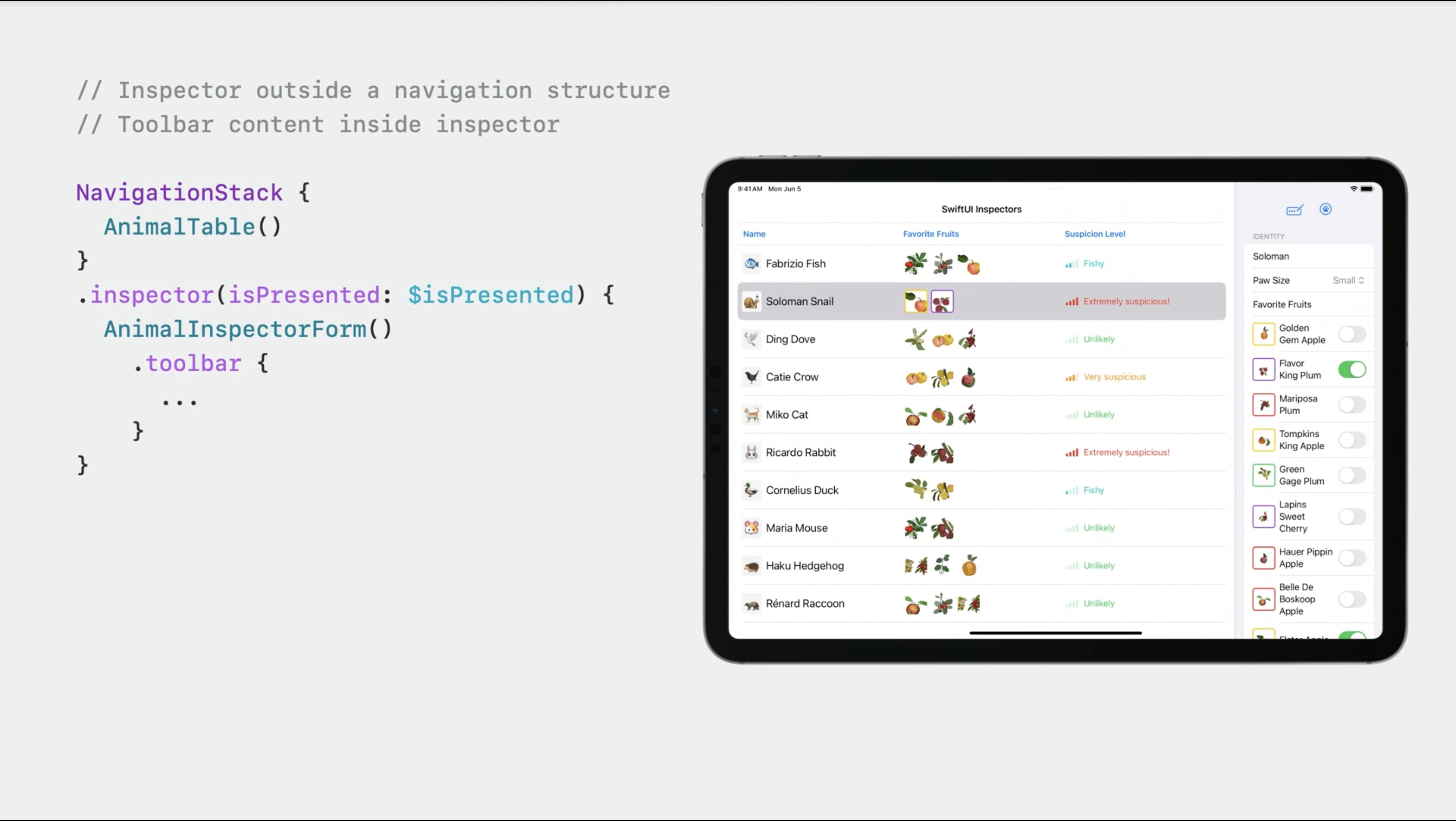
The release also improved day-to-day developer workflow with side inspectors, simpler previews, and adjacent frameworks worth learning next.
Two smaller SwiftUI conveniences from the article are worth remembering. First, inspector panes became much easier to express for right-side detail UI.
Second, #Preview made view previews cleaner than the older provider boilerplate.
@State private var inspectorPresented = false

content
    .inspector(isPresented: $inspectorPresented) {
        DetailInspector()
    }

#Preview {
    ContentView()
}
The roundup also branched into TipKit and Swift macros. Those deserve their own deep dives rather than a paragraph here, so they already live as separate articles: TipKit in SwiftUI and custom Swift macros.
The best way to read this release is not as 19 disconnected tricks, but as a steady reduction in custom boilerplate across the app stack.
Some additions were flashy, like shaders and symbol effects. Some were quietly more important, like scroll targeting, StoreKit surfaces you can actually ship, and SwiftData for smaller local data models. Together they made SwiftUI apps feel less like a framework where you constantly hit escape hatches.
That is why this WWDC 2023 roundup still holds up: it captures the moment SwiftUI became more capable not only in visuals, but in the ordinary app tasks developers repeat every week.