Category: SwiftUI

  • Adapt to physical camera control button within your own iOS app (for SwiftUI, Zoom, Exposure, & Custom Controls)

    This article talks about adapting the new physical camera button within your iOS app.
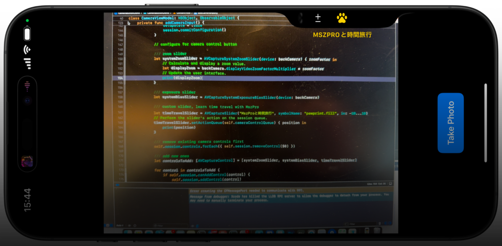
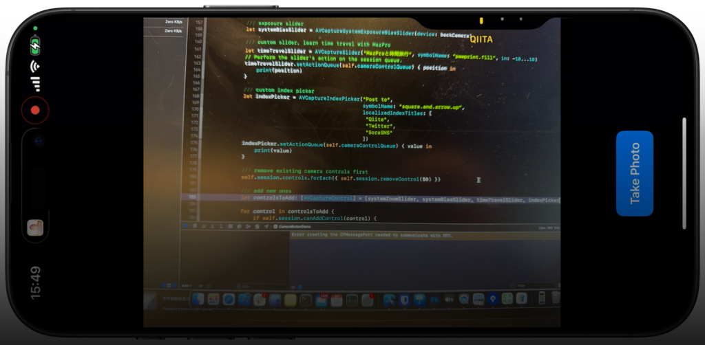
    Why?

    If you do nothing, and when the user presses the camera button within your app, it always goes to the system Camera app. However, with some minor adjustments, user can use the camera button to take pictures within your own app, and your app can provide custom controls to the camera, for example, allow the user to change the filter by swiping on the physical camera button.

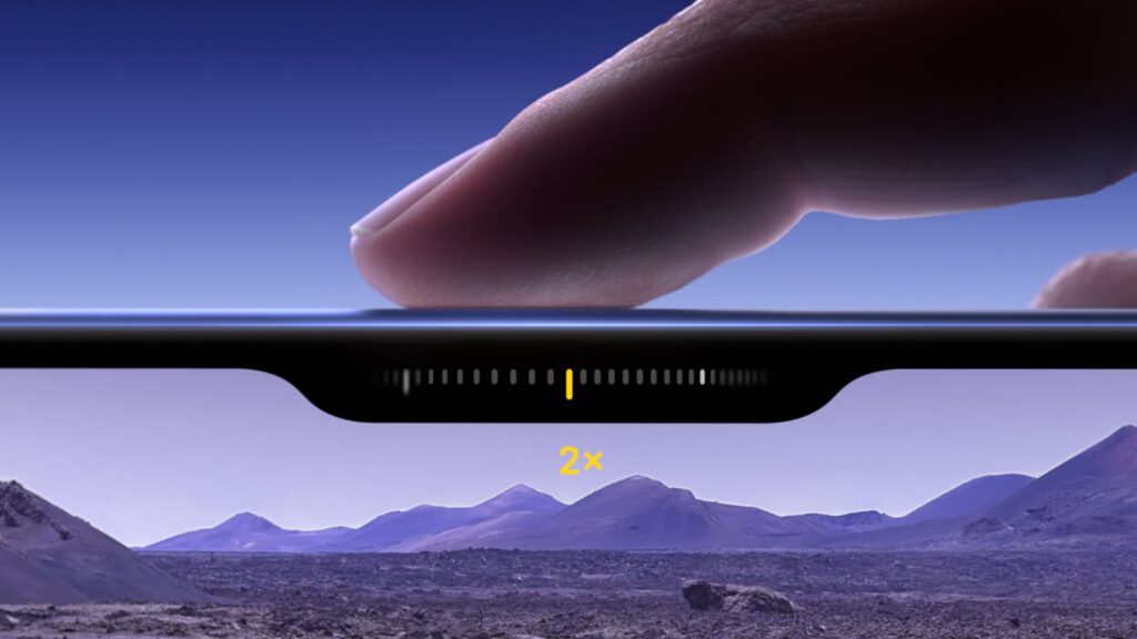
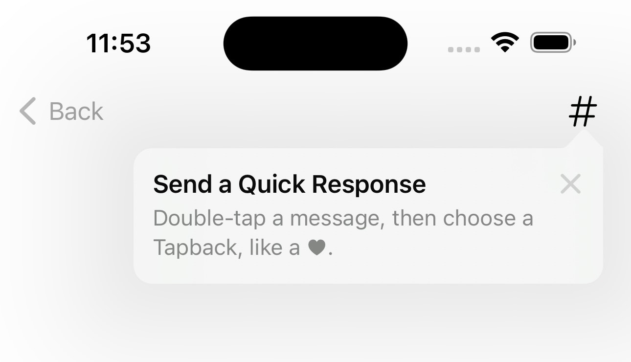
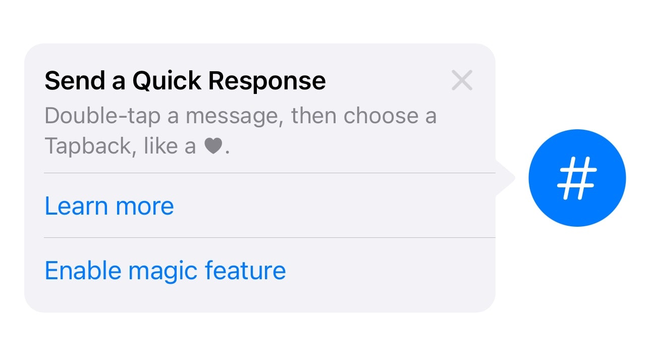
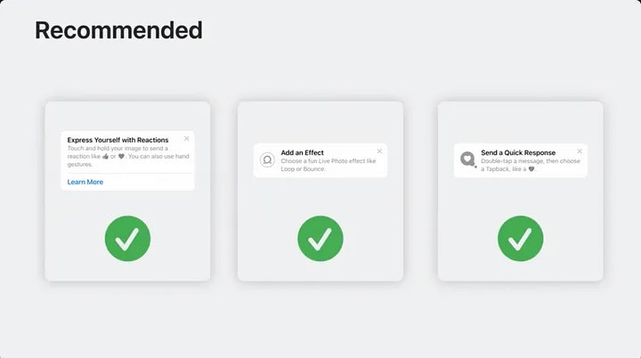
    Also, you can add cool new control options, like shown in the above 2 screenshots.

    Let’s get started!

    Starting point

    We will start from a very simple SwiftUI view that shows a camera and a capture button:

    This is the view model that manages the permission to access camera, and take actions when we need to take a picture, and receives the image and saves it to a variable.

    // MARK: - Unified Camera ViewModel
    class CameraViewModel: NSObject, ObservableObject {
        
        // Session states
        enum CameraSetupState {
            case idle
            case configured
            case permissionDenied
            case failed
        }
        
        @Published var setupState: CameraSetupState = .idle
        @Published var capturedPhoto: UIImage? = nil
        @Published var permissionGranted: Bool = false
        
        let session = AVCaptureSession()
        private let photoOutput = AVCapturePhotoOutput()
        private var videoInput: AVCaptureDeviceInput?
        
        // Dispatch queue for configuring the session
        private let configurationQueue = DispatchQueue(label: "com.example.camera.config")
        
        override init() {
            super.init()
        }
        
        deinit {
            stopSession()
        }
        
        // MARK: - Public API
        
        /// Checks camera permissions and configures session if authorized.
        func requestAccessIfNeeded() {
            let authStatus = AVCaptureDevice.authorizationStatus(for: .video)
            switch authStatus {
                case .authorized:
                    permissionGranted = true
                    configureSessionIfIdle()
                case .notDetermined:
                    AVCaptureDevice.requestAccess(for: .video) { [weak self] granted in
                        guard let self = self else { return }
                        DispatchQueue.main.async {
                            if granted {
                                self.permissionGranted = true
                                self.configureSessionIfIdle()
                            } else {
                                self.setupState = .permissionDenied
                            }
                        }
                    }
                default:
                    // Denied or Restricted
                    setupState = .permissionDenied
            }
        }
        
        /// Initiate photo capture.
        func capturePhoto() {
            guard setupState == .configured else { return }
            let settings = AVCapturePhotoSettings()
            photoOutput.capturePhoto(with: settings, delegate: self)
        }
        
        // MARK: - Session Configuration
        
        private func configureSessionIfIdle() {
            configurationQueue.async { [weak self] in
                guard let self = self, self.setupState == .idle else { return }
                
                self.session.beginConfiguration()
                self.session.sessionPreset = .photo
                
                self.addCameraInput()
                self.addPhotoOutput()
                
                self.session.commitConfiguration()
                self.startSessionIfReady()
            }
        }
        
        private func addCameraInput() {
            do {
                guard let backCamera = AVCaptureDevice.default(.builtInWideAngleCamera,
                                                               for: .video,
                                                               position: .back) else {
                    print("CameraViewModel: Back camera is unavailable.")
                    setupState = .idle
                    session.commitConfiguration()
                    return
                }
                
                let cameraInput = try AVCaptureDeviceInput(device: backCamera)
                if session.canAddInput(cameraInput) {
                    session.addInput(cameraInput)
                    videoInput = cameraInput
                    DispatchQueue.main.async {
                        self.setupState = .configured
                    }
                } else {
                    print("CameraViewModel: Unable to add camera input to session.")
                    setupState = .idle
                    session.commitConfiguration()
                }
            } catch {
                print("CameraViewModel: Error creating camera input - \(error)")
                setupState = .failed
                session.commitConfiguration()
            }
        }
        
        private func addPhotoOutput() {
            guard session.canAddOutput(photoOutput) else {
                print("CameraViewModel: Cannot add photo output.")
                setupState = .failed
                session.commitConfiguration()
                return
            }
            session.addOutput(photoOutput)
            photoOutput.maxPhotoQualityPrioritization = .quality
            DispatchQueue.main.async {
                self.setupState = .configured
            }
        }
        
        private func startSessionIfReady() {
            guard setupState == .configured else { return }
            session.startRunning()
        }
        
        private func stopSession() {
            configurationQueue.async { [weak self] in
                guard let self = self else { return }
                if self.session.isRunning {
                    self.session.stopRunning()
                }
            }
        }
    }
    
    // MARK: - AVCapturePhotoCaptureDelegate
    extension CameraViewModel: AVCapturePhotoCaptureDelegate {
        func photoOutput(_ output: AVCapturePhotoOutput,
                         didFinishProcessingPhoto photo: AVCapturePhoto,
                         error: Error?) {
            
            guard error == nil else {
                print("CameraViewModel: Error capturing photo - \(error!)")
                return
            }
            guard let photoData = photo.fileDataRepresentation() else {
                print("CameraViewModel: No photo data found.")
                return
            }
            self.capturedPhoto = UIImage(data: photoData)
        }
    }

    This is our UIKit compatible view so we can show the camera preview layer within SwiftUI:

    // MARK: - SwiftUI Representable for Camera Preview
    struct CameraLayerView: UIViewRepresentable {
        
        let cameraSession: AVCaptureSession
        
        func makeUIView(context: Context) -> CameraContainerView {
            let container = CameraContainerView()
            container.backgroundColor = .black
            container.previewLayer.session = cameraSession
            container.previewLayer.videoGravity = .resizeAspect
            return container
        }
        
        func updateUIView(_ uiView: CameraContainerView, context: Context) {
            // No dynamic updates needed
        }
        
        // A UIView subclass that hosts an AVCaptureVideoPreviewLayer
        class CameraContainerView: UIView {
            
            override class var layerClass: AnyClass {
                AVCaptureVideoPreviewLayer.self
            }
            
            var previewLayer: AVCaptureVideoPreviewLayer {
                guard let layer = self.layer as? AVCaptureVideoPreviewLayer else {
                    fatalError("CameraContainerView: Failed casting layer to AVCaptureVideoPreviewLayer.")
                }
                return layer
            }
        }
    }

    And this is our main SwiftUI view:

    // MARK: - SwiftUI Main View
    struct ContentView: View {
        
        @ObservedObject var viewModel = CameraViewModel()
        
        var body: some View {
            GeometryReader { _ in
                ZStack(alignment: .bottom) {
                    CameraLayerView(cameraSession: viewModel.session)
                        .onAppear {
                            viewModel.requestAccessIfNeeded()
                        }
                        .edgesIgnoringSafeArea(.all)
                    
                    // Capture button
                    VStack {
                        Spacer()
                        
                        Button {
                            viewModel.capturePhoto()
                        } label: {
                            Text("Take Photo")
                                .font(.headline)
                                .foregroundColor(.white)
                                .padding()
                                .background(Color.blue)
                                .cornerRadius(10)
                        }
                        .padding(.bottom, 20)
                    }
                    
                    // Thumbnail of the captured photo
                    if let image = viewModel.capturedPhoto {
                        Image(uiImage: image)
                            .resizable()
                            .aspectRatio(contentMode: .fit)
                            .frame(width: 120, height: 90)
                            .padding(.bottom, 80)
                    }
                }
            }
        }
    }
    
    // MARK: - SwiftUI Preview
    #Preview {
        ContentView()
    }
    

    Capture picture when pressing camera button
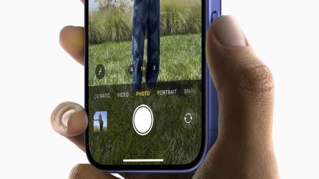
    As we talked about, if your app does not adapt this, when the user presses on the camera button, it will jump to the camera app.

    To allow your app to handle the take picture action, simply import the AVKit framework and add a view modifier onCameraCaptureEvent() view modifier to your camera preview layer CameraLayerView:

    CameraLayerView(cameraSession: viewModel.session)
        .onAppear {
            viewModel.requestAccessIfNeeded()
        }
        .edgesIgnoringSafeArea(.all)
        .onCameraCaptureEvent() { event in
            if event.phase == .began {
                self.viewModel.capturePhoto()
            }
        }

    Now, whenever the user presses the camera button on the side, it will call the code block you provided, which you can call the capture photo function within your view model.

    Checking support

    You can check if the user’s device has support for camera button by checking the supportsControls parameter within your camera session AVCaptureSession:

    In our provided starting point code, you can call it like this

    struct ContentView: View {
        
        @ObservedObject var viewModel = CameraViewModel()
        
        var body: some View {
            GeometryReader { _ in
                // ... //
            }
            .task {
                let supportsCameraButton = self.viewModel.session.supportsControls
                
            }
        }
    }

    Add zoom control

    We can easily add a control for the zoom level. What’s great is that iOS system handles the zoom automatically, and your app get notified the zoom level to be shown in your own UI:
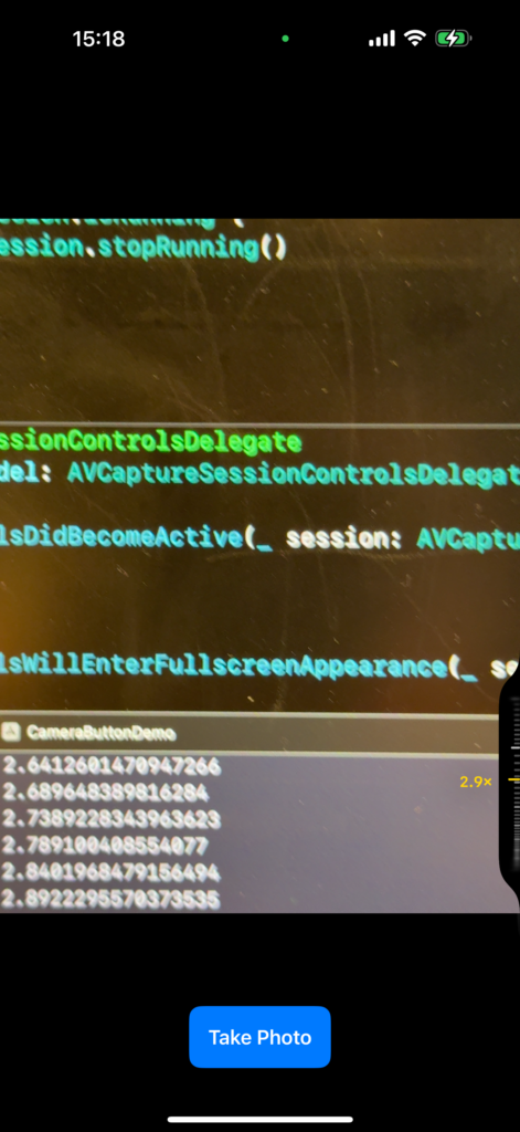
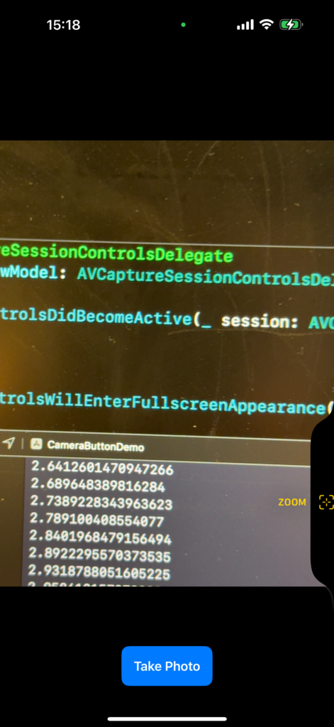
    To get started, first, set a camera control delegate to your camera session:

    self.session.setControlsDelegate(self, queue: self.cameraControlQueue)

    Now, conform your class to AVCaptureSessionControlsDelegate and add the required functions.

    // MARK: - AVCaptureSessionControlsDelegate
    extension CameraViewModel: AVCaptureSessionControlsDelegate {
        
        func sessionControlsDidBecomeActive(_ session: AVCaptureSession) {
            return
        }
        
        func sessionControlsWillEnterFullscreenAppearance(_ session: AVCaptureSession) {
            return
        }
        
        func sessionControlsWillExitFullscreenAppearance(_ session: AVCaptureSession) {
            return
        }
        
        func sessionControlsDidBecomeInactive(_ session: AVCaptureSession) {
            return
        }
        
    }

    Even if you do nothing in the above functions, you have to implement the delegate in order to use the camera control features.

    Now, we will initialize the system zoom control:

    let systemZoomSlider = AVCaptureSystemZoomSlider(device: backCamera) { zoomFactor in
        // Calculate and display a zoom value.
        let displayZoom = backCamera.displayVideoZoomFactorMultiplier * zoomFactor
        // Update the user interface.
        print(displayZoom)
    }

    Here, we provide the camera device as the input. Within the code block, the system will run our code whenever the zoom level changes.

    We will then remove all existing controls of the camera, and add the system zoom slider:

    /// remove existing camera controls first
    self.session.controls.forEach({ self.session.removeControl($0) })
    
    /// add new ones
    let controlsToAdd: [AVCaptureControl] = [systemZoomSlider]
    
    for control in controlsToAdd {
        if self.session.canAddControl(control) {
            self.session.addControl(control)
        }
    }

    Here is my updated CameraViewModel

    // MARK: - Unified Camera ViewModel
    class CameraViewModel: NSObject, ObservableObject {
        
        // Session states
        enum CameraSetupState {
            case idle
            case configured
            case permissionDenied
            case failed
        }
        
        @Published var setupState: CameraSetupState = .idle
        @Published var capturedPhoto: UIImage? = nil
        @Published var permissionGranted: Bool = false
        
        let session = AVCaptureSession()
        private let photoOutput = AVCapturePhotoOutput()
        private var videoInput: AVCaptureDeviceInput?
        
        // Dispatch queue for configuring the session
        private let configurationQueue = DispatchQueue(label: "com.example.camera.config")
        private let cameraControlQueue = DispatchQueue(label: "com.example.camera.control")
        
        override init() {
            super.init()
        }
        
        deinit {
            stopSession()
        }
        
        // MARK: - Public API
        
        /// Checks camera permissions and configures session if authorized.
        func requestAccessIfNeeded() { ... }
        
        /// Initiate photo capture.
        func capturePhoto() { ... }
        
        // MARK: - Session Configuration
        
        private func configureSessionIfIdle() { ... }
        
        private func addCameraInput() {
            do {
                guard let backCamera = AVCaptureDevice.default(.builtInWideAngleCamera,
                                                               for: .video,
                                                               position: .back) else {
                    print("CameraViewModel: Back camera is unavailable.")
                    setupState = .idle
                    session.commitConfiguration()
                    return
                }
                
                let cameraInput = try AVCaptureDeviceInput(device: backCamera)
                if session.canAddInput(cameraInput) {
                    session.addInput(cameraInput)
                    videoInput = cameraInput
                    DispatchQueue.main.async {
                        self.setupState = .configured
                    }
                } else {
                    print("CameraViewModel: Unable to add camera input to session.")
                    setupState = .idle
                    session.commitConfiguration()
                }
                
                // configure for camera control button
                let systemZoomSlider = AVCaptureSystemZoomSlider(device: backCamera) { zoomFactor in
                    // Calculate and display a zoom value.
                    let displayZoom = backCamera.displayVideoZoomFactorMultiplier * zoomFactor
                    // Update the user interface.
                    print(displayZoom)
                }
                
                /// remove existing camera controls first
                self.session.controls.forEach({ self.session.removeControl($0) })
                
                /// add new ones
                let controlsToAdd: [AVCaptureControl] = [systemZoomSlider]
                
                for control in controlsToAdd {
                    if self.session.canAddControl(control) {
                        self.session.addControl(control)
                    }
                }
                
                /// set delegate
                self.session.setControlsDelegate(self, queue: self.cameraControlQueue)
                //
            } catch {
                print("CameraViewModel: Error creating camera input - \(error)")
                setupState = .failed
                session.commitConfiguration()
            }
        }
        
        private func addPhotoOutput() { ... }
        
        private func startSessionIfReady() { ... }
        
        private func stopSession() { ... }
    }
    
    // MARK: - AVCaptureSessionControlsDelegate
    extension CameraViewModel: AVCaptureSessionControlsDelegate {
        
        func sessionControlsDidBecomeActive(_ session: AVCaptureSession) {
            return
        }
        
        func sessionControlsWillEnterFullscreenAppearance(_ session: AVCaptureSession) {
            return
        }
        
        func sessionControlsWillExitFullscreenAppearance(_ session: AVCaptureSession) {
            return
        }
        
        func sessionControlsDidBecomeInactive(_ session: AVCaptureSession) {
            return
        }
        
    }

    Notice that I have added a cameraControlQueue, set the delegate, and set the system zoom slider within my addCameraInput function.

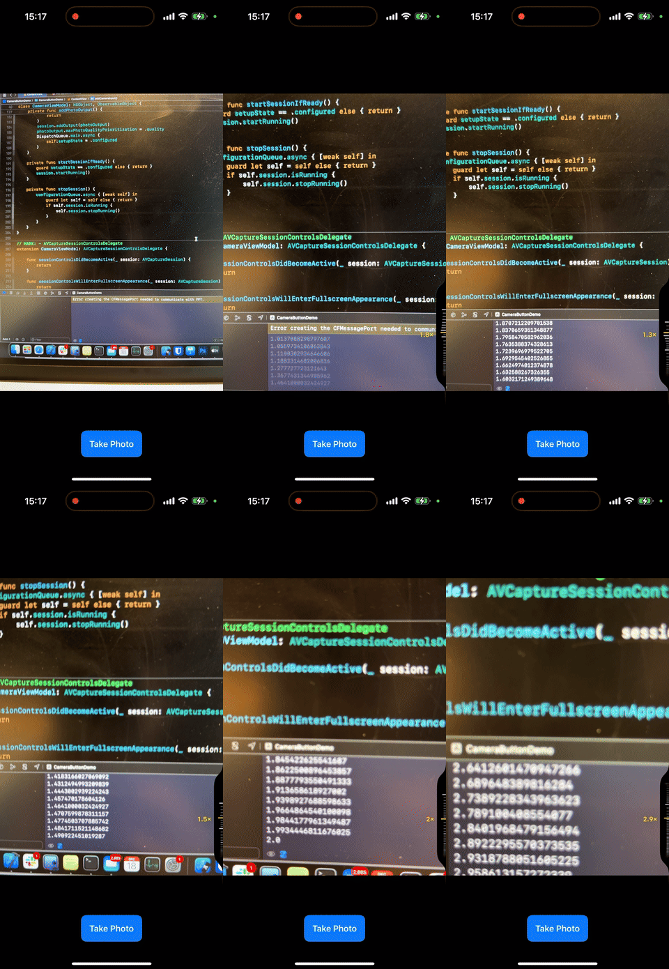
    Now, if you run your program on your iPhone, you will notice that you can use the zoom slider within your own app:
    Add exposure control

    You can easily add control for exposure by adding one more camera control to the array:

    // configure for camera control button
    let systemZoomSlider = AVCaptureSystemZoomSlider(device: backCamera) { zoomFactor in
        // Calculate and display a zoom value.
        let displayZoom = backCamera.displayVideoZoomFactorMultiplier * zoomFactor
        // Update the user interface.
        print(displayZoom)
    }
    
    let systemBiasSlider = AVCaptureSystemExposureBiasSlider(device: backCamera)
    
    /// remove existing camera controls first
    self.session.controls.forEach({ self.session.removeControl($0) })
    
    /// add new ones
    let controlsToAdd: [AVCaptureControl] = [systemZoomSlider, systemBiasSlider]
    
    for control in controlsToAdd {
        if self.session.canAddControl(control) {
            self.session.addControl(control)
        }
    }

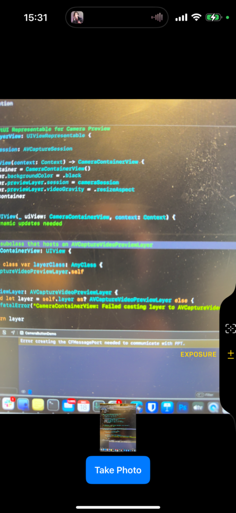
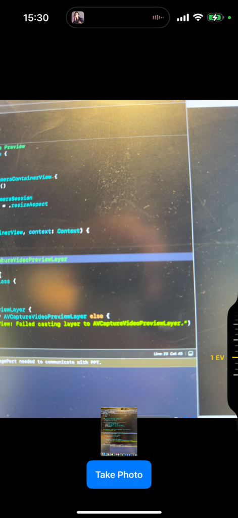
    Now, when you launch the app and quickly double tap (not press) on the camera button, you will see 2 options, and you can switch to the exposure control (which is a slider provided by the system)
    Add custom slider

    You can initialize a custom slider, and use setActionQueue to get notified when the value changes.

    Here is a little joke where you control the time (4th dimension( with my camera app (fancy right?)

    let timeTravelSlider = AVCaptureSlider("MszProと時間旅行", symbolName: "pawprint.fill", in: -10...10)
    // Perform the slider's action on the session queue.
    timeTravelSlider.setActionQueue(self.cameraControlQueue) { position in
        print(position)
    }

    Add custom picker

    You can also allow the user to pick one of the many given options (for example, a list of filters)

    let indexPicker = AVCaptureIndexPicker("Post to",
                                           symbolName: "square.and.arrow.up",
                                           localizedIndexTitles: [
                                            "Qiita",
                                            "Twitter",
                                            "SoraSNS"
                                           ])
    indexPicker.setActionQueue(self.cameraControlQueue) { value in
        print(value)
    }

    Notice, the value you get within the function is an index number.

    That is how you do it!

    Did you learn how to add custom camera control options within your own app? Here is the complete code:

    import SwiftUI
    import AVFoundation
    import Combine
    import AVKit
    
    // MARK: - SwiftUI Representable for Camera Preview
    struct CameraLayerView: UIViewRepresentable {
        
        let cameraSession: AVCaptureSession
        
        func makeUIView(context: Context) -> CameraContainerView {
            let container = CameraContainerView()
            container.backgroundColor = .black
            container.previewLayer.session = cameraSession
            container.previewLayer.videoGravity = .resizeAspect
            return container
        }
        
        func updateUIView(_ uiView: CameraContainerView, context: Context) {
            // No dynamic updates needed
        }
        
        // A UIView subclass that hosts an AVCaptureVideoPreviewLayer
        class CameraContainerView: UIView {
            
            override class var layerClass: AnyClass {
                AVCaptureVideoPreviewLayer.self
            }
            
            var previewLayer: AVCaptureVideoPreviewLayer {
                guard let layer = self.layer as? AVCaptureVideoPreviewLayer else {
                    fatalError("CameraContainerView: Failed casting layer to AVCaptureVideoPreviewLayer.")
                }
                return layer
            }
        }
    }
    
    // MARK: - Unified Camera ViewModel
    class CameraViewModel: NSObject, ObservableObject {
        
        // Session states
        enum CameraSetupState {
            case idle
            case configured
            case permissionDenied
            case failed
        }
        
        @Published var setupState: CameraSetupState = .idle
        @Published var capturedPhoto: UIImage? = nil
        @Published var permissionGranted: Bool = false
        
        let session = AVCaptureSession()
        private let photoOutput = AVCapturePhotoOutput()
        private var videoInput: AVCaptureDeviceInput?
        
        // Dispatch queue for configuring the session
        private let configurationQueue = DispatchQueue(label: "com.example.camera.config")
        private let cameraControlQueue = DispatchQueue(label: "com.example.camera.control")
        
        override init() {
            super.init()
        }
        
        deinit {
            stopSession()
        }
        
        // MARK: - Public API
        
        /// Checks camera permissions and configures session if authorized.
        func requestAccessIfNeeded() {
            let authStatus = AVCaptureDevice.authorizationStatus(for: .video)
            switch authStatus {
                case .authorized:
                    permissionGranted = true
                    configureSessionIfIdle()
                case .notDetermined:
                    AVCaptureDevice.requestAccess(for: .video) { [weak self] granted in
                        guard let self = self else { return }
                        DispatchQueue.main.async {
                            if granted {
                                self.permissionGranted = true
                                self.configureSessionIfIdle()
                            } else {
                                self.setupState = .permissionDenied
                            }
                        }
                    }
                default:
                    // Denied or Restricted
                    setupState = .permissionDenied
            }
        }
        
        /// Initiate photo capture.
        func capturePhoto() {
            guard setupState == .configured else { return }
            let settings = AVCapturePhotoSettings()
            photoOutput.capturePhoto(with: settings, delegate: self)
        }
        
        // MARK: - Session Configuration
        
        private func configureSessionIfIdle() {
            configurationQueue.async { [weak self] in
                guard let self = self, self.setupState == .idle else { return }
                
                self.session.beginConfiguration()
                
                self.session.sessionPreset = .photo
                
                self.addCameraInput()
                self.addPhotoOutput()
                
                // save configuration and start camera session
                self.session.commitConfiguration()
                self.startSessionIfReady()
            }
        }
        
        private func addCameraInput() {
            do {
                guard let backCamera = AVCaptureDevice.default(.builtInWideAngleCamera,
                                                               for: .video,
                                                               position: .back) else {
                    print("CameraViewModel: Back camera is unavailable.")
                    setupState = .idle
                    session.commitConfiguration()
                    return
                }
                
                let cameraInput = try AVCaptureDeviceInput(device: backCamera)
                if session.canAddInput(cameraInput) {
                    session.addInput(cameraInput)
                    videoInput = cameraInput
                    DispatchQueue.main.async {
                        self.setupState = .configured
                    }
                } else {
                    print("CameraViewModel: Unable to add camera input to session.")
                    setupState = .idle
                    session.commitConfiguration()
                }
                
                // configure for camera control button
                
                /// zoom slider
                let systemZoomSlider = AVCaptureSystemZoomSlider(device: backCamera) { zoomFactor in
                    // Calculate and display a zoom value.
                    let displayZoom = backCamera.displayVideoZoomFactorMultiplier * zoomFactor
                    // Update the user interface.
                    print(displayZoom)
                }
                
                /// exposure slider
                let systemBiasSlider = AVCaptureSystemExposureBiasSlider(device: backCamera)
                
                /// custom slider, learn time travel with MszPro
                let timeTravelSlider = AVCaptureSlider("MszProと時間旅行", symbolName: "pawprint.fill", in: -10...10)
                // Perform the slider's action on the session queue.
                timeTravelSlider.setActionQueue(self.cameraControlQueue) { position in
                    print(position)
                }
                
                /// custom index picker
                let indexPicker = AVCaptureIndexPicker("Post to",
                                                       symbolName: "square.and.arrow.up",
                                                       localizedIndexTitles: [
                                                        "Qiita",
                                                        "Twitter",
                                                        "SoraSNS"
                                                       ])
                indexPicker.setActionQueue(self.cameraControlQueue) { value in
                    print(value)
                }
                
                /// remove existing camera controls first
                self.session.controls.forEach({ self.session.removeControl($0) })
                
                /// add new ones
                let controlsToAdd: [AVCaptureControl] = [systemZoomSlider, systemBiasSlider, timeTravelSlider, indexPicker]
                
                for control in controlsToAdd {
                    if self.session.canAddControl(control) {
                        self.session.addControl(control)
                    }
                }
                
                /// set delegate
                self.session.setControlsDelegate(self, queue: self.cameraControlQueue)
                //
            } catch {
                print("CameraViewModel: Error creating camera input - \(error)")
                setupState = .failed
                session.commitConfiguration()
            }
        }
        
        private func addPhotoOutput() {
            guard session.canAddOutput(photoOutput) else {
                print("CameraViewModel: Cannot add photo output.")
                setupState = .failed
                session.commitConfiguration()
                return
            }
            session.addOutput(photoOutput)
            photoOutput.maxPhotoQualityPrioritization = .quality
            DispatchQueue.main.async {
                self.setupState = .configured
            }
        }
        
        private func startSessionIfReady() {
            guard setupState == .configured else { return }
            session.startRunning()
        }
        
        private func stopSession() {
            configurationQueue.async { [weak self] in
                guard let self = self else { return }
                if self.session.isRunning {
                    self.session.stopRunning()
                }
            }
        }
    }
    
    // MARK: - AVCaptureSessionControlsDelegate
    extension CameraViewModel: AVCaptureSessionControlsDelegate {
        
        func sessionControlsDidBecomeActive(_ session: AVCaptureSession) {
            return
        }
        
        func sessionControlsWillEnterFullscreenAppearance(_ session: AVCaptureSession) {
            return
        }
        
        func sessionControlsWillExitFullscreenAppearance(_ session: AVCaptureSession) {
            return
        }
        
        func sessionControlsDidBecomeInactive(_ session: AVCaptureSession) {
            return
        }
        
    }
    
    // MARK: - AVCapturePhotoCaptureDelegate
    extension CameraViewModel: AVCapturePhotoCaptureDelegate {
        func photoOutput(_ output: AVCapturePhotoOutput,
                         didFinishProcessingPhoto photo: AVCapturePhoto,
                         error: Error?) {
            
            guard error == nil else {
                print("CameraViewModel: Error capturing photo - \(error!)")
                return
            }
            guard let photoData = photo.fileDataRepresentation() else {
                print("CameraViewModel: No photo data found.")
                return
            }
            self.capturedPhoto = UIImage(data: photoData)
        }
    }
    
    // MARK: - SwiftUI Main View
    struct ContentView: View {
        
        @ObservedObject var viewModel = CameraViewModel()
        
        var body: some View {
            GeometryReader { _ in
                ZStack(alignment: .bottom) {
                    CameraLayerView(cameraSession: viewModel.session)
                        .onAppear {
                            viewModel.requestAccessIfNeeded()
                        }
                        .edgesIgnoringSafeArea(.all)
                        .onCameraCaptureEvent() { event in
                            if event.phase == .began {
                                self.viewModel.capturePhoto()
                            }
                        }
                    
                    // Capture button
                    VStack {
                        Spacer()
                        
                        Button {
                            viewModel.capturePhoto()
                        } label: {
                            Text("Take Photo")
                                .font(.headline)
                                .foregroundColor(.white)
                                .padding()
                                .background(Color.blue)
                                .cornerRadius(10)
                        }
                        .padding(.bottom, 20)
                    }
                    
                    // Thumbnail of the captured photo
                    if let image = viewModel.capturedPhoto {
                        Image(uiImage: image)
                            .resizable()
                            .aspectRatio(contentMode: .fit)
                            .frame(width: 120, height: 90)
                            .padding(.bottom, 80)
                    }
                }
            }
            .task {
                let supportsCameraButton = self.viewModel.session.supportsControls
                
            }
        }
    }
    
    // MARK: - SwiftUI Preview
    #Preview {
        ContentView()
    }
    

    Enjoy!

  • Custom tab bar and side bar (Twitter iOS app like) built in SwiftUI

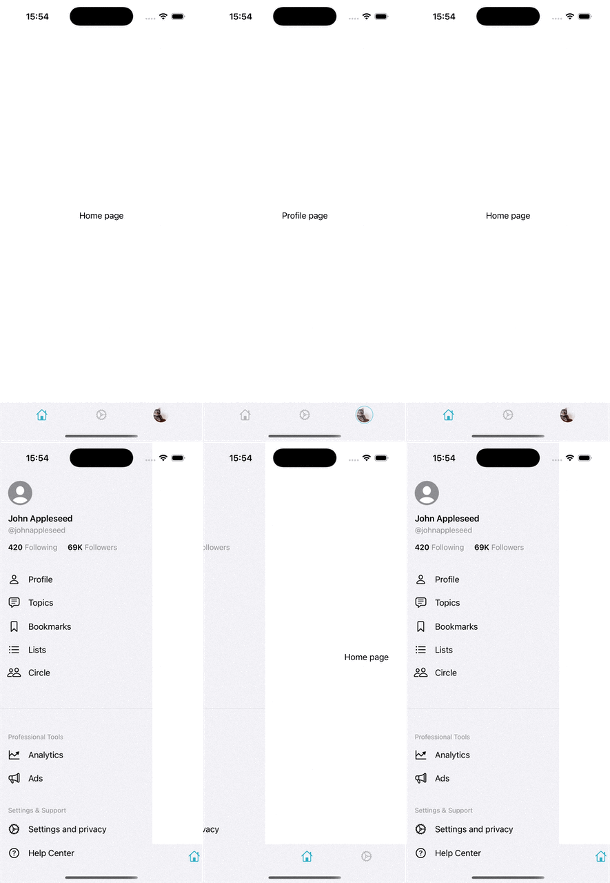
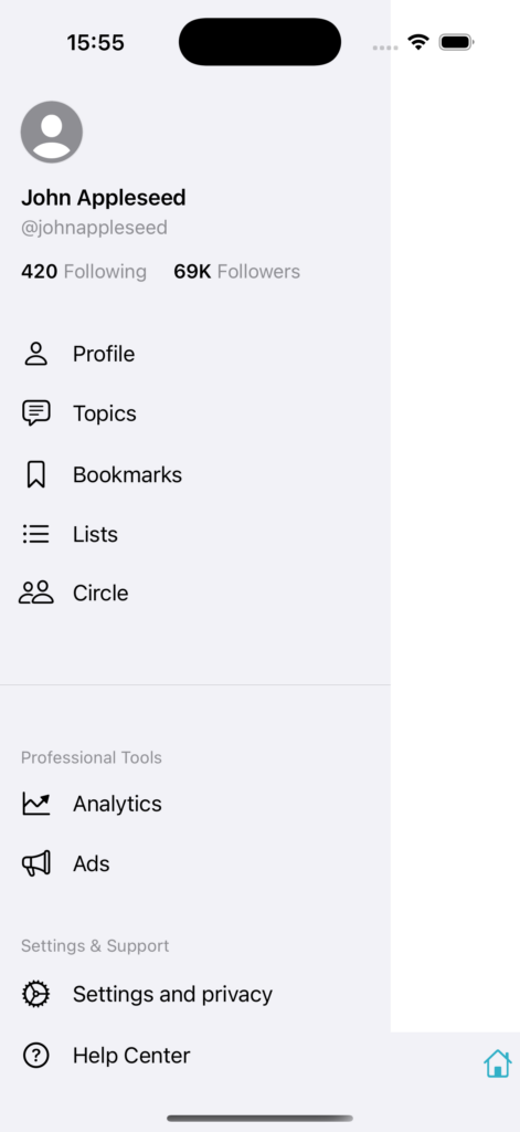
    In this article, we will implement a tab bar that has a user avatar (custom tab bar), and a slide to open side-bar within our SwiftUI application.

    Custom tab bar

    The benefit of using a custom tab bar is that you can add images, or menus (for example, allow the user to quickly switch to another account).

    First, we will define which tab we have using an enum:

    enum CurrentTab {
    case home
    case settings
    case profile
    }

    We will create a variable to store and control which tab is currently selected:

    @State private var currentTab: CurrentTab = .home

    For custom tab bar, we will still use a TabView , however, we will not provide the .tabItem for each of the view inside. This way, the system will not display the default tab bar.

    TabView(selection: $currentTab) {

    Text("Home page")
    .tag(CurrentTab.home)

    Text("Settings page")
    .tag(CurrentTab.settings)

    Text("Profile page")
    .tag(CurrentTab.profile)

    }

    Then, we use a ZStack aligned to the bottom of the screen to add our custom tab bar on top of the current view.

    var body: some View {

    ZStack(alignment: .bottom) {
    TabView(selection: $currentTab) {

    Text("Home page")
    .tag(CurrentTab.home)

    Text("Settings page")
    .tag(CurrentTab.settings)

    Text("Profile page")
    .tag(CurrentTab.profile)

    }

    floatingToolBar

    }

    }

    Now, I need to implement my tab bar. I first write a custom structure that stores the view of a single tab item within that tab bar:

    func CustomTabItem(symbolName: String, isActive: Bool) -> some View{
    HStack {
    Image(systemName: symbolName)
    .resizable()
    .foregroundColor(isActive ? .teal : .gray)
    .opacity(isActive ? 1 : 0.6)
    .frame(width: 22, height: 22)
    }
    .frame(maxWidth: .infinity)
    .frame(height: 38)
    }

    Here, I am just showing an image, but you can use a VStack and put a text label at the bottom.

    Now, I will implement my floating tab bar:

    var floatingToolBar: some View {
    HStack {

    Spacer()

    Button {
    self.currentTab = .home
    } label: {
    CustomTabItem(
    symbolName: "house",
    isActive: self.currentTab == .home)
    }

    Spacer()

    Button {
    self.currentTab = .settings
    } label: {
    CustomTabItem(
    symbolName: "gear",
    isActive: self.currentTab == .settings)
    }

    Spacer()

    Button {
    self.currentTab = .profile
    } label: {
    AsyncImage(url: URL(string: "https://cdn.pixabay.com/photo/2024/03/07/10/38/simba-8618301_640.jpg")!) { loadedImage in
    loadedImage
    .resizable()
    .scaledToFit()
    .clipShape(Circle())
    .frame(maxWidth: .infinity)
    .frame(height: 30)
    .padding(2)
    .background {
    if self.currentTab == .profile {
    Circle()
    .stroke(.teal, lineWidth: 1)
    }
    }
    } placeholder: {
    ProgressView()
    }
    .frame(maxWidth: .infinity)
    .frame(height: 30)
    }

    Spacer()

    }
    .frame(maxWidth: .infinity)
    .padding(.top, 5)
    .padding(.horizontal, 20)
    .background(Color(uiColor: .systemGroupedBackground))
    }

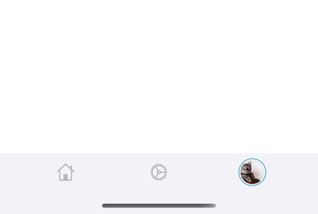
    When the button is activated, it will have a blue color, otherwise, it will be gray.

    Also, you can see, the benefit of the custom tab bar is that you can put any view components. For example, I can add a menu or an image (to show the user’s avatar image for example).

    You can also enable customization of the tab bar by allowing the user to turn on or off certain tabs.

    Now we have completed the custom tab bar. Let’s move on to the custom side bar.

    Custom side bar

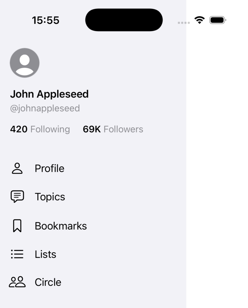
    To implement the custom side bar, we will use a HStack to put a menu on the left side of our main content.

    We will use a GeometryReader on the outside to read the size of the screen. We will then calculate the width of the side bar.

    var body: some View {
    GeometryReader { geometry in
    let sideBarWidth = geometry.size.width - 100

    }
    }

    Then, we set the width of the side bar as the `sideBarWidth` and the width of the main content view the same as the screen width:

    var body: some View {
    GeometryReader { geometry in
    let sideBarWidth = geometry.size.width - 100

    HStack(spacing: 0) {
    // Side Menu
    SideMenuView()
    .frame(width: sideBarWidth)

    // Main Content, which is the TabView from the above section
    MainContentView()
    .frame(width: geometry.size.width)
    }
    }
    }

    But if we set the frame that way, the view will overflow the screen. So when the view is initially shown, we will set the offset on x axis, so the view initially only shows the content, and only if user scrolls that it will show the menu.

    In the below code, initially, the navigationState.offset value is 0, so the initial offset is set to just hide the menu. When the user starts drag gesture from left to right, it will update the offset x so it shows part of the side menu.

    var body: some View {
    GeometryReader { geometry in
    let sideBarWidth = geometry.size.width - 100

    HStack(spacing: 0) {
    // Side Menu
    SideMenuView()
    .frame(width: sideBarWidth)

    // Main Content, which is the TabView from the above section
    MainContentView()
    .frame(width: geometry.size.width)
    }
    + .offset(x: -sideBarWidth + navigationState.offset)
    }
    }

    Notice that it is important to define the frame .frame(width: geometry.size.width) for your main content view as well, so it fills the entire screen width.

    Then, we add the additional code for handling user’s gesture.

    Here is the completed code:

    struct ContentView: View {
    @StateObject private var navigationState = NavigationState()
    @GestureState private var gestureOffset: CGFloat = 0

    var body: some View {
    GeometryReader { geometry in
    let sideBarWidth = geometry.size.width - 100

    HStack(spacing: 0) {
    // Side Menu
    SideMenuView()
    .frame(width: sideBarWidth)

    // Main Content, which is the TabView from the above section
    VStack {
    HStack {
    Rectangle().foregroundColor(.blue)
    }
    }
    .frame(width: geometry.size.width)
    }
    .offset(x: -sideBarWidth + navigationState.offset)
    .gesture(
    DragGesture()
    .updating($gestureOffset) { value, state, _ in // Use the local gestureOffset
    state = value.translation.width
    }
    .onEnded { value in
    navigationState.handleGestureEnd(value: value, sideBarWidth: sideBarWidth)
    }
    )
    .animation(.linear(duration: 0.15), value: navigationState.offset == 0)
    .onChange(of: navigationState.showMenu) { newValue in
    handleMenuVisibilityChange(sideBarWidth: sideBarWidth)
    }
    .onChange(of: gestureOffset) { newValue in // Use the local gestureOffset
    handleGestureOffsetChange(sideBarWidth: sideBarWidth, gestureOffset: newValue)
    }
    }
    }

    private func handleMenuVisibilityChange(sideBarWidth: CGFloat) {
    if navigationState.showMenu && navigationState.offset == 0 {
    navigationState.offset = sideBarWidth
    navigationState.lastStoredOffset = navigationState.offset
    }

    if !navigationState.showMenu && navigationState.offset == sideBarWidth {
    navigationState.offset = 0
    navigationState.lastStoredOffset = 0
    }
    }

    private func handleGestureOffsetChange(sideBarWidth: CGFloat, gestureOffset: CGFloat) {
    if gestureOffset != 0 {
    let potentialOffset = navigationState.lastStoredOffset + gestureOffset
    if potentialOffset < sideBarWidth && potentialOffset > 0 {
    navigationState.offset = potentialOffset
    } else if potentialOffset < 0 {
    navigationState.offset = 0
    }
    }
    }
    }

    // MARK: - Navigation State
    class NavigationState: ObservableObject {
    @Published var showMenu: Bool = false
    @Published var offset: CGFloat = 0
    @Published var lastStoredOffset: CGFloat = 0

    func handleGestureEnd(value: DragGesture.Value, sideBarWidth: CGFloat) {
    withAnimation(.spring(duration: 0.15)) {
    if value.translation.width > 0 {
    // Handle opening gesture
    if value.translation.width > sideBarWidth / 2 {
    openMenu(sideBarWidth: sideBarWidth)
    } else if value.velocity.width > 800 {
    openMenu(sideBarWidth: sideBarWidth)
    } else if !showMenu {
    closeMenu()
    }
    } else {
    // Handle closing gesture
    if -value.translation.width > sideBarWidth / 2 {
    closeMenu()
    } else {
    guard showMenu else { return }

    if -value.velocity.width > 800 {
    closeMenu()
    } else {
    openMenu(sideBarWidth: sideBarWidth)
    }
    }
    }
    }
    lastStoredOffset = offset
    }

    private func openMenu(sideBarWidth: CGFloat) {
    offset = sideBarWidth
    lastStoredOffset = sideBarWidth
    showMenu = true
    }

    private func closeMenu() {
    offset = 0
    showMenu = false
    }
    }

    We use the handleGestureOffsetChange function to check if the offset is valid (from zero up to the width of the menu). If the offset is valid, we update it to the navigationState.offset , which will then affect the above offset of the view.

    In the handleGestureEnd function, we are running multiple checks to decide whether to open a menu if the user is swiping from left side to right side:

    if value.translation.width > sideBarWidth / 2 this code means the user has slide the menu open.

    else if value.velocity.width > 800 this means the user has not yet slide to the required width to open the menu, but the user is sliding the screen very fast, so we open the menu as well.

    The logic for closing the menu is the same, which works by checking the distance user has swiped, and check the velocity.

    Now, you have a side bar menu that can be open and close like a drawer.

    Complete code for side menu and custom tool bar

    //
    // ContentView.swift
    // TabBarSideBarDemo
    //
    // Created by msz on 2024/12/09.
    //

    import SwiftUI

    enum CurrentTab {
    case home
    case settings
    case profile
    }

    struct ContentView: View {
    @StateObject private var navigationState = NavigationState()
    @GestureState private var gestureOffset: CGFloat = 0
    @State private var currentTab: CurrentTab = .home

    var body: some View {
    GeometryReader { geometry in
    let sideBarWidth = geometry.size.width - 100

    HStack(spacing: 0) {
    // Side Menu
    SideMenuView()
    .frame(width: sideBarWidth)

    // Main Content, which is the TabView from the above section
    ZStack(alignment: .bottom) {
    TabView(selection: $currentTab) {

    Text("Home page")
    .tag(CurrentTab.home)

    Text("Settings page")
    .tag(CurrentTab.settings)

    Text("Profile page")
    .tag(CurrentTab.profile)

    }

    floatingToolBar
    }
    .frame(width: geometry.size.width)
    }
    .offset(x: -sideBarWidth + navigationState.offset)
    .gesture(
    DragGesture()
    .updating($gestureOffset) { value, state, _ in // Use the local gestureOffset
    state = value.translation.width
    }
    .onEnded { value in
    navigationState.handleGestureEnd(value: value, sideBarWidth: sideBarWidth)
    }
    )
    .animation(.linear(duration: 0.15), value: navigationState.offset == 0)
    .onChange(of: navigationState.showMenu) { newValue in
    handleMenuVisibilityChange(sideBarWidth: sideBarWidth)
    }
    .onChange(of: gestureOffset) { newValue in // Use the local gestureOffset
    handleGestureOffsetChange(sideBarWidth: sideBarWidth, gestureOffset: newValue)
    }
    }
    }

    // MARK: Custom side menu

    private func handleMenuVisibilityChange(sideBarWidth: CGFloat) {
    if navigationState.showMenu && navigationState.offset == 0 {
    navigationState.offset = sideBarWidth
    navigationState.lastStoredOffset = navigationState.offset
    }

    if !navigationState.showMenu && navigationState.offset == sideBarWidth {
    navigationState.offset = 0
    navigationState.lastStoredOffset = 0
    }
    }

    private func handleGestureOffsetChange(sideBarWidth: CGFloat, gestureOffset: CGFloat) {
    if gestureOffset != 0 {
    let potentialOffset = navigationState.lastStoredOffset + gestureOffset
    if potentialOffset < sideBarWidth && potentialOffset > 0 {
    navigationState.offset = potentialOffset
    } else if potentialOffset < 0 {
    navigationState.offset = 0
    }
    }
    }

    // MARK: Custom tab bar

    var floatingToolBar: some View {
    HStack {

    Spacer()

    Button {
    self.currentTab = .home
    } label: {
    CustomTabItem(
    symbolName: "house",
    isActive: self.currentTab == .home)
    }

    Spacer()

    Button {
    self.currentTab = .settings
    } label: {
    CustomTabItem(
    symbolName: "gear",
    isActive: self.currentTab == .settings)
    }

    Spacer()

    Button {
    self.currentTab = .profile
    } label: {
    AsyncImage(url: URL(string: "https://cdn.pixabay.com/photo/2024/03/07/10/38/simba-8618301_640.jpg")!) { loadedImage in
    loadedImage
    .resizable()
    .scaledToFit()
    .clipShape(Circle())
    .frame(maxWidth: .infinity)
    .frame(height: 30)
    .padding(2)
    .background {
    if self.currentTab == .profile {
    Circle()
    .stroke(.teal, lineWidth: 1)
    }
    }
    } placeholder: {
    ProgressView()
    }
    .frame(maxWidth: .infinity)
    .frame(height: 30)
    }

    Spacer()

    }
    .frame(maxWidth: .infinity)
    .padding(.top, 5)
    .padding(.horizontal, 20)
    .background(Color(uiColor: .systemGroupedBackground))
    }

    func CustomTabItem(symbolName: String, isActive: Bool) -> some View{
    HStack {
    Image(systemName: symbolName)
    .resizable()
    .foregroundColor(isActive ? .teal : .gray)
    .opacity(isActive ? 1 : 0.6)
    .frame(width: 22, height: 22)
    }
    .frame(maxWidth: .infinity)
    .frame(height: 38)
    }
    }

    // MARK: - Navigation State
    class NavigationState: ObservableObject {
    @Published var showMenu: Bool = false
    @Published var offset: CGFloat = 0
    @Published var lastStoredOffset: CGFloat = 0

    func handleGestureEnd(value: DragGesture.Value, sideBarWidth: CGFloat) {
    withAnimation(.spring(duration: 0.15)) {
    if value.translation.width > 0 {
    // Handle opening gesture
    if value.translation.width > sideBarWidth / 2 {
    openMenu(sideBarWidth: sideBarWidth)
    } else if value.velocity.width > 800 {
    openMenu(sideBarWidth: sideBarWidth)
    } else if !showMenu {
    closeMenu()
    }
    } else {
    // Handle closing gesture
    if -value.translation.width > sideBarWidth / 2 {
    closeMenu()
    } else {
    guard showMenu else { return }

    if -value.velocity.width > 800 {
    closeMenu()
    } else {
    openMenu(sideBarWidth: sideBarWidth)
    }
    }
    }
    }
    lastStoredOffset = offset
    }

    private func openMenu(sideBarWidth: CGFloat) {
    offset = sideBarWidth
    lastStoredOffset = sideBarWidth
    showMenu = true
    }

    private func closeMenu() {
    offset = 0
    showMenu = false
    }

    }

    // MARK: - Preview
    #Preview {
    ContentView()
    .environmentObject(NavigationState())
    }

    Thank you for reading!
    The code in this article is available at: https://github.com/mszpro/Custom-Side-Tab-Bar

    Japanese version: https://qiita.com/mashunzhe/items/17fa31267e69e2fd8cd8

    Follow me on Twitter: https://twitter.com/mszpro

    Subscribe on Youtube: https://www.youtube.com/@MszPro6

    Mastodon, Misskey: @[email protected]

    Bluesky: @mszpro.com

    Website: https://mszpro.com

    SoraSNS for Mastodon, Misskey, Bluesky, Nostr all in one: https://mszpro.com/sorasns

  • Free translation API — using the iOS 18’s system Translation framework in your app (SwiftUI or UIKit)

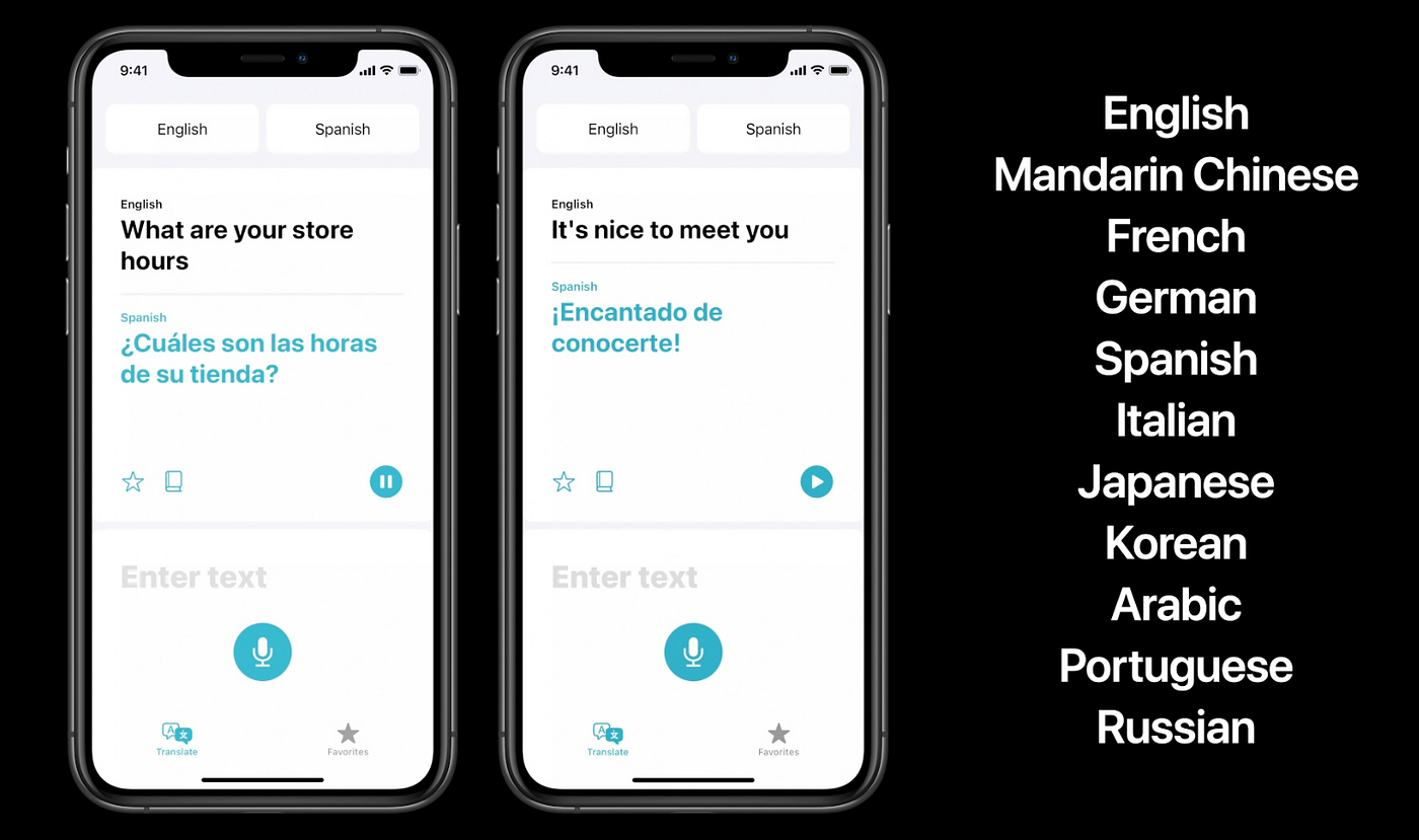
    Photo from Apple documentation

    If you offer contents within your app and are targeting users around the world, you probably want translation feature. User submitted texts can be in all kinds of languages, and providing a translation feature will enrich your user experience.

    For example, in my Mastodon, Misskey, Bluesky, Nostr all in one client SoraSNS, I used the similar technique described in this article for free translation API.

    Using online API provided by companies like Google or DeepL can incur a fee, which indie developers like myself find it difficult.

    The answer: The Translation Framework

    Ever since iOS 14 in 2020, Apple has introduced the system Translation app. It is a very simple yet elegant app with just a single text box. What’s more, Apple’s translation app allows you to download for local translation as well.

    In iOS 18, Apple has opened the translation API, so your app can use it to translate content.

    Enough story telling. Let’s get started!

    Notice: You have to test these APIs on real devices. The Translation feature does not work in simulator! (wired-ly sometimes the pre-build UI does work in simulator LOL)

    Present pre-built translation UI in SwiftUI

    Your SwiftUI app can present a pre-built Apple translate app popup, within your own app.

    First, import the Translation framework. You can also use the #if canImport(Translation)statement to check if the system supports it. For example, if the user is running iOS 18 and up, provide the translation feature; if the user is running iOS 17 and below, fallback to an online translation service or hide the translation button.

    #if canImport(Translation)
    import Translation
    #endif

    Then, create a @State variable that controls when the translation dialog is shown. Initially, it is false and you set it to true once you want to present the translated result:

    @State private var isTranslationShown: Bool = false

    Then, attach the translationPresentation view modifier to your view component, with the isPresented parameter set to the binding of the variable that controls whether it is shown or not, and the text parameter set to the text you want to translate.

    Form {
    // ... //
    }
    #if canImport(Translation)
    .translationPresentation(isPresented: $isTranslationShown,
    text: self.sourceText)
    #endif

    Here is the full example code:

    import SwiftUI

    #if canImport(Translation)
    import Translation
    #endif

    struct PopupTranslation: View {

    @State private var sourceText = "Hello, World! This is a test."

    @State private var isTranslationShown: Bool = false

    var body: some View {

    NavigationStack {
    Form {

    Section {
    Label("Source text", systemImage: "globe")

    TextField("What do you want to translate?",
    text: $sourceText,
    axis: .vertical)
    }

    }
    .toolbar {
    ToolbarItem(placement: .topBarTrailing) {
    Button("Translate") {
    self.isTranslationShown = true
    }
    }
    }
    #if canImport(Translation)
    .translationPresentation(isPresented: $isTranslationShown,
    text: self.sourceText)
    #endif
    }

    }

    }

    #Preview {
    PopupTranslation()
    }

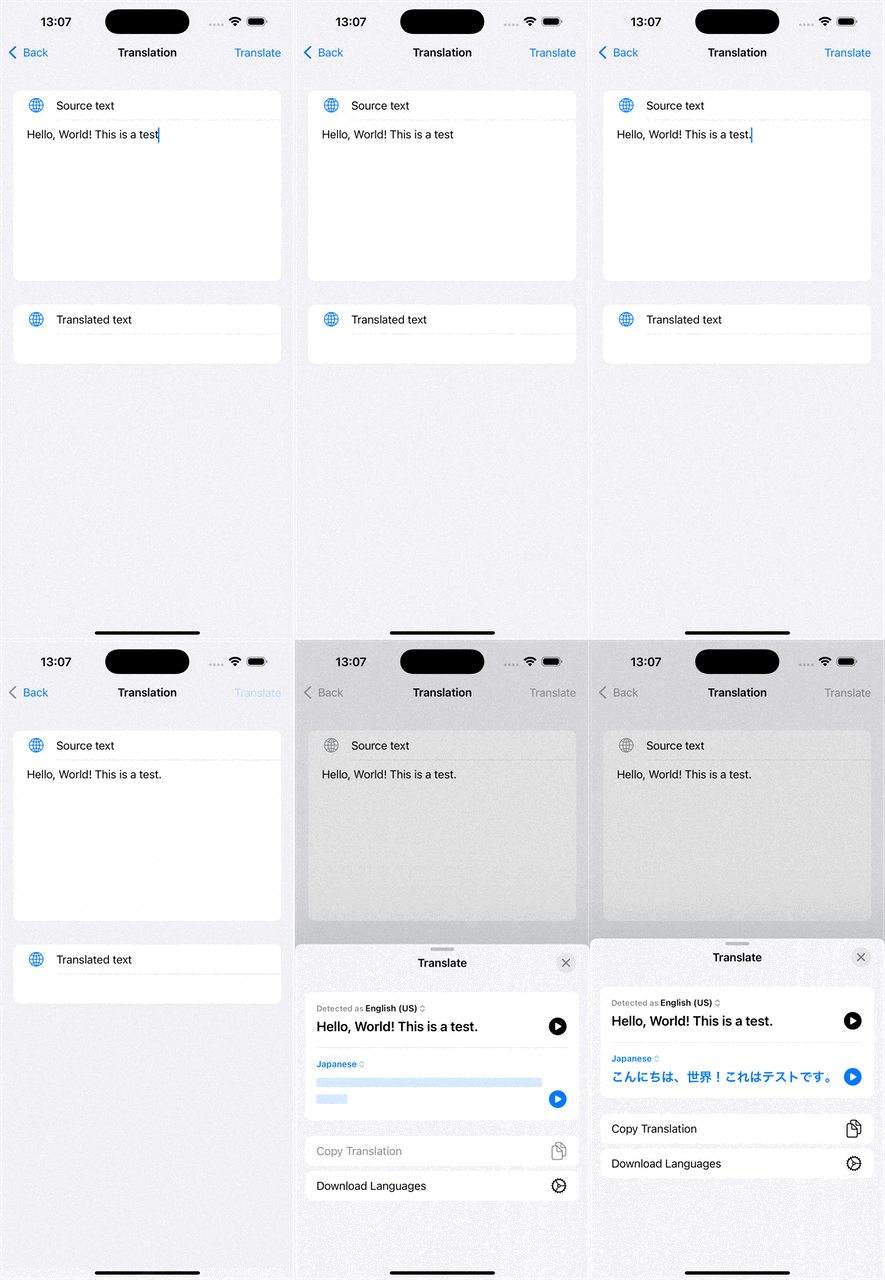
    Now, if you run it, you will get a simple translation popup when the user presses the translate button:

    You can also add a button within the present popup so user can quickly provide the translated text to your app:

    //
    // PopupTranslation.swift
    // iOSTranslationVideo
    //
    // Created by msz on 2024/12/01.
    //

    import SwiftUI

    #if canImport(Translation)
    import Translation
    #endif

    struct PopupTranslation: View {

    @State private var sourceText = "Hello, World!"
    + @State private var targetText = ""

    @State private var isTranslationShown: Bool = false

    var body: some View {

    NavigationStack {
    Form {

    Section {
    Label("Source text", systemImage: "globe")

    TextField("What do you want to translate?",
    text: $sourceText,
    axis: .vertical)
    }

    + Section {
    + Label("Translated text", systemImage: "globe")
    + Text(targetText)
    + }

    }
    .toolbar {
    ToolbarItem(placement: .topBarTrailing) {
    Button("Translate") {
    self.isTranslationShown = true
    }
    }
    }
    #if canImport(Translation)
    .translationPresentation(isPresented: $isTranslationShown,
    text: self.sourceText)
    + { newString in
    + self.targetText = newString
    + }
    #endif
    }

    }

    }

    #Preview {
    PopupTranslation()
    }

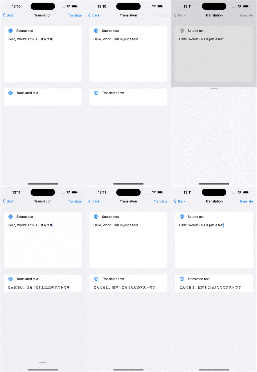
    In the above code, we added a code block for the translationPresentationview modifier. We then set the result text to the targetText variable of the app.

    This will not automatically provide the translated result to the app. Instead, user will see a button called Replace with translation

    The benefit of the above is that it uses system pre-designed UI, and you do not need to provide the source and target language, all are auto configured and detected by the system.

    But if you want to get the translated result programmatically, read on!

    Check if language is supported by iOS system

    iOS system offers translation service for some popular languages. To check which language pair is available, you can use

    func checkSpecificLanguagePairs() async {
    let availability = LanguageAvailability()

    // English to Japanese
    let english = Locale.Language(identifier: "en")
    let japanese = Locale.Language(identifier: "ja")
    let statusEnJa = await availability.status(from: english, to: japanese)
    print("English to Japanese: \(statusDescription(statusEnJa))")

    // English to Simplified Chinese
    let chinese = Locale.Language(identifier: "zh-Hans")
    let statusEnCh = await availability.status(from: english, to: chinese)
    print("English to Simplified Chinese: \(statusDescription(statusEnCh))")


    // English to German
    let german = Locale.Language(identifier: "de")
    let statusEnDe = await availability.status(from: english, to: german)
    print("English to German: \(statusDescription(statusEnDe))")
    }

    // Helper function to describe the status
    func statusDescription(_ status: LanguageAvailability.Status) -> String {
    switch status {
    case .installed:
    return "Translation installed and ready to use."
    case .supported:
    return "Translation supported but requires download of translation model."
    case .unsupported:
    return "Translation unsupported between the given language pair."
    @unknown default:
    return "Unknown status"
    }
    }

    Now, if the returned status is installed, it means you can translate normally. If it is unsupported , it means iOS does not support translation of that language peer. If it is supported but not installed it means the iOS system has not yet downloaded the files necessary for this translation.

    These translation model files only need to be downloaded once every device.

    Bonus topic: checking the language of a text

    Your app can actually detect the language of a given text by using NaturalLanguage framework

    import NaturalLanguage

    static func detectLanguage(for string: String) -> String? {
    let recognizer = NLLanguageRecognizer()
    recognizer.processString(string)
    guard let languageCode = recognizer.dominantLanguage?.rawValue else {
    return nil
    }
    return languageCode
    }

    Download translation models

    You can ask iOS to present the download dialog for the translation files.

    struct TranslationModelDownloader: View {

    var configuration: TranslationSession.Configuration {
    TranslationSession.Configuration(
    source: Locale.Language(identifier: "en"),
    target: Locale.Language(identifier: "ja")
    )
    }

    var body: some View {
    NavigationView {
    Text("Download translation files between \(configuration.source?.minimalIdentifier ?? "?") and \(configuration.target?.minimalIdentifier ?? "?")")
    .translationTask(configuration) { session in
    do {
    try await session.prepareTranslation()
    } catch {
    // Handle any errors.
    print("Error downloading translation: \(error)")
    }
    }
    }
    }
    }

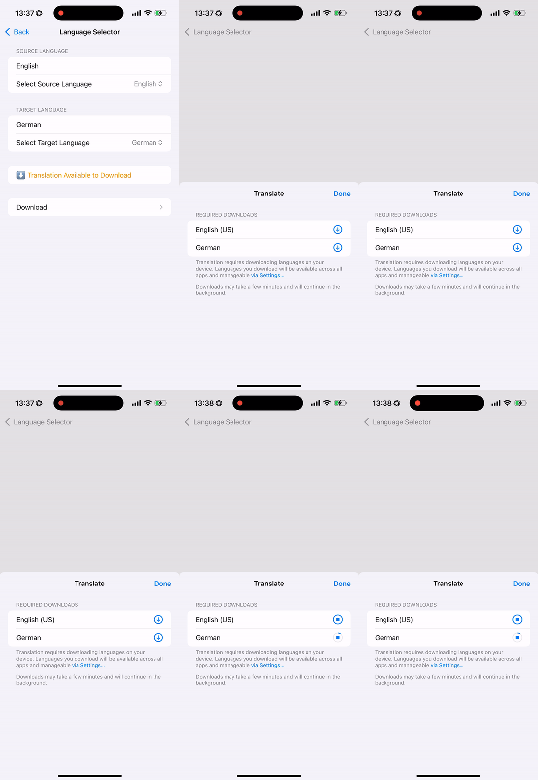
    In the above code, you will attach the translationTask view modifier to your SwiftUI view. You will define the language configuration (source language and target language) within the configuration parameter. Then, you will call session.prepareTranslation() within the translation task view modifier.

    When the view shows up, it will present a system dialog for downloading translation files.

    Here is a full SwiftUI demo code for checking available languages and downloading the models:

    //
    // LanguageAvailabilityChecker.swift
    // iOSTranslationVideo
    //
    // Created by msz on 2024/12/01.
    //

    import SwiftUI
    import Translation

    fileprivate class ViewModel: ObservableObject {
    @Published var sourceLanguage: Locale.Language = Locale.current.language
    @Published var targetLanguage: Locale.Language = Locale.current.language

    @Published var languageStatus: LanguageAvailability.Status = .unsupported

    @Published var sourceFilter: String = "English"
    @Published var targetFilter: String = "German"

    let languages: [Locale.Language]

    init() {
    // Initialize the list of available languages
    let languageCodes = Locale.LanguageCode.isoLanguageCodes
    self.languages = languageCodes.compactMap { Locale.Language(languageCode: $0) }
    }

    func displayName(for language: Locale.Language) -> String {
    guard let languageCode = language.languageCode?.identifier else {
    return language.maximalIdentifier
    }
    return Locale.current.localizedString(forLanguageCode: languageCode) ?? languageCode
    }

    var filteredSourceLanguages: [Locale.Language] {
    if sourceFilter.isEmpty {
    return languages
    } else {
    return languages.filter {
    displayName(for: $0).localizedCaseInsensitiveContains(sourceFilter)
    }
    }
    }

    var filteredTargetLanguages: [Locale.Language] {
    if targetFilter.isEmpty {
    return languages
    } else {
    return languages.filter {
    displayName(for: $0).localizedCaseInsensitiveContains(targetFilter)
    }
    }
    }

    func checkLanguageSupport() async {
    let availability = LanguageAvailability()
    let status = await availability.status(from: sourceLanguage, to: targetLanguage)

    DispatchQueue.main.async {
    self.languageStatus = status
    }
    }
    }


    struct LanguageAvailabilityChecker: View {
    @StateObject fileprivate var viewModel = ViewModel()

    var body: some View {
    Form {
    // Source Language Section
    Section("Source Language") {
    TextField("Filter languages", text: $viewModel.sourceFilter)
    .padding(.vertical, 4)

    Picker("Select Source Language", selection: $viewModel.sourceLanguage) {
    ForEach(viewModel.filteredSourceLanguages, id: \.maximalIdentifier) { language in
    Button {} label: {
    Text(viewModel.displayName(for: language))
    Text(language.minimalIdentifier)
    }
    .tag(language)
    }
    }
    .disabled(viewModel.filteredSourceLanguages.isEmpty)
    .onChange(of: viewModel.sourceLanguage) { _, _ in
    Task {
    await viewModel.checkLanguageSupport()
    }
    }
    }

    // Target Language Section
    Section("Target Language") {
    TextField("Filter languages", text: $viewModel.targetFilter)

    Picker("Select Target Language", selection: $viewModel.targetLanguage) {
    ForEach(viewModel.filteredTargetLanguages, id: \.maximalIdentifier) { language in
    Button {} label: {
    Text(viewModel.displayName(for: language))
    Text(language.minimalIdentifier)
    }
    .tag(language)
    }
    }
    .disabled(viewModel.filteredTargetLanguages.isEmpty)
    .onChange(of: viewModel.targetLanguage) { _, _ in
    Task {
    await viewModel.checkLanguageSupport()
    }
    }
    }

    // Status Section
    Section {
    if viewModel.languageStatus == .installed {
    Text("✅ Translation Installed")
    .foregroundColor(.green)
    } else if viewModel.languageStatus == .supported {
    Text("⬇️ Translation Available to Download")
    .foregroundColor(.orange)
    } else {
    Text("❌ Translation Not Supported")
    .foregroundColor(.red)
    }
    }

    // Download Button Section
    if viewModel.languageStatus == .supported {
    NavigationLink("Download") {
    TranslationModelDownloader(sourceLanguage: viewModel.sourceLanguage,
    targetLanguage: viewModel.targetLanguage)
    }
    }
    }
    .navigationTitle("Language Selector")
    .onAppear {
    Task {
    await viewModel.checkLanguageSupport()
    }
    }
    }
    }

    #Preview {
    LanguageAvailabilityChecker()
    }

    struct TranslationModelDownloader: View {

    var configuration: TranslationSession.Configuration

    init(sourceLanguage: Locale.Language, targetLanguage: Locale.Language) {
    self.configuration = TranslationSession.Configuration(source: sourceLanguage, target: targetLanguage)
    }

    var body: some View {
    NavigationView {
    Text("Download translation files between \(configuration.source?.minimalIdentifier ?? "?") and \(configuration.target?.minimalIdentifier ?? "?")")
    .translationTask(configuration) { session in
    do {
    try await session.prepareTranslation()
    } catch {
    // Handle any errors.
    print("Error downloading translation: \(error)")
    }
    }
    }
    }
    }

    Get translated result programmatically

    If you want to show the translated result within your app’s view. You can use a translation session.

    To get the translation result programmatically, you still need a SwiftUI shown on screen.

    First, set up the variables to store the text to translate, an optional translation configuration, and one to store the result:

    @State private var textToTranslate: String?
    @State private var translationConfiguration: TranslationSession.Configuration?
    @State private var translationResult: String?

    Then, add a translationTask view modifier:

    .translationTask(translationConfiguration) { session in
    do {
    guard let textToTranslate else { return }
    let response = try await session.translate(textToTranslate)
    self.translationResult = response.targetText
    } catch {
    print("Error: \(error)")
    }
    }

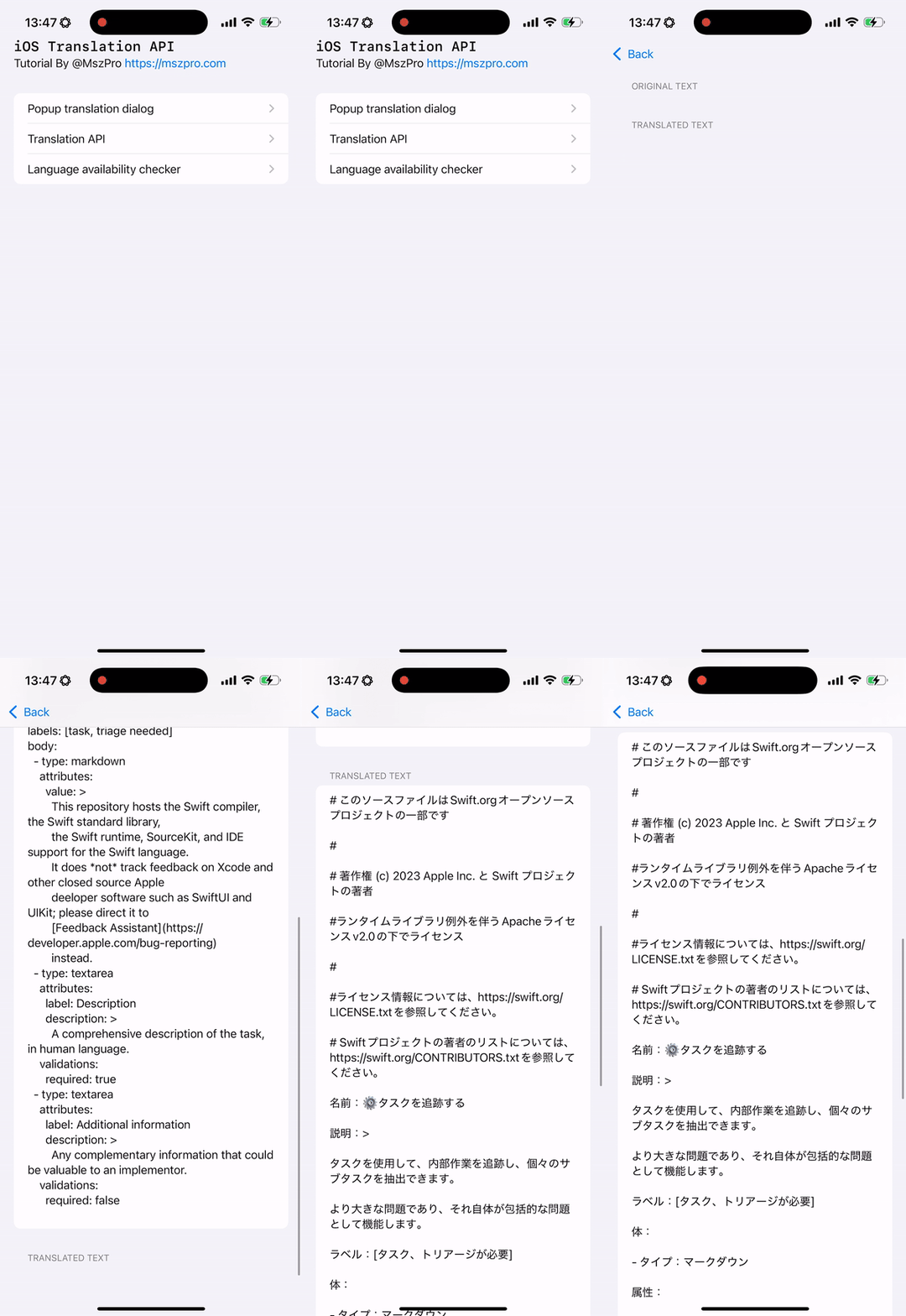
    Now, when you are ready to translate (for example, you have fetched the text for translation, you can set a value to the variables). For example, in the below code, we fetch the content of a web page and translate it to Japanese.

    let (data, _) = try await URLSession.shared.data(from: URL(string: "https://raw.githubusercontent.com/swiftlang/swift/refs/heads/main/.github/ISSUE_TEMPLATE/task.yml")!)
    guard let webPageContent = String(data: data, encoding: .utf8) else { return }
    // start a translation to Japanese
    self.textToTranslate = webPageContent
    self.translationConfiguration = .init(target: .init(identifier: "ja"))

    Notice that the self.translationConfiguration can take no parameters, just the source language code, just the target language code, or both. For the parameters that you do not provide, the system will infer automatically based on user configuration.

    It is recommended that you define the source and target language by yourself.

    Here is the complete code:

    import SwiftUI
    import Translation

    struct CustomTranslation: View {

    @State private var textToTranslate: String?
    @State private var translationConfiguration: TranslationSession.Configuration?
    @State private var translationResult: String?

    var body: some View {
    Form {

    Section("Original text") {
    if let textToTranslate {
    Text(textToTranslate)
    }
    }

    Section("Translated text") {
    if let translationResult {
    Text(translationResult)
    }
    }

    }
    .translationTask(translationConfiguration) { session in
    do {
    guard let textToTranslate else { return }
    let response = try await session.translate(textToTranslate)
    self.translationResult = response.targetText
    } catch {
    print("Error: \(error)")
    }
    }
    .task {
    // fetch the text
    do {
    let (data, response) = try await URLSession.shared.data(from: URL(string: "https://raw.githubusercontent.com/swiftlang/swift/refs/heads/main/.github/ISSUE_TEMPLATE/task.yml")!)
    guard let webPageContent = String(data: data, encoding: .utf8) else { return }
    // start a translation to Japanese
    self.textToTranslate = webPageContent
    self.translationConfiguration = .init(target: .init(identifier: "ja"))
    } catch {
    print("Error: \(error)")
    }
    }
    }

    }

    #Preview {
    CustomTranslation()
    }

    Compatibility for older iOS versions

    The translationTask view modifier is only available for iOS 18 and higher. If you also want your app to support iOS 17, you can create a custom SwiftUI view modifier (that runs the translation task if it is iOS 18 or higher, and do nothing when it is not supported):

    @ViewBuilder
    public func translationTaskCompatible(
    shouldRun: Bool,
    textToTranslate: String,
    targetLanguage: Locale.Language = Locale.current.language,
    action: @escaping (_ detectedSourceLanguage: String, _ translationResult: String) -> Void
    ) -> some View {
    if shouldRun, #available(iOS 18.0, *) {
    self
    .translationTask(.init(target: targetLanguage), action: { session in
    do {
    let response = try await session.translate(textToTranslate)
    action(response.sourceLanguage.minimalIdentifier, response.targetText)
    } catch {
    print("Translation failed: \(error.localizedDescription)")
    }
    })
    } else {
    self // No-op for unsupported iOS versions
    }
    }

    Then, in your iOS code, you can use it like this:

    .translationTaskCompatible(shouldRun: self.runAppleTranslation,
    textToTranslate: self.displayedPostContent,
    targetLanguage: Locale.current.language, action: { detectedSourceLanguageCode, translationResult in
    self.displayedPostContent = translationResult
    })

    Submit multiple translation requests

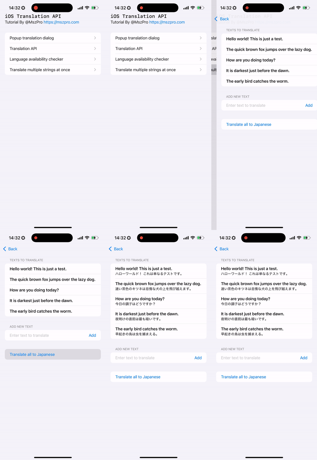
    You can submit multiple translation requests, and have results coming with unique IDs whenever it becomes available:

    Within a Task block and a SwiftUI view, you can create an array of translation requests, and submit them all in once. Within each request, you can specify a request ID, so you know which original text it is referring to when you get the result back.

    //
    // MultipleTranslate.swift
    // iOSTranslationVideo
    //
    // Created by msz on 2024/12/05.
    //

    import SwiftUI
    import Translation

    struct MultipleTranslate: View {

    // translation struct with the original text and optional translated text String
    struct TranslationEntry: Identifiable {
    let id: String
    let originalText: String
    var translatedText: String?

    init(id: String = UUID().uuidString, originalText: String, translatedText: String? = nil) {
    self.id = id
    self.originalText = originalText
    self.translatedText = translatedText
    }
    }

    @State private var textsToTranslate: [TranslationEntry] = [
    .init(originalText: "Hello world! This is just a test."),
    .init(originalText: "The quick brown fox jumps over the lazy dog."),
    .init(originalText: "How are you doing today?"),
    .init(originalText: "It is darkest just before the dawn."),
    .init(originalText: "The early bird catches the worm."),
    ]
    @State private var userEnteredNewText: String = ""

    @State private var configuration: TranslationSession.Configuration?

    var body: some View {

    Form {

    // list all text
    Section("Texts to translate") {
    List {
    ForEach(textsToTranslate) { text in
    VStack(alignment: .leading) {
    // original text
    Text(text.originalText)
    .font(.headline)
    // translated text, if available
    if let translatedText = text.translatedText {
    Text(translatedText)
    .font(.subheadline)
    }
    }
    }
    }
    }

    // allow user to add a new text, using a TextField and a Button
    Section("Add new text") {
    HStack {
    TextField("Enter text to translate",
    text: $userEnteredNewText)
    Button("Add") {
    textsToTranslate.append(.init(originalText: userEnteredNewText))
    userEnteredNewText = ""
    }
    }
    }

    Button("Translate all to Japanese") {
    self.configuration = .init(target: .init(identifier: "ja"))
    }

    }
    .translationTask(configuration) { session in
    let allRequests = textsToTranslate.map {
    return TranslationSession.Request(
    sourceText: $0.originalText,
    clientIdentifier: $0.id)
    }
    do {
    for try await response in session.translate(batch: allRequests) {
    print(response.targetText, response.clientIdentifier ?? "")
    if let i = self.textsToTranslate.firstIndex(where: { $0.id == response.clientIdentifier }) {
    var entry = self.textsToTranslate[i]
    entry.translatedText = response.targetText
    self.textsToTranslate.remove(at: i)
    self.textsToTranslate.insert(entry, at: i)
    }
    }
    } catch {
    print(error.localizedDescription)
    }
    }

    }

    }

    #Preview {
    MultipleTranslate()
    }

    Using in UIKit

    You might notice that all the above need a view modifier attached to a SwiftUI View.

    Here is a quote from Apple Engineer:

    “While the Translation APIs do need to be triggered from SwiftUI, there’s still a straightforward workaround to get this working from a mostly UIKit (or AppKit) app. You can add UIHostingController (or NSHostingController) to the place in your app you want any translation UI to present from. You can add the .translationPresentation or .translationTask modifier to a simple SwiftUI view, even though most of your app doesn’t use SwiftUI.” https://developer.apple.com/forums/thread/756837?answerId=791116022#791116022

    So the translation API needs to be triggered from a SwiftUI view.

    If you are using UIKit, you can use a UIHostingController

    //
    // TranslationUIKit.swift
    // iOSTranslationVideo
    //
    // Created by msz on 2024/12/05.
    //

    import Foundation
    import UIKit
    import SwiftUI

    #if canImport(Translation)
    import Translation
    #endif

    struct EmbeddedTranslationView: View {
    var sourceText: String
    @State private var isTranslationShown: Bool = false

    var body: some View {
    VStack {
    #if canImport(Translation)
    Button("Translate") {
    self.isTranslationShown = true
    }
    .translationPresentation(isPresented: $isTranslationShown,
    text: self.sourceText)
    #else
    Text("Translation feature not available.")
    #endif
    }
    }
    }

    // UIKit ViewController
    class ViewController: UIViewController {
    override func viewDidLoad() {
    super.viewDidLoad()
    view.backgroundColor = .systemBackground

    // Create the SwiftUI view
    let embeddedSwiftUIView = EmbeddedTranslationView(sourceText: "Hello world! This is a test.")

    // Embed the SwiftUI view in a UIHostingController
    let hostingController = UIHostingController(rootView: embeddedSwiftUIView)

    // Add the UIHostingController as a child view controller
    addChild(hostingController)
    hostingController.view.translatesAutoresizingMaskIntoConstraints = false
    view.addSubview(hostingController.view)
    hostingController.didMove(toParent: self)

    // Layout the SwiftUI view
    NSLayoutConstraint.activate([
    hostingController.view.centerXAnchor.constraint(equalTo: view.centerXAnchor),
    hostingController.view.centerYAnchor.constraint(equalTo: view.centerYAnchor),
    hostingController.view.widthAnchor.constraint(equalTo: view.widthAnchor, multiplier: 0.8),
    hostingController.view.heightAnchor.constraint(equalTo: view.heightAnchor, multiplier: 0.5)
    ])
    }
    }

    // Wrap UIKit ViewController for SwiftUI
    struct UIKitViewWrapper: UIViewControllerRepresentable {
    func makeUIViewController(context: Context) -> UIViewController {
    return ViewController()
    }

    func updateUIViewController(_ uiViewController: UIViewController, context: Context) {
    // No updates required for now
    }
    }

    // Add a SwiftUI Preview for Testing
    struct UIKitViewWrapper_Previews: PreviewProvider {
    static var previews: some View {
    UIKitViewWrapper()
    .edgesIgnoringSafeArea(.all)
    }
    }

    In the above view, you will embed the SwiftUI view (which shows a single translate button). When the user taps that button, you can present the translation view.

    Similarly, if you want to call the translation API, you can pass the translated value back from SwiftUI view to your UIKit view.

    Thank you for reading!

    The code in this article is available at: https://github.com/mszpro/iOS-System-Translation-Demo

    Japanese version: https://qiita.com/mashunzhe/items/d90ae92e7daba800abaf

    Follow me on Twitter: https://twitter.com/mszpro

    Subscribe on Youtube: https://www.youtube.com/@MszPro6

    Mastodon, Misskey: @[email protected]

    Bluesky: @mszpro.com

    Website: https://mszpro.com

    SoraSNS for Mastodon, Misskey, Bluesky, Nostr all in one: https://mszpro.com/sorasns

  • SwiftUI .tabItem deprecated in iOS 18.1 -> replace it with new Tab

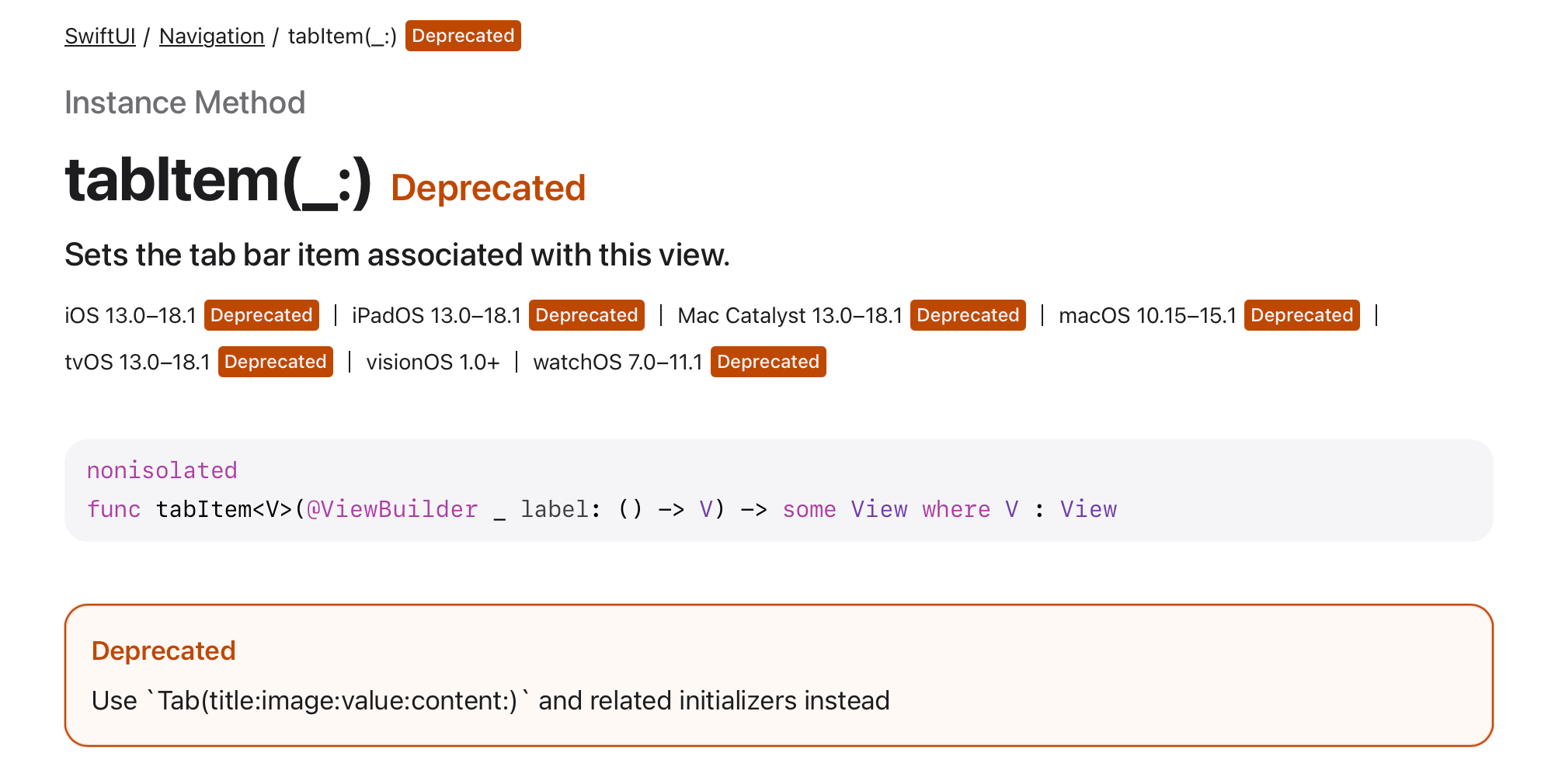
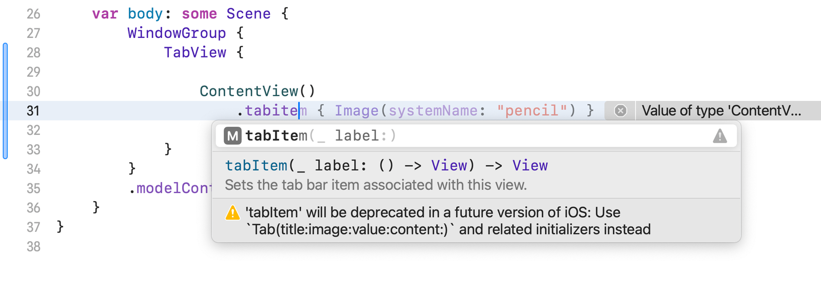
    In the newest Xcode, you might see a deprecation warning if you try to use .tabItem view modifier.

    💡

    ‘tabItem’ will be deprecated in a future version of iOS: Use Tab (title:image:value:content:) and related initializers instead

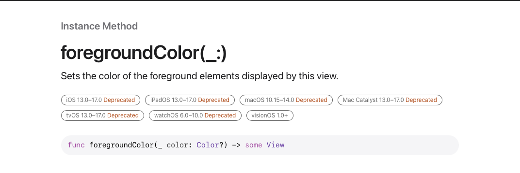
    As shown on the Apple Developer documentation:

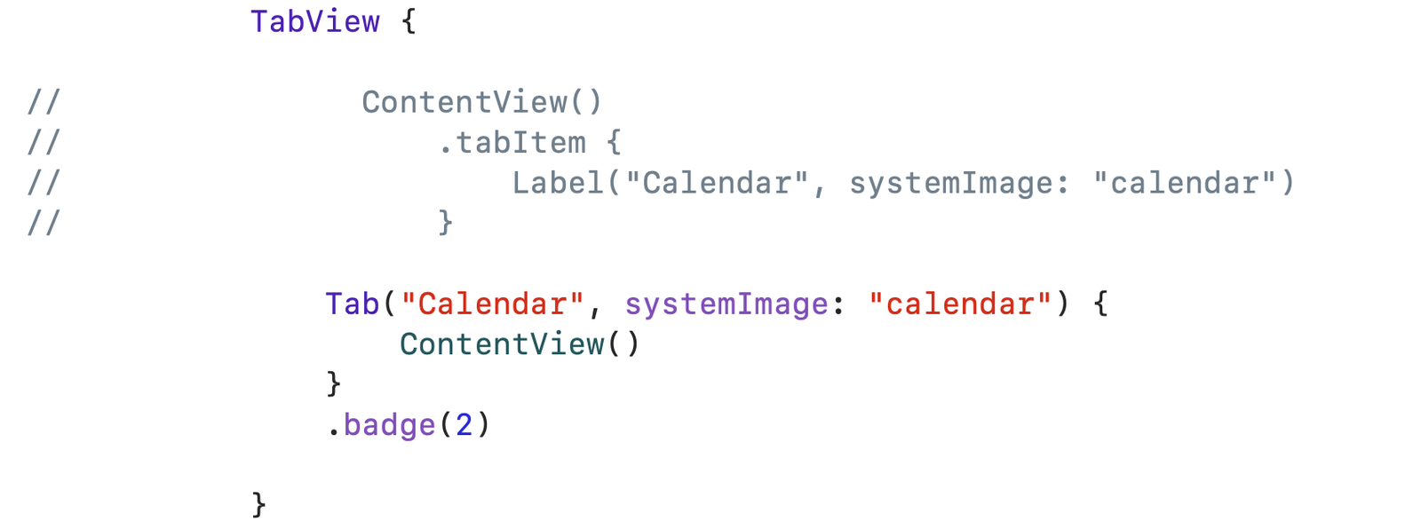
    You can easily fix this by using the new Tab view:

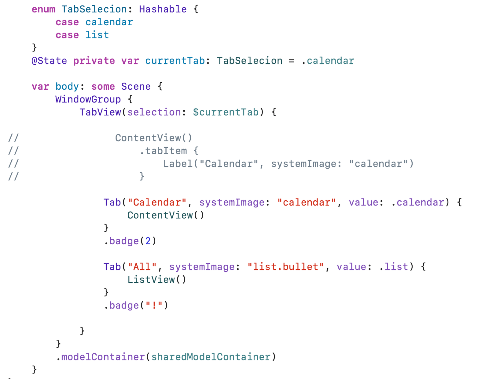
    You can also easily add a badge (that shows a number or a character text), and use the value parameter to control which tab is currently activated:

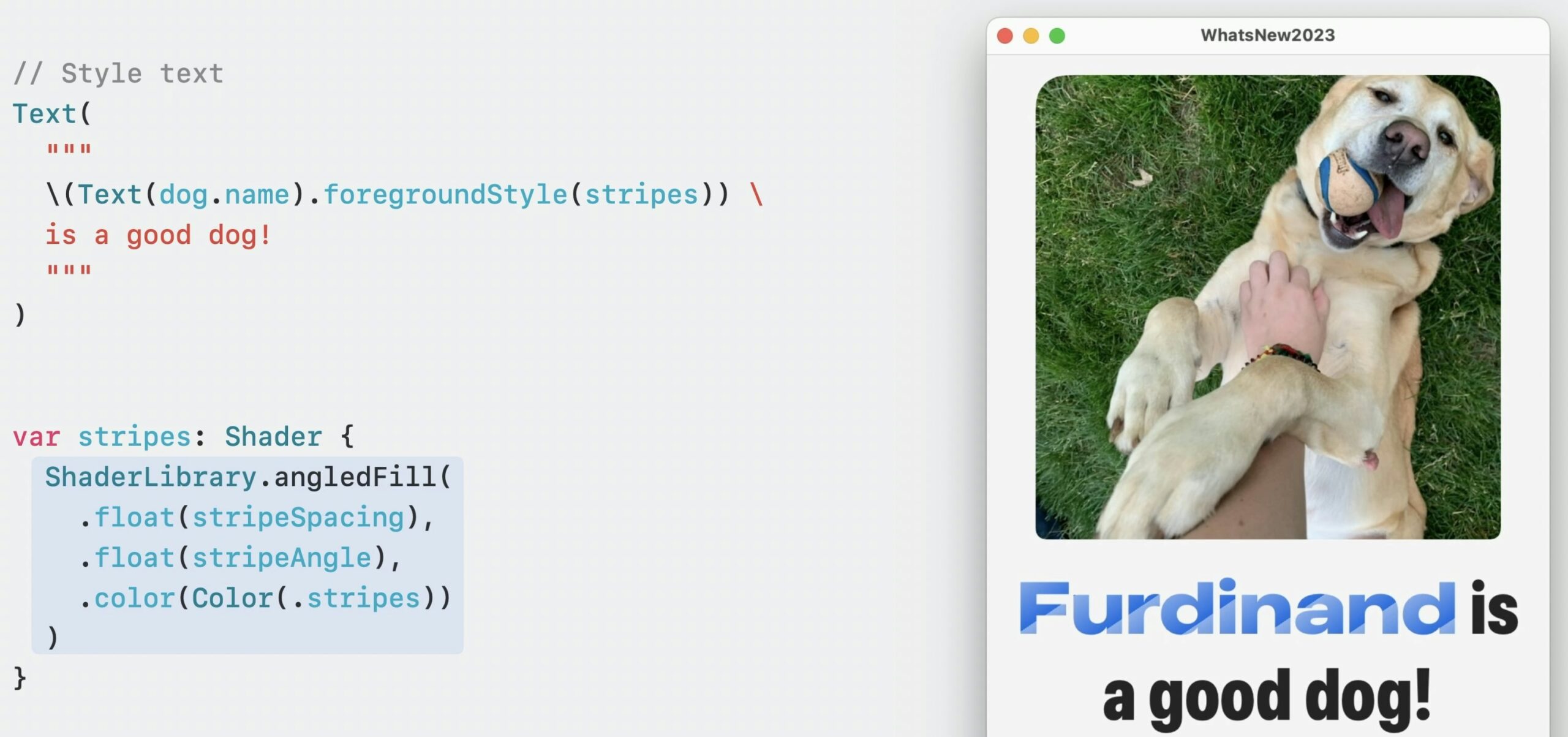
  • All things about SwiftUI Text: underline, strikethrough, kerning, inline SF symbol, combine multiple

    Can you make the same view as shown in the header thumbnail?

    If you can, save your time by skipping this article. Otherwise, let’s go!

    Different default font size

    We will start off with the basics like font size.

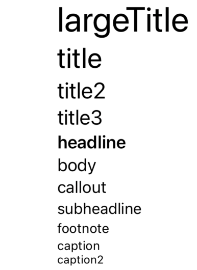
    You can use the .font(.title3) to set a preset font size:

    If you want to use system style but a custom size, you can use .font(.system(size: 60))

    For using a custom font file (like .ttf) you can refer to here: https://developer.apple.com/documentation/swiftui/applying-custom-fonts-to-text/

    Underline

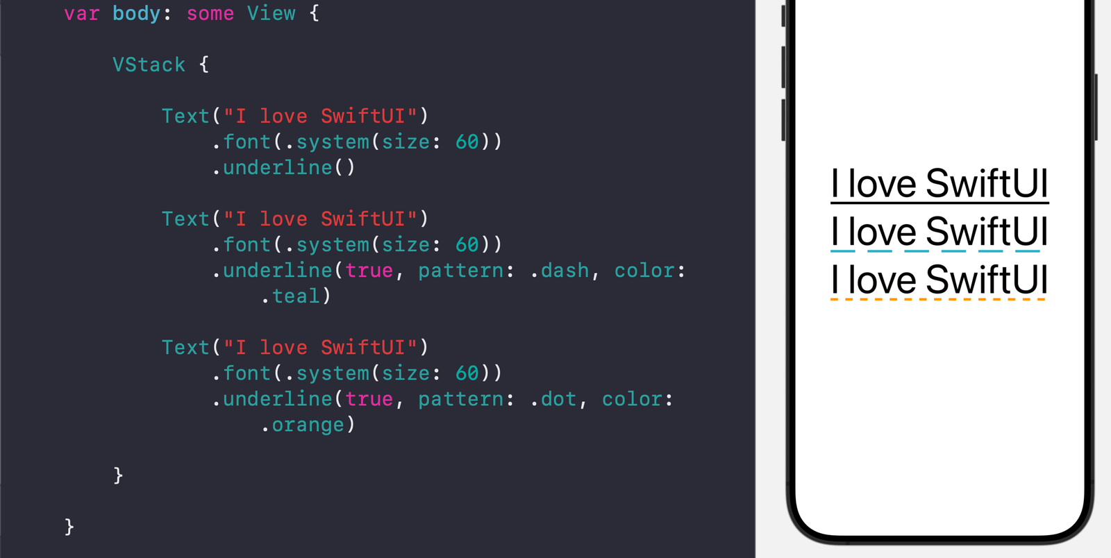
    You can add an underline with many styles like dashed, dotted.

    If you do not provide any parameters for the .underline() view modifier, it will draw a solid line with the same color as text.

    You can also supply a Bool variable to control whether the underline is active, specify a pattern (dash or dot or both), and specify a color.

    struct TextModifiers: View {
        
        var body: some View {
            
            VStack {
                
                Text("I love SwiftUI")
                    .font(.system(size: 60))
                    .underline()
                
                Text("I love SwiftUI")
                    .font(.system(size: 60))
                    .underline(true, pattern: .dash, color: .teal)
                
                Text("I love SwiftUI")
                    .font(.system(size: 60))
                    .underline(true, pattern: .dot, color: .orange)
                
            }
            
        }
        
    }

    Strikethrough

    You can set strike through to use a line to cross the text.

    Similar to the above underline view modifier, you can provide no parameters, or the parameter to control whether to activate the strikethrough, the pattern, or the color.

    Kerning

    This view modifier controls the spacing between each character.

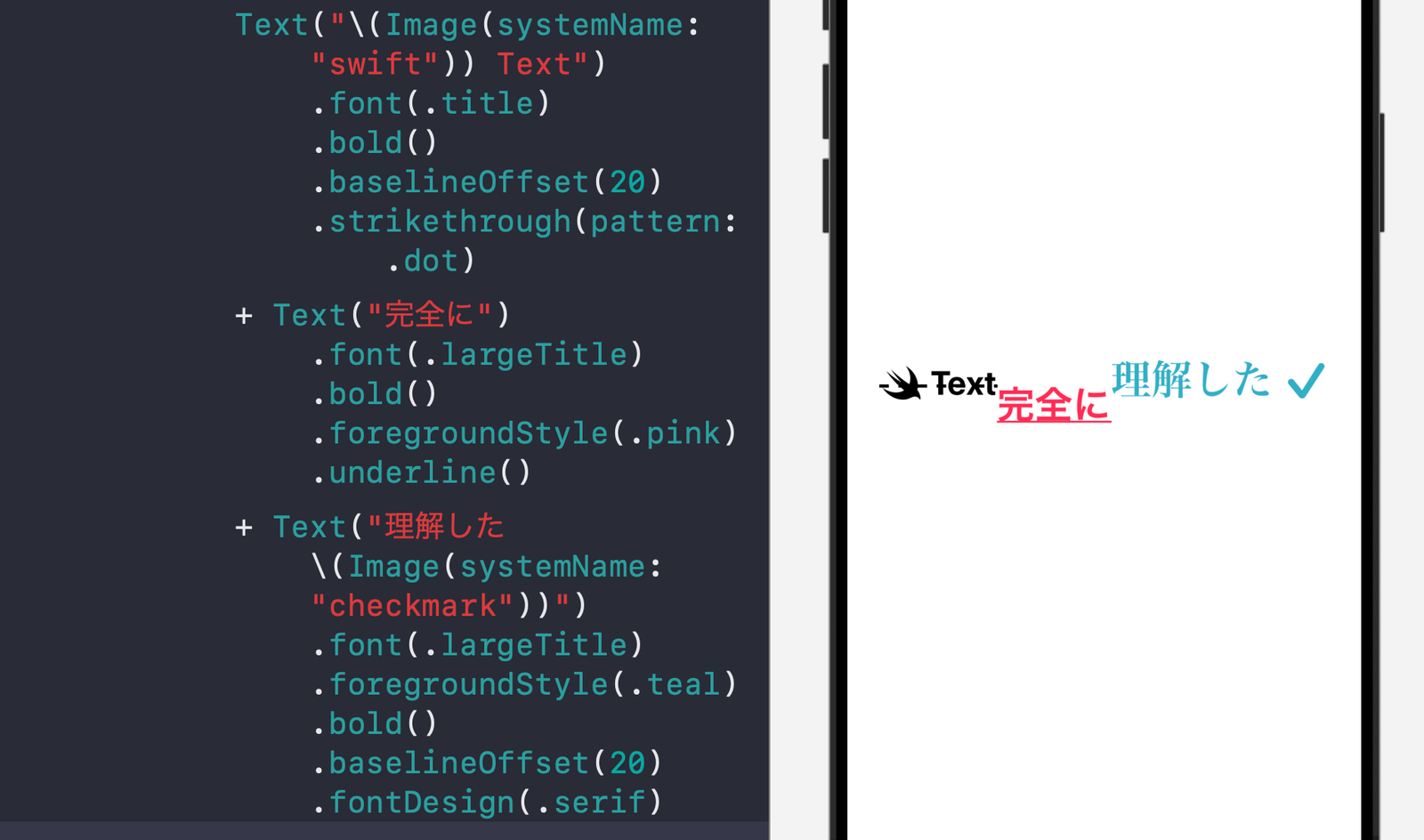
    Combining multiple text with different styles

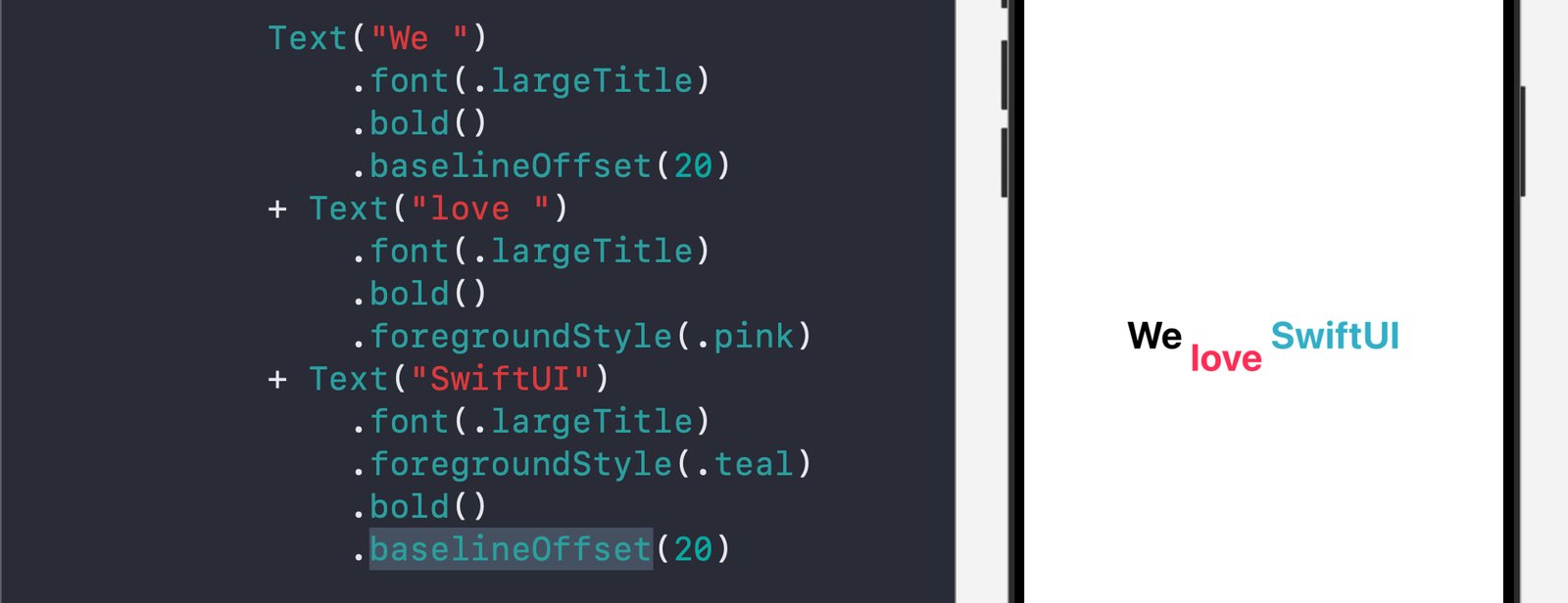
    You can join Text views by using the + operator.

    Adjust the offset (on vertical axis)

    You can use the baselineOffset view modifier to adjust the vertical offset of the text. You can also use the above method to create an artistic looking text:

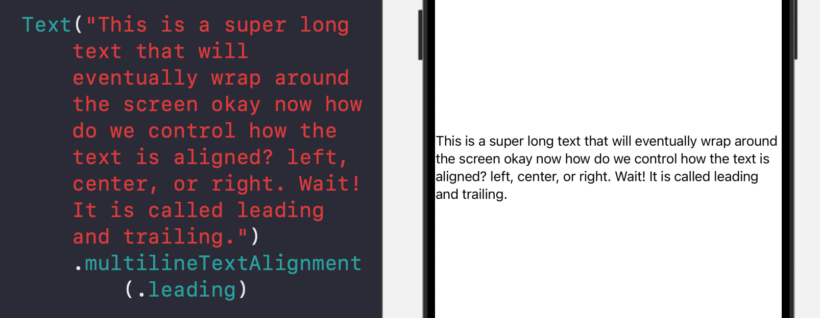
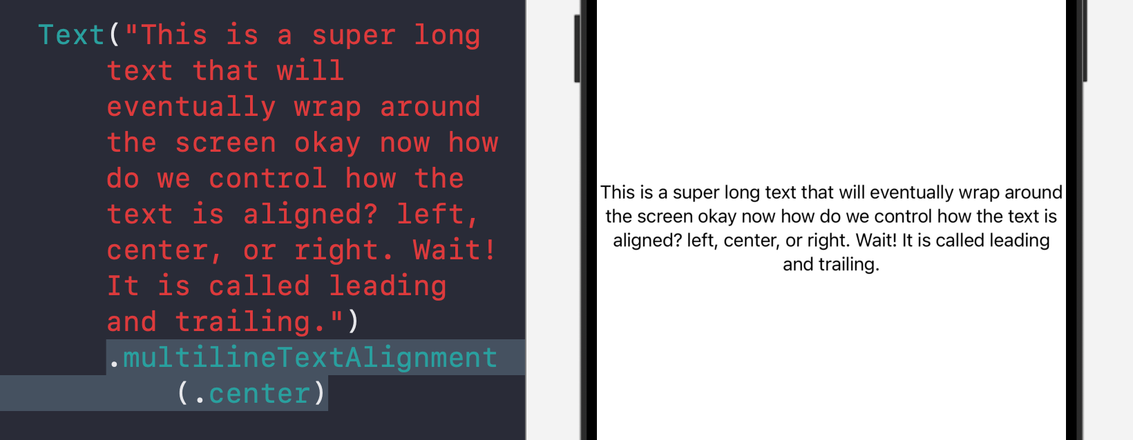
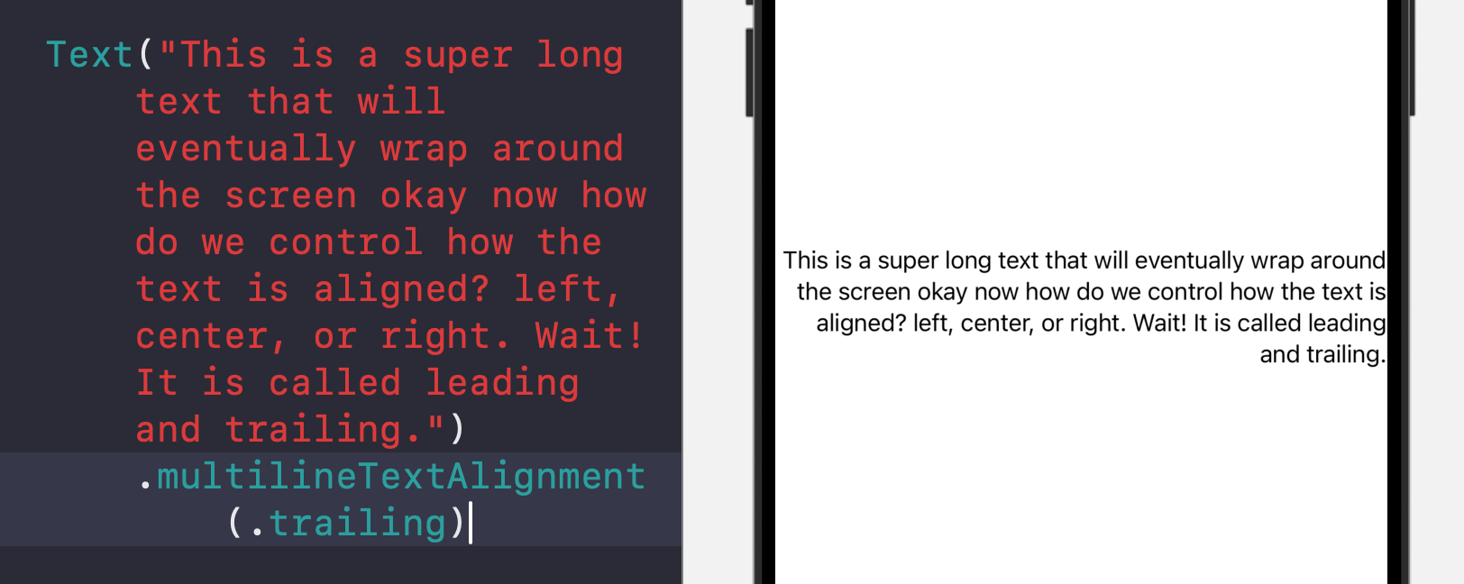
    Control where text is aligned for multiple lines

    You can use the multilineTextAlignment to control multi-line text alignment, whether all aligned to the left (leading) edge, the center, or the right (trailing edge)

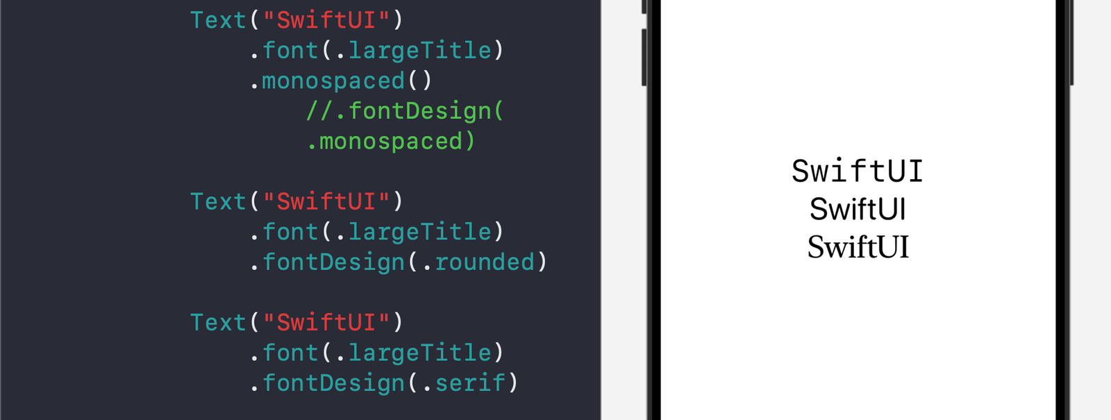
    Font design

    You can change the font design to fit the looking of your overall view:

    For example, you can use monospaced design to help the user see each character of the text clearly (for example, when displaying a username or password).

    Show SF Symbol within text

    You can show system symbol in line with the text:

    You can also use the \() format to show a variable like a number.

    Complete example code:

    //
    //  TextModifiers.swift
    //  WhatsNewIniOS18
    //
    //  Created by Msz on 8/10/24.
    //
    
    import SwiftUI
    
    struct TextModifiers: View {
        
        var body: some View {
            
            List {
                
                Text("I love SwiftUI")
                    .font(.system(size: 60))
                    .underline()
                
                Text("I love SwiftUI")
                    .font(.system(size: 60))
                    .underline(true, pattern: .dash, color: .teal)
                
                Text("I love SwiftUI")
                    .font(.system(size: 60))
                    .underline(true, pattern: .dot, color: .orange)
                
                Text("UIStoryboard")
                    .font(.system(size: 60))
                    .strikethrough()
                
                Text("UIStoryboard")
                    .font(.system(size: 60))
                    .strikethrough(true, pattern: .dash, color: .orange)
                
                Text("SwiftUI")
                    .font(.system(size: 60))
                    .kerning(1)
                
                Text("SwiftUI")
                    .font(.system(size: 60))
                    .kerning(6)
                
                Text("SwiftUI")
                    .font(.system(size: 60))
                    .kerning(12)
                
                Text("I love ").font(.largeTitle).bold() + Text("SwiftUI").font(.largeTitle).foregroundStyle(.orange).bold()
                
                Text("\(Image(systemName: "swift")) Text")
                    .font(.title)
                    .bold()
                    .baselineOffset(20)
                    .strikethrough(pattern: .dot)
                + Text("完全に")
                    .font(.largeTitle)
                    .bold()
                    .foregroundStyle(.pink)
                    .underline()
                + Text("理解した \(Image(systemName: "checkmark"))")
                    .font(.largeTitle)
                    .foregroundStyle(.teal)
                    .bold()
                    .baselineOffset(20)
                    .fontDesign(.serif)
                
                Text("This is a super long text that will eventually wrap around the screen okay now how do we control how the text is aligned? left, center, or right. Wait! It is called leading and trailing.")
                    .multilineTextAlignment(.trailing)
                
                Text("SwiftUI")
                    .font(.largeTitle)
                    .monospaced() //.fontDesign(.monospaced)
                
                Text("SwiftUI")
                    .font(.largeTitle)
                    .fontDesign(.rounded)
                
                Text("SwiftUI")
                    .font(.largeTitle)
                    .fontDesign(.serif)
                
            }
            
        }
        
    }
    
    #Preview {
        TextModifiers()
    }
    
  • SwiftUI List control spacing between sections (listSectionSpacing)

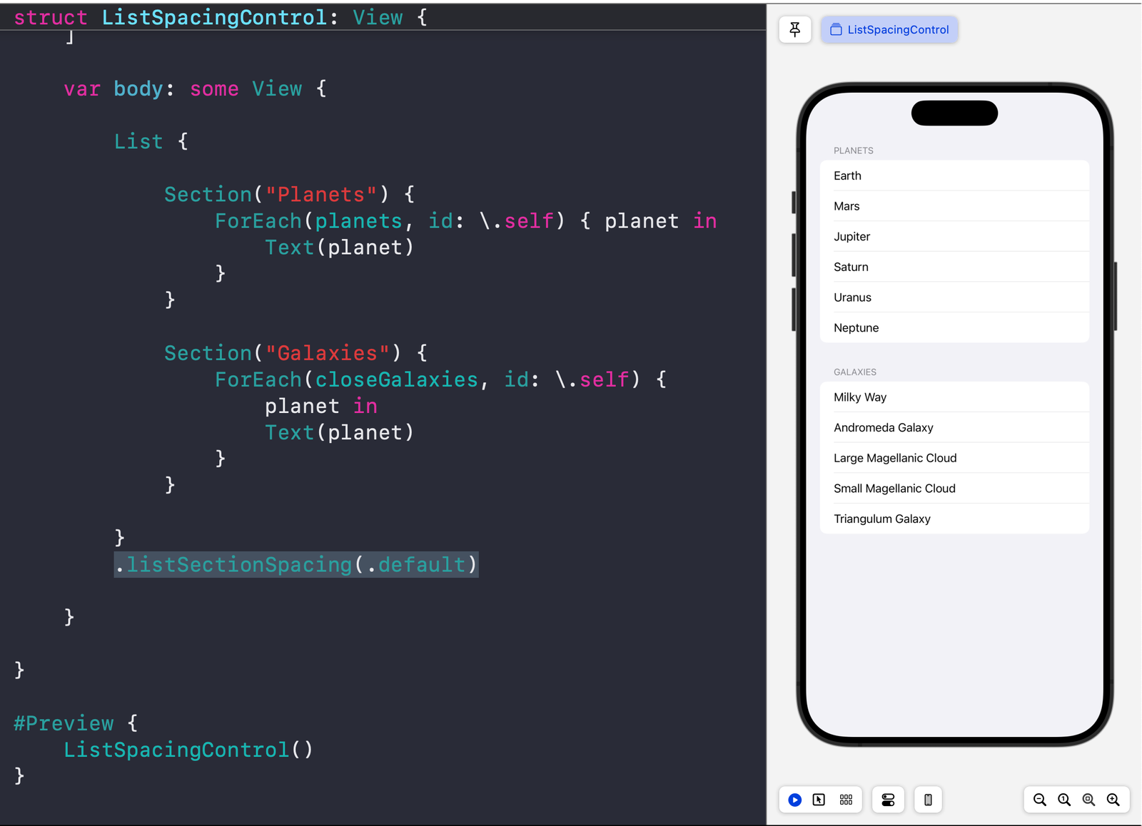
    In SwiftUI List, you can use the listSectionSpacing view modifier for List view to control how much space is in between different sections.

    Base code

    We will use this code as a starting point:

    //
    //  ListSpacingControl.swift
    //  WhatsNewIniOS18
    //
    //  Created by Msz on 8/10/24.
    //
    
    import SwiftUI
    
    struct ListSpacingControl: View {
        
        let planets: [String] = ["Earth", "Mars", "Jupiter", "Saturn", "Uranus", "Neptune"]
        let closeGalaxies = [
            "Milky Way",
            "Andromeda Galaxy",
            "Large Magellanic Cloud",
            "Small Magellanic Cloud",
            "Triangulum Galaxy"
        ]
        
        var body: some View {
            
            List {
                
                Section("Planets") {
                    ForEach(planets, id: \.self) { planet in
                        Text(planet)
                    }
                }
                
                Section("Galaxies") {
                    ForEach(closeGalaxies, id: \.self) { planet in
                        Text(planet)
                    }
                }
                
            }
            .listSectionSpacing(.default)
            
        }
        
    }
    
    #Preview {
        ListSpacingControl()
    }
    

    Default spacing

    Here, you can set the default spacing using the .default as the input to the view modifier.

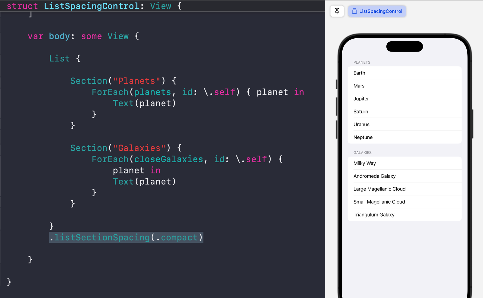
    Compact spacing

    You can set it to compact for relatively small spacing between different sections.

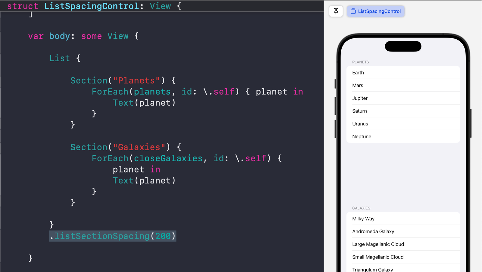
    Custom spacing

    You can set a custom spacing by providing a number.

  • Making a user-configurable widget for your iOS app

    In this article, we’ll cover the following:

    1. Adding Widgets to an Existing Application
    2. ⭐️ Adding Configurable Widgets (e.g., user selects a city)
    3. Reloading Widgets

    You can check out the completed source code here.

    Adding Widgets to an Existing Application

    Creating the Application Target

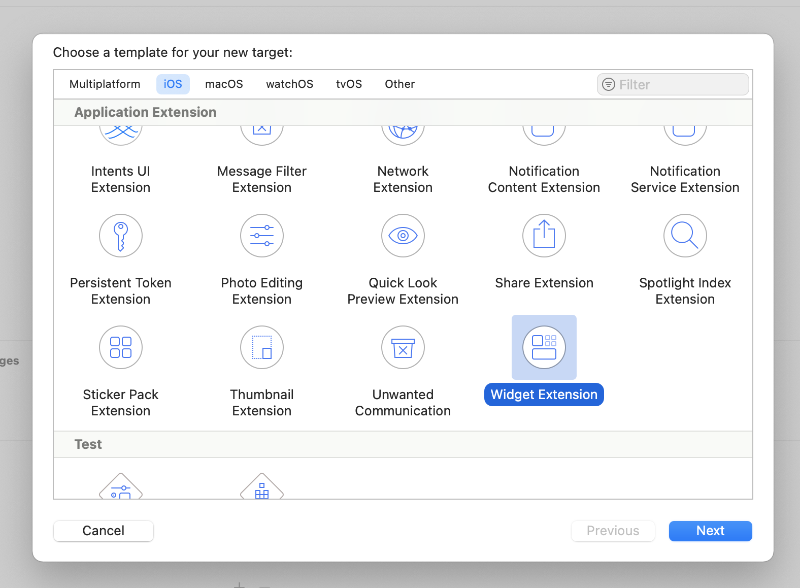
    Adding a widget to an existing iOS application is simple. Add the target Widget Extension.

    image

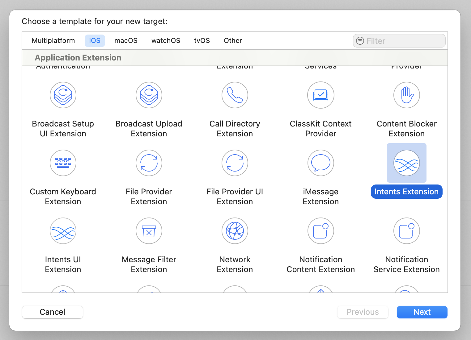
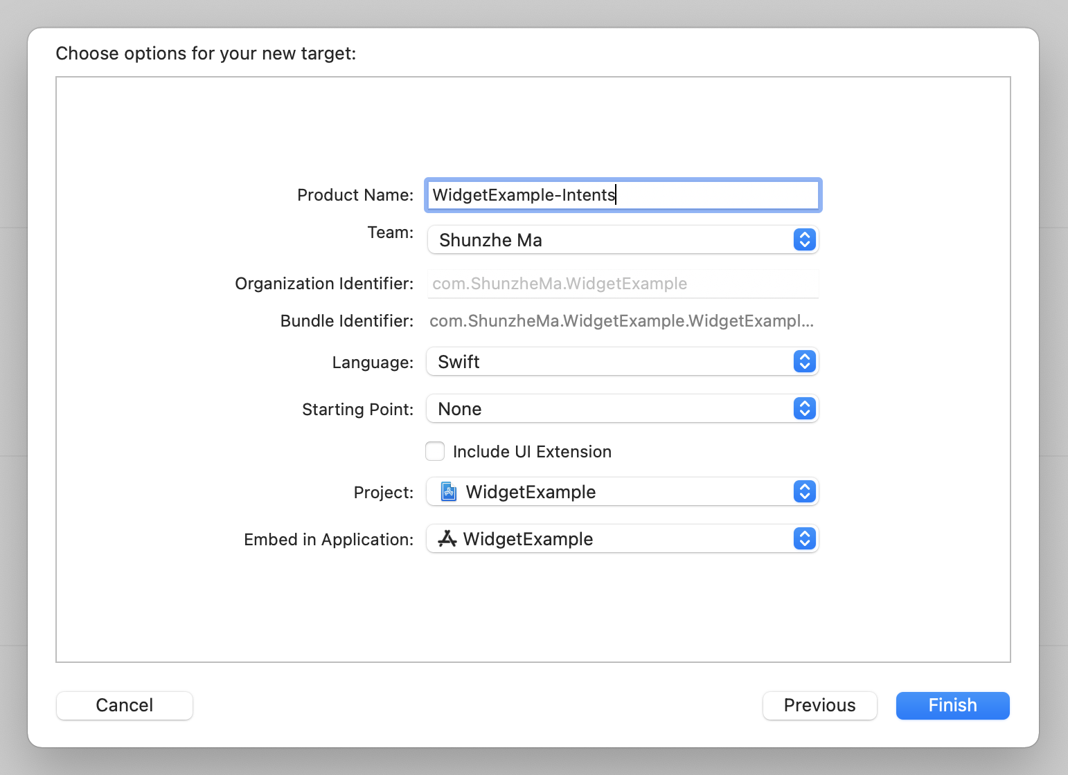
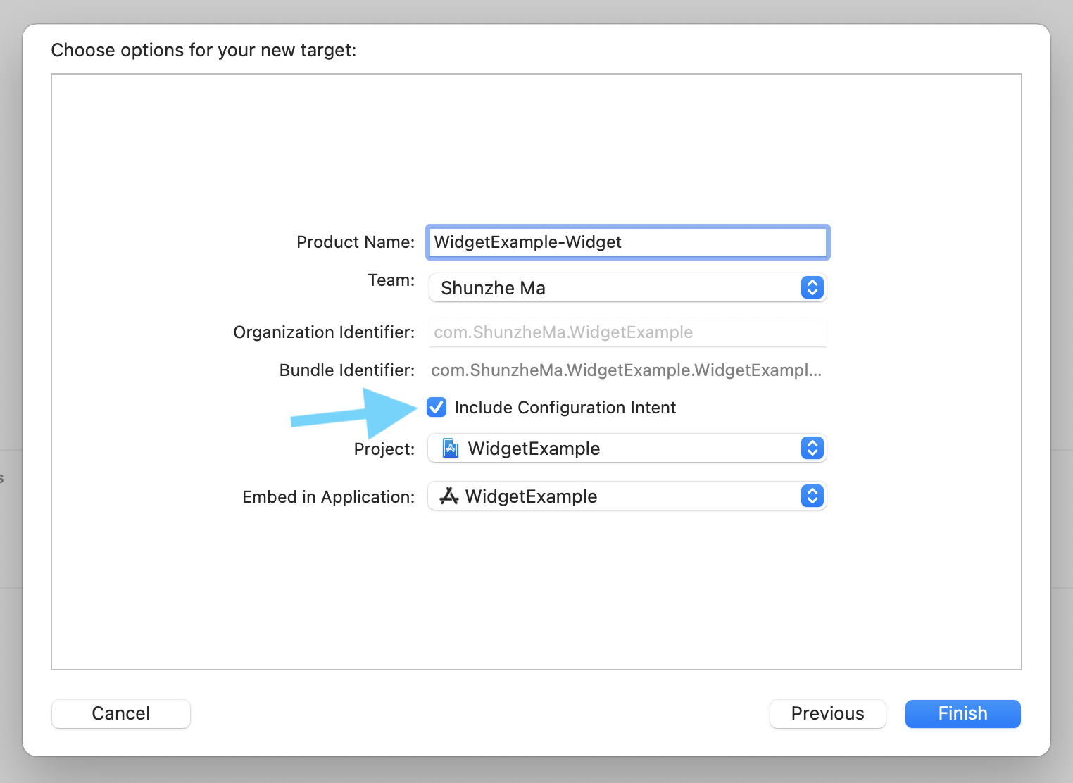
    Now, make sure you have checked the Include Configuration Intent box. We’ll need that configuration file in part 2 of this article.

    image

    Data Structure

    You should now see a new folder named WidgetExample-Widget. Click to open the file WidgetExample_Widget.swift, delete its contents, and follow this guide.

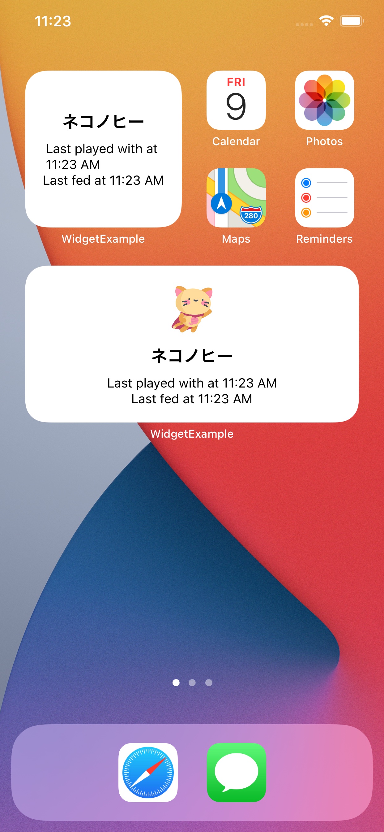
    You can create the data structure for the data you want to display in your widget. In this example, we’ll display information about a cat!

    struct CatEntry: TimelineEntry {
        var date: Date
        
        var name: String
        var lastFed: Date
        var lastPlayedWith: Date
    }
    

    Creating the IntentTimelineProvider Structure

    The IntentTimelineProvider structure provides three types of content:

    1. placeholder is displayed while the widget is loading.
    2. getSnapshot is shown in the widget gallery.
    3. getTimeline is used for the actual widget display.

    First, create a struct conforming to the IntentTimelineProvider type, then define the type of Entry.

    struct CatProviderStatic: TimelineProvider {
        typealias Entry = CatEntry
    
        func getSnapshot(in context: Context, completion: @escaping (CatEntry) -> Void) {
            //TODO
        }
    
        func getTimeline(in context: Context, completion: @escaping (Timeline<CatEntry>) -> Void) {
            //TODO
        }
    
        func placeholder(in context: Context) -> CatEntry {
            //TODO
        }
    }
    

    For the getSnapshot function, you can provide example values for the widget view to help users understand what information your widget will provide:

    func getSnapshot(in context: Context, completion: @escaping (CatEntry) -> Void) {
        let entry = CatEntry(date: Date(), name: "Cat Name", lastFed: Date(), lastPlayedWith: Date())
        completion(entry)
    }
    

    For the placeholder view, you can display empty or example values:

    func placeholder(in context: Context) -> CatEntry {
        return CatEntry(date: Date(), name: "Cat Name", lastFed: Date(), lastPlayedWith: Date())
    }
    

    For the timeline display, you can provide the actual content to be displayed.

    In this example, we display static data values. In your application, you can fetch content from Core Data (see this article on how to share data), online, from CloudKit, or from UserDefaults.

    func getTimeline(in context: Context, completion: @escaping (Timeline<CatEntry>) -> Void) {
        let entry = CatEntry(date: Date(), name: "Neko No Hī", lastFed: Date(), lastPlayedWith: Date())
        let timeline = Timeline(entries: [entry], policy: .atEnd)
        completion(timeline)
    }
    

    Adding Multiple Items to the Timeline

    You can also add multiple items to the timeline. The widget will automatically check the timeline items and reload at the times indicated.

    func getTimeline(in context: Context, completion: @escaping (Timeline<CatEntry>) -> Void) {
        var timelineEntries = [CatEntry]()
        if let date1 = Calendar.current.date(byAdding: .hour, value: 1, to: Date()) {
            let entry = CatEntry(date: date1, name: "Neko No Hī", lastFed: date1, lastPlayedWith: date1)
            timelineEntries.append(entry)
        }
        if let date2 = Calendar.current.date(byAdding: .hour, value: 2, to: Date()) {
            let entry = CatEntry(date: date2, name: "Neko No Hī", lastFed: date2, lastPlayedWith: date2)
            timelineEntries.append(entry)
        }
        let timeline = Timeline(entries: timelineEntries, policy: .atEnd)
        completion(timeline)
    }
    

    Designing the Widget View

    Now, you can design the SwiftUI view for your widget.

    struct CatWidgetView: View {
        
        @Environment(\.widgetFamily) var family
        
        var entry: CatEntry
        
        var body: some View {
            
            VStack {
                
                if family == .systemMedium || family == .systemLarge {
                    Image("kitty")
                        .resizable()
                        .frame(width: 50, height: 50)
                        .padding(.vertical, 5)
                }
                
                Text(entry.name)
                    .font(.headline)
                    .padding(1)
                
                Text("Last played with at " + entry.lastPlayedWith.getString())
                    .font(.caption)
                    .padding(.horizontal)
                
                Text("Last fed at " + entry.lastFed.getString())
                    .font(.caption)
                    .padding(.horizontal)
                
            }
            
        }
    }
    

    You can use the @Environment(\.widgetFamily) var family variable to check the size of the widget.

    In this example, we’re displaying a cat image if the widget is large enough to fit the image.

    if family == .systemMedium || family == .systemLarge {
        Image("kitty")
            .resizable()
            .frame(width: 50, height: 50)
            .padding(.vertical, 5)
    }
    

    Coding the Widget Application

    Now, you can code the widget application.

    @main
    struct CatWidget: Widget {
        
        var body: some WidgetConfiguration {
            IntentConfiguration(kind: "CatWidget", intent: ConfigurationIntent.self, provider: CatProvider()) { entry in
                CatWidgetView(entry: entry)
            }.configurationDisplayName("Cat")
            .description("See when you last fed or played with your cat.")
        }
    }
    

    Now you can run the app on the simulator and add the widget you just designed to your screen.

    image

    Adding Configurable Widgets

    If you’ve used a weather widget, you’ll know that by long-pressing on the widget, users can configure it to display different cities. You can add this functionality using the Intents framework and Target.

    Adding the Intents Program Target

    image

    At this stage, UI elements are unnecessary, so uncheck the Include UI Extension option.

    image

    In the created Intents target page, find the section named Supported Intents. Create a new item named ConfigurationIntent. Now, you can name this to anything, but make sure to be consistent and use the same name for the upcoming steps.

    スクリーンショット 0002-10-09 15.16.55.png
    スクリーンショット 0002-10-09 15.11.01.png

    Configuring .intentdefinition

    Next, in

    the previously created widget, add the newly created Intents extension as the intent target for the WidgetExample_Widget.intentdefinition file.

    If you do not yet have an intentdefinition file, you can create one. Make sure to link the file to both the widget and the intent target.

    image

    Click Configuration on the left side of the screen. If no configurations exists, tap the plus mark and create a new intent, and modify the name to be Configuration

    image

    On the right side, ensure the configuration matches the following image.

    image

    Next, add a new parameter named cat.

    image

    In the settings screen for the newly created cat parameter, select String for the Type to use as the identifier for the cat.

    image

    Configuring IntentHandler

    Next, open the IntentHandler.swift file. This file provides options for users to configure the widget. In this example, the option will be the cat identifier.

    Add the keyword ConfigurationIntentHandling next to the class type INExtension to allow Xcode to automatically display the next function names to add.

    class IntentHandler: INExtension, ConfigurationIntentHandling {
        ...
    }
    

    In this example, the completed IntentHandler.swift file looks like this:

    class IntentHandler: INExtension, ConfigurationIntentHandling {
        
        func provideCatOptionsCollection(for intent: ConfigurationIntent, searchTerm: String?, with completion: @escaping (INObjectCollection<NSString>?, Error?) -> Void) {
            let catIdentifiers: [NSString] = [
                "Neko No Hī",
                "Mugi",
                "Azuki"
            ]
            let allCatIdentifiers = INObjectCollection(items: catIdentifiers)
            completion(allCatIdentifiers, nil)
        }
        
        override func handler(for intent: INIntent) -> Any {
            // This is the default implementation. If you want different objects to handle different intents,
            // you can override this and return the handler you want for that particular intent.
            return self
        }
    }
    

    In the provideCatOptionsCollection function, you need to input a list of values. These values can actually be fetched from User Defaults, Core Data, or online. In this example, the values are hard-coded.

    Using Core Data with App Extensions

    Creating IntentTimelineProvider

    In part 1 of this article, we used TimelineProvider. This time, we’ll use IntentTimelineProvider.

    If you already have a regular timeline provider, you should replace all the function headers (parameters).

    The data structures between IntentTimelineProvider and TimelineProvider are almost identical. The difference is that you’ll need to declare an additional typealias.

    typealias Intent = ConfigurationIntent
    

    Another difference is that each function receives an additional parameter representing the intent selection ConfigurationIntent.

    struct CatProvider: IntentTimelineProvider {
        
        typealias Intent = ConfigurationIntent
        typealias Entry = CatEntry
        
        func placeholder(in context: Context) -> CatEntry {
            let entry = CatEntry(date: Date(), name: "", lastFed: Date(), lastPlayedWith: Date())
            return entry
        }
        
        func getSnapshot(for configuration: ConfigurationIntent, in context: Context, completion: @escaping (CatEntry) -> Void) {
            let entry = CatEntry(date: Date(), name: "Cat Name", lastFed: Date(), lastPlayedWith: Date())
            completion(entry)
        }
        
        func getTimeline(for configuration: ConfigurationIntent, in context: Context, completion: @escaping (Timeline<CatEntry>) -> Void) {
            let entry = CatEntry(date: Date(), name: configuration.cat ?? "", lastFed: Date(), lastPlayedWith: Date())
            let timeline = Timeline(entries: [entry], policy: .atEnd)
            completion(timeline)
        }
    }
    

    You can use the configuration.cat property to read the value of the option selected by the user.

    let entry = CatEntry(date: Date(), name: configuration.cat ?? "", lastFed: Date(), lastPlayedWith: Date())
    

    Updating CatWidget Code

    In part 1, we used StaticConfiguration. In this part, we’ll use IntentConfiguration (the name set in Supported Intents).

    @main
    struct CatWidget: Widget {
        
        var body: some WidgetConfiguration {
            IntentConfiguration(kind: "CatWidget", intent: ConfigurationIntent.self, provider: CatProvider()) { entry in
                CatWidgetView(entry: entry)
            }.configurationDisplayName("Cat")
            .description("See when you last fed or played with your cat.")
        }
    }
    

    Now you can run the program on the simulator. By long-pressing the widget, you’ll see an option named Edge Widget and you can change the cat name.

    ezgif-6-bf9e4b4783c9.gif

    Reloading Widgets

    If content in the widget changes, you can manually call the reload function for the widget from the main iOS application.

    // import WidgetKit
    WidgetCenter.shared.reloadAllTimelines()
    

    For example, if you have a ToDo app and a widget displaying the number of ToDo items, you can reload the widget when the user completes or adds a ToDo item.

    :relaxed: Twitter @MszPro

    :sunny: Check out my list of publicly available Qiita articles by category.

  • SwiftUIでTipKitを使用してユーザーにヒントを表示(iOS 17、WWDC 2023)

    この記事では、iOS 17の新しいTipKitフレームワークを使用して、アプリ内のさまざまな機能をユーザーに発見させる方法について説明します。

    tipkit-inline-2.jpg

    本記事の内容は以下の通りです:

    • インラインヒントの表示
    • フローティングヒントの表示
    • 条件に基づくヒントの表示
    • カウンターに基づくヒントの表示
    • ヒントのアクションボタンのカスタマイズ

    この記事は、主にSwiftUIを対象としています。

    Tipオブジェクトの定義

    Tipオブジェクトには、画像、タイトル、説明、およびヒントのアクションが含まれています。以下はシンプルなヒントの例です:

    var asset: Image? には、ヒントの左側に表示するオプションの画像を提供できます。
    var title: Text には、このヒントのタイトルとして表示したいSwiftUIのテキストを提供します。
    var message: Text? には、タイトルの下部に表示されるオプションの説明文字列を提供できます。

    import TipKit
    
    struct HashTagPostButtonTip: Tip {
        var image: Image? {
            Image(systemName: "star.bubble")
        }
        var title: Text {
            Text("Send a Quick Response")
        }
        var message: Text? {
            Text("Double-tap a message, then choose a Tapback, like a ♥︎.")
        }
    }
    
    tipkit-floating.jpg

    また、var rules: [Rule] および var actions: [Action] パラメータもありますが、これについては記事の次のセクションで説明します。

    ヒントの表示

    ヒントを表示する方法は2つあります。

    apple-tip-view-ways.jpeg

    (from WWDC video)

    インラインヒント

    ヒントをビュー内に表示することができます。ヒントビューは、あなたの機能(例:ボタン)を指す矢印とともに表示されます。これは、TipViewをビューコードに直接含めることで実現できます:

    tipkit-inline-2.jpg
    import SwiftUI
    import TipKit
    
    struct TipWithArrow: View {
        var body: some View {
            VStack {
                
                HStack {
                    TipView(HashTagPostButtonTip(), arrowEdge: .trailing)
                    
                    Image(systemName: "number")
                        .font(.system(size: 30))
                        .foregroundStyle(.white)
                        .padding()
                        .background { Circle().foregroundStyle(.blue) }
                }
                
            }
            .padding()
            .task {
                try? Tips.configure([
                    .displayFrequency(.immediate),
                    .datastoreLocation(.applicationDefault)
                ])
            }
        }
    }
    
    #Preview {
        TipWithArrow()
    }
    

    arrowEdge パラメータを使用して、矢印の指す方向を決定することができます。
    .trailing に設定すると、ヒントは右側を指す矢印を表示します(つまり、機能ボタンが右側にあります)。
    また、機能ボタンが左側にあり(表示されているヒントがボタンの右側にある場合)、.leadingに設定します。

    フローティング(ポップオーバー)ヒント

    ボタンにフローティングヒントを添付するためのビューモディファイアも使用できます。これは、例えばナビゲーションボタンに対するヒントを表示したい場合に便利です:

    floating-tip.jpg
    struct PopOverTip: View {
        
        var hashtagButtonTip = HashTagPostButtonTip()
        
        var body: some View {
            VStack {
                
                Text("Hello world!")
                
            }
            .padding()
            .toolbar {
                ToolbarItem(placement: .navigationBarTrailing) {
                    Image(systemName: "number")
                        .onTapGesture {
                            hashtagButtonTip.invalidate(reason: .actionPerformed)
                        }
                        .popoverTip(hashtagButtonTip)
                }
            }
            .task {
                try? Tips.configure([
                    .displayFrequency(.immediate),
                    .datastoreLocation(.applicationDefault)
                ])
            }
        }
        
    }
    
    #Preview {
        PopOverTip()
    }


    If you want your app to be compatible also with previous iOS versions, you can use a similar technique as shown below to create a conditional view modifier:

    extension View {
    	@ViewBuilder
    	func tipIfAvailable(with tip: Tip) -> some View {
    		if #available(iOS 17, *) {
    			self
    				.popoverTip(tip)
    		}
    	}
    }
    

    ヒントの頻度

    デフォルトでは、各ヒントは一度だけ表示されます。
    .displayFrequency(.immediate) に設定すると、ユーザーが以前にヒントを見ていない場合、ヒントはすぐに表示されます。
    他の表示頻度も設定することができます。例えば、.hourly に設定すると、システムは1時間に1回以上ヒントが表示されないようにします。
    ヒントデータの保存場所(ヒントが表示されたかどうか)も .datastoreLocation(.applicationDefault) 関数を使用してカスタマイズできます。

    特定の条件が満たされたときにヒントを表示

    特定の条件が満たされた場合にのみヒントを表示することができます。例えば、プレミアム機能のヒントは、ユーザーがプレミアム機能を購入した場合にのみ表示されるべきです。
    Tipオブジェクトの静的変数を定義することができます。その後、その静的変数に値を割り当てることで、ヒントが表示されるかどうかを制御することができます。

    import TipKit
    
    struct PremiumUserOnlyTip: Tip {
        
        @Parameter
        static var isPremiumUser: Bool = false
        
        var image: Image? {
            Image(systemName: "wand.and.rays")
        }
        var title: Text {
            Text("Add an Effect")
        }
        var message: Text? {
            Text("Choose a fun Live Photo effect like Loop or Bounce.")
        }
        
        var rules: [Rule] {
            #Rule(Self.$isPremiumUser) {
                $0 == true
            }
        }
        
    }


    アプリの起動時に、静的変数 PremiumUserOnlyTip.isPremiumUser を設定することで、ヒントはプレミアムユーザーのみに表示されます。

    ユーザーのインタラクションを記録し、それに応じてヒントを表示

    ユーザーのインタラクションをカウンターとして記録(アプリを使用した回数など)し、ユーザーが要件を満たしたときのみヒントを表示することができます。

    import TipKit
    
    struct UsageFrequencyBasedTip: Tip {
        
        static let numerOfTimesOpened: Event = Event(id: "com.example.TipKit.numberOfTimesOpened")
        
        var image: Image? {
            Image(systemName: "star.fill")
        }
        var title: Text {
            Text("Tap to download HD picture")
        }
        var message: Text? {
            Text("Only for premium users")
        }
        
        var rules: [Rule] {
            #Rule(Self.numerOfTimesOpened) {
                $0.donations.count >= 3
            }
        }
        
    }
    

    上記のコードでは、Eventオブジェクトを使用してアプリを開いた回数を記録します。rulesパラメータでは、Swiftのマクロを使用して、ユーザーがアプリを開いた回数が3回以上の場合にのみヒントが表示されることを示しています。
    これで、アプリ内で以下のコードを使用してカウンターをインクリメントできます:

    Button("tap this button 3 times") {
        Task {
            await UsageFrequencyBasedTip.numerOfTimesOpened.donate()
        }
    }
    

    UsageFrequencyBasedTip.numerOfTimesOpened.donate() 関数を3回呼び出すと、ヒントが表示されます

    カスタムアクション付きヒント

    ヒントのアクションボタンを提供することもできます:

    tip-custom-actions.jpg
    import TipKit
    
    struct TipWithOptions: Tip {
        
        var image: Image? {
            Image(systemName: "star.bubble")
        }
        
        var title: Text {
            Text("Send a Quick Response")
        }
        
        var message: Text? {
            Text("Double-tap a message, then choose a Tapback, like a ♥︎.")
        }
        
        var actions: [Action] {
            return [
                .init(id: "learn-more", title: "Learn more", perform: {
                    print("Learn more tapped")
                }),
                .init(id: "enable-feature", title: "Enable magic feature", perform: {
                    print("Enable feature tapped")
                })
            ]
        }
        
    }

    ヒントのデバッグ

    以下の関数を使用して、ヒントをデバッグすることができます:
    ヒントが表示されたかどうかのストレージデータベースをリセット:

    try? Tips.resetDatastore()

    上記のコードは、Tips/configure(options:)を呼び出す前に呼び出す必要があります。
    ヒントが以前に表示されたかどうかに関係なく、すべてのヒントを表示することもできます:

    Tips.showAllTipsForTesting()

    ヒントが以前に表示されたかどうかに関係なく、特定のヒントを表示する:

    Tips.showTipsForTesting([ExampleTip.self])

    パラメータで、ヒントのタイプの配列を提供します。
    すべてのヒントを隠す、または特定のタイプのヒントのみを隠すこともできます:

    Tips.hideAllTipsForTesting()
    Tips.hideTipsForTesting(_ tips: [Tip.Type])

    サンプルコード

    iOS 17が公開された後、サンプルのXcodeプロジェクトをアップロードします。

    Good & NG

    tipkit-good.jpeg
    tipkit-ng.jpg

    プロモーションのヒントを表示すべきではありません。TipKitを使用してエラーメッセージを表示しないでください。実行可能なアイテム(例:クリック可能な機能ボタン)に関連したヒントのみを表示し、ヒント内に詳細な手順を表示しないでください(NGの例で示されているように。その場合、ユーザーにオプションを提供するためにカスタムアクションボタンを使用するのが最善)。

    (source: public Apple session videos)


    お読みいただき、ありがとうございました。

    ニュースレター: https://blog.mszpro.com

    Mastodon/MissKey: @[email protected] https://sns.mszpro.com

    :relaxed: Twitter @MszPro

    :relaxed: 個人ウェブサイト https://MszPro.com


    上記内容の一部は、Apple社のサンプルコードから引用しています。ライセンスは下記に添付しています:

    Copyright © 2023 Apple Inc.
    
    Permission is hereby granted, free of charge, to any person obtaining a copy of this software and associated documentation files (the "Software"), to deal in the Software without restriction, including without limitation the rights to use, copy, modify, merge, publish, distribute, sublicense, and/or sell copies of the Software, and to permit persons to whom the Software is furnished to do so, subject to the following conditions:
    
    The above copyright notice and this permission notice shall be included in all copies or substantial portions of the Software.
    
    THE SOFTWARE IS PROVIDED "AS IS", WITHOUT WARRANTY OF ANY KIND, EXPRESS OR IMPLIED, INCLUDING BUT NOT LIMITED TO THE WARRANTIES OF MERCHANTABILITY, FITNESS FOR A PARTICULAR PURPOSE AND NONINFRINGEMENT. IN NO EVENT SHALL THE AUTHORS OR COPYRIGHT HOLDERS BE LIABLE FOR ANY CLAIM, DAMAGES OR OTHER LIABILITY, WHETHER IN AN ACTION OF CONTRACT, TORT OR OTHERWISE, ARISING FROM, OUT OF OR IN CONNECTION WITH THE SOFTWARE OR THE USE OR OTHER DEALINGS IN THE SOFTWARE.
    

  • Using TipKit to display a tip to the user in SwiftUI for onboarding

    This article is about using the new TipKit framework for iOS 17 to help the user discover various features within your app.

    This article will cover:

    • displaying an inline tip
    • displaying floating tip
    • display tip based on conditions
    • display tip based on a counter

    This article is primarily for SwiftUI.

    This article is written with public resources and may contain screenshots from public Apple documentations and example codes. To see how it works, please try it yourself with the Xcode 15

    Define a Tip object

    Tip object contains the image, title, description, and the actions for a tip. Here is a simple tip:

    import TipKit

    struct HashTagPostButtonTip: Tip {
    var image: Image? {
    Image(systemName: "star.bubble")
    }
    var title: Text {
    Text("Send a Quick Response")
    }
    var message: Text? {
    Text("Double-tap a message, then choose a Tapback, like a ♥︎.")
    }
    }

    In the var asset: Image?, you can provide an optional image to be displayed on the left side of the tip.

    In the var title: Text, you will provide a SwiftUI Text for the text you want to show as the title of this tip.

    In the var message: Text?, you can provide an optional description string that will be displayed at the bottom of the title.

    There is also a var rules: [Rule] and the var actions: [Action]parameter, which we will talk about in the next section of this article.

    Displaying a tip

    There are 2 ways to display a tip.

    image from public documentation on developer.apple.com

    inline tips

    You can display the tip within your view. The tip view will come with an arrow that points to your feature (for example, a button). You can do that by directly including TipView in your view code:

    import SwiftUI
    import TipKit

    struct TipWithArrow: View {
    var body: some View {
    VStack {

    HStack {
    TipView(HashTagPostButtonTip(), arrowEdge: .trailing)

    Image(systemName: "number")
    .font(.system(size: 30))
    .foregroundStyle(.white)
    .padding()
    .background { Circle().foregroundStyle(.blue) }
    }

    }
    .padding()
    .task {
    try? Tips.configure([
    .displayFrequency(.immediate),
    .datastoreLocation(.applicationDefault)
    ])
    }
    }
    }

    #Preview {
    TipWithArrow()
    }

    You can use the arrowEdge parameter to decide which direction the arrow points to. Set to .trailing so that the tip will display an arrow point to the right side (meaning the feature button is on the right); or set it to .leading when the feature button is on the left (and the shown tip is on the right side of the button).

    Floating (popover) tips

    You can also use a view modifier to attach a floating tip to a button. This is useful for example when you want to show a tip for a navigation button:

    struct PopOverTip: View {

    var hashtagButtonTip = HashTagPostButtonTip()

    var body: some View {
    VStack {

    Text("Hello world!")

    }
    .padding()
    .toolbar {
    ToolbarItem(placement: .navigationBarTrailing) {
    Image(systemName: "number")
    .onTapGesture {
    hashtagButtonTip.invalidate(reason: .actionPerformed)
    }
    .popoverTip(hashtagButtonTip)
    }
    }
    .task {
    try? Tips.configure([
    .displayFrequency(.immediate),
    .datastoreLocation(.applicationDefault)
    ])
    }
    }

    }

    #Preview {
    PopOverTip()
    }

    Tip frequency

    By default, each tip only shows once.

    When you set .displayFrequency(.immediate), the tip will be immediately shown if the user has not seen the tip before.

    You can also set other display frequencies. For example, if you set it to .hourly, the system makes sure that no more than 1 tip is shown every hour.

    You can also customize where the tip data (whether the tips have been shown or not) by using the .datastoreLocation(.applicationDefault) function.

    Show tip when certain condition is met

    You can only show a tip when certain condition is met. For example, a tip for a premium feature should only be shown if the user has purchased the premium feature.

    You can define a static variable for the Tip object. Then, you can assign values to that static variable to control whether the tip is shown or not.

    import TipKit

    struct PremiumUserOnlyTip: Tip {

    @Parameter
    static var isPremiumUser: Bool = false

    var image: Image? {
    Image(systemName: "wand.and.rays")
    }
    var title: Text {
    Text("Add an Effect")
    }
    var message: Text? {
    Text("Choose a fun Live Photo effect like Loop or Bounce.")
    }

    var rules: [Rule] {
    #Rule(Self.$isPremiumUser) {
    $0 == true
    }
    }

    }

    On app launch, we can set the static variable isPremiumUser so the tip will only be shown for users who is premium.

    PremiumUserOnlyTip.isPremiumUser = isPremiumUser

    Record user interactions and show tips accordingly

    You can record user interactions as a counter (like the number of times that the user used your app) and only show tips when the user has met a requirement.

    import TipKit

    struct UsageFrequencyBasedTip: Tip {

    static let numerOfTimesOpened: Event = Event(id: "com.example.TipKit.numberOfTimesOpened")

    var image: Image? {
    Image(systemName: "star.fill")
    }
    var title: Text {
    Text("Tap to download HD picture")
    }
    var message: Text? {
    Text("Only for premium users")
    }

    var rules: [Rule] {
    #Rule(Self.numerOfTimesOpened) {
    $0.donations.count >= 3
    }
    }

    }

    In the above code, we record the number of times user opened the app using an Event object. In the rules parameter, we use a Swift Macro and indicate that the tip will only be shown if the times user opened is larger than or equal to 3.

    Now, we can increment the counter by using the following code in our app:

    Button("tap this button 3 times") {
    Task {
    await UsageFrequencyBasedTip.numerOfTimesOpened.donate()
    }
    }

    When you call donate() function for 3 times, the tip will be shown.

    Tip with custom actions

    You can also provide your action buttons for a tip:

    import TipKit

    struct TipWithOptions: Tip {

    var image: Image? {
    Image(systemName: "star.bubble")
    }

    var title: Text {
    Text("Send a Quick Response")
    }

    var message: Text? {
    Text("Double-tap a message, then choose a Tapback, like a ♥︎.")
    }

    var actions: [Action] {
    return [
    .init(id: "learn-more", title: "Learn more", perform: {
    print("Learn more tapped")
    }),
    .init(id: "enable-feature", title: "Enable magic feature", perform: {
    print("Enable feature tapped")
    })
    ]
    }

    }

    Debugging tips

    You can debug your tips by using the following function:

    Reset the storage database for whether tips are shown or not:

    try? Tips.resetDatastore()

    The above code must be called before calling Tips/configure(options:)

    You can also show all tips regardless of whether a tip has been shown before:

    Tips.showAllTipsForTesting()

    You can show a specific tip regardless of whether it has been shown before:

    Tips.showTipsForTesting([ExampleTip.self])

    in the parameter, provide an array of the type of the tips.

    You can also hide all tips, or just hide a specific type of tip:

    Tips.hideAllTipsForTesting()
    Tips.hideTipsForTesting(_ tips: [Tip.Type])

    Good vs Not Good

    Good Examples. image from public documentation on developer.apple.com
    NG (Not Good). image from public documentation on developer.apple.com

    vYou should not show promotion tips, do not use TipKit to show error messages, only show tip that is associated with an actionable item (for example, a clickable feature button), and do not show detailed steps within the tip (like shown in the example of the NG)

  • 「iOS 17」SwiftUIの新たな19本の機能とビュー(コード例付き)(WWDC 2023)

    目次

    • スクロールビューで特定の位置までスクロール
    • App Storeで購入可能なアイテムを表示
    • App Storeのサブスクリプションを表示
    • 写真がNSFWかどうかを分析
    • データストレージSwiftDataを使用
    • SwiftUIのビュースタイルのためにMetalシェーダーを使用
    • マップにマーカーやその他のコンポーネントを追加
    • SFシンボルの画像エフェクト(パルス、反転、バウンス、スケール、表示/非表示、トランジション)
    • 回転のジェスチャー
    • インスペクタビュー(右側に表示されるサイドバー)
    • 新しい#previewプレビューブロック
    • foregroundStyleスタイルの使用
    • TipKitを使ったヒントの表示
    • Swift Macro

    はじめに

    この記事の多くの部分(例えば、SwiftData、センシティブコンテンツ分析など)については、後ほどQiitaの記事でより詳しい解説を書く予定です。

    ※一般公開されている(一般に開示した情報)WWDC Keynoteの動画と公開Session/Documentationページだけを使ってこの記事を執筆しました。スクリーンショットはWWDCのセッション映像のものを使用しています。Xcodeのベータ版にアクセスできる場合は、自身でコードを実行されることをお勧めします。

    ScrollView内で特定の位置までスクロールする

    ScrollViewとその内部のスタック構造を使用している場合、
    特定の行までビューをスクロールすることができます。

    まず、.scrollTargetLayout()というビューモディファイアを、ScrollView内に主要な繰り返しコンテンツを含むレイアウトコンテナに追加します。これはVStack、LazyHStack、HStack、またはForEachなどになります。

    import SwiftUI
    
    struct ScrollViewToRow: View {
        var body: some View {
            VStack {
                ScrollView {
                    ForEach(1..<30, id: \.self) { number in
                        // ...
                    }
    +                .scrollTargetLayout()
                }
            }
        }
    }
    

    この例では、1から30までのすべての数字をループするためにForEachを使用しています。したがって、このビューモディファイアをForEachに追加します。

    次に、scrollPositionビューモディファイアを使用してスクロール位置をバインドします。このビューモディファイアはScrollViewに添付されます。

    import SwiftUI
    
    struct ScrollViewToRow: View {
    +    @State private var scrollPosition: Int? = 0
        var body: some View {
            VStack {
                ScrollView {
                    ForEach(1..<30, id: \.self) { number in
                        // ...
                    }
                        .scrollTargetLayout()
                }
    +            .scrollPosition(id: $scrollPosition)
            }
        }
    }
    

    オプションのInt型の@State変数を使用します。

    新しい値を割り当てることでスクロール位置を更新することができます。コードをwithAnimationブロック内に配置すると、スクロールアニメーションが表示されます。

    現在のスクロール位置を読み取ることもできます。

    import SwiftUI
    
    struct ScrollViewToRow: View {
        
        @State private var scrollPosition: Int? = 0
        
        var body: some View {
            
            VStack {
                
                Text("currently at \(scrollPosition ?? -1)")
                
                Button("Scroll") {
                    withAnimation {
                        scrollPosition = 10
                    }
                }
                
                ScrollView {
                    ForEach(1..<30, id: \.self) { number in
                        HStack {
                            Text(verbatim: number.formatted())
                            Spacer()
                        }
                        .padding()
                        .foregroundStyle(.white)
                        .background {
                            RoundedRectangle(cornerRadius: 10)
                                .foregroundStyle(.teal)
                        }
                    }
                        .scrollTargetLayout()
                }
                .scrollPosition(id: $scrollPosition)
                
            }
            .padding()
            
        }
        
    }
    
    #Preview {
        ScrollViewToRow()
    }
    

    App Storeのアプリ内購入製品を表示

    IMG_1155.JPG

    このビューでは、1つの製品を表示しています。
    複数の商品を紹介するスクロールビューや水平スタックなどを作成することができます。

    この話題については後で詳しくQiitaの記事を書きます

    App Storeから取得した製品IDを使用して、ProductViewを初期化できます。

    大きな製品ビュー(上記のBox of Nutrition Pelletsのような)を表示するためには、ビューモディファイア .productViewStyle(.large) を使用します。

    ProductView(id: ids.nutritionPelletBox) {
        BoxOfNutritionPelletsIcon()
    }
    .productViewStyle(.large)
    

    ProductViewのコードブロック内では、製品のアイコン(たとえば、Image)を提供できます。

    App Storeのすべてのサブスクリプションを表示

    Appleから提供されるプレスタイルのビューを使用して、App Storeのサブスクリプションを表示することができます。

    これを最も簡単に表示する方法は、SubscriptionStoreView(groupID: birdPassGroupID)を呼び出すだけで、非常にシンプルなビューが表示されます。

    IMG_1156.JPG

    この話題については後で詳しくQiitaの記事を書きます

    このビューはカスタマイズ可能で、カスタムヘッダー、背景、アイコンを表示できます。

    まず、サブスクリプショングループIDを使用してSubscriptionStoreViewを初期化します。visibleRelationshipsでは、アップグレードのみを表示するか、すべてのオプション(ダウングレードオプションを含む)を表示するかを定義できます。

    ブロック内では、PassMarketingContent(オプション)がヘッダーとして表示されます。ここでは、アプリのアイコン、サブスクリプショングループ名、サブスクリプションの利点を簡単に説明できます。

    また、.subscriptionStoreControlIcon(オプション)ビューモディファイアを使用して、各サブスクリプションアイテムのアイコンを定義することもできます。

    SubscriptionStoreView(
        groupID: passGroupID,
        visibleRelationships: showPremiumUpgrade ? .upgrade : .all
    ) {
        PassMarketingContent(showPremiumUpgrade: showPremiumUpgrade)
    #if !os(watchOS)
            .containerBackground(for: .subscriptionStoreFullHeight) {
                SkyBackground()
            }
    #endif
    }
    #if os(iOS)
    .storeButton(.visible, for: .redeemCode)
    #else
    .frame(width: 400, height: 550)
    #endif
    .subscriptionStoreControlIcon { _, subscriptionInfo in
        Group {
            switch PassStatus(levelOfService: subscriptionInfo.groupLevel) {
                case .premium:
                    Image(systemName: "bird")
                case .family:
                    Image(systemName: "person.3.sequence")
                default:
                    Image(systemName: "wallet.pass")
            }
        }
        .foregroundStyle(.accent)
        .symbolVariant(.fill)
    }
    #if !os(watchOS)
    .backgroundStyle(.clear)
    .subscriptionStoreButtonLabel(.multiline)
    .subscriptionStorePickerItemBackground(.thinMaterial)
    #endif
    

    SensitiveContentAnalysisを使用して画像を解析

    https://developer.apple.com/documentation/sensitivecontentanalysis

    この話題については後で詳しくQiitaの記事を書きます

    rendered2x-1683741577.png

    まず、センシティブコンテンツ(NSFW)アナライザーのエンタイトルメントをプロジェクトに追加する必要があります。

    イメージアナライザーを初期化します:

    let analyzer = SCSensitivityAnalyzer()
    

    次に、アプリは、ユーザーがセンシティブコンテンツ分析機能をオンにしているかどうかをチェックします。

    ユーザーは、システム設定(プライバシーセクション内)でこの機能をオンまたはオフにすることができます。この設定がオフの場合、画像の解析はできません。

    switch analyzer.analysisPolicy {
        case .simpleInterventions:
            Label("Simple UI", systemImage: "checkmark")
            Text("Blur the image, and show a button to show the content.")
        case .descriptiveInterventions:
            Label("Detailed UI", systemImage: "checkmark")
            Text("Show a detailed description on how these types of images might affect the user.")
        case .disabled:
            Label("Not enabled", systemImage: "xmark")
            Text("To analyze a photo, turn on the sensitive photo warning first in system settings.")
    }
    

    その後、CGImageオブジェクトに変換することで、画像を解析することができます

    func analyzePhoto(input: CGImage) {
        Task {
            let response = try await analyzer.analyzeImage(input)
            self.isImageSensitive = response.isSensitive
        }
    }
    

    以下は、フォトピッカーも含むSwiftUIのコードです。

    import SwiftUI
    import SensitiveContentAnalysis
    import PhotosUI
    
    struct ContentView: View {
        
        let analyzer = SCSensitivityAnalyzer()
        
        @State private var pickedPhotoToAnalyze: PhotosPickerItem?
        @State private var analyzedImage: UIImage?
        @State private var isImageSensitive: Bool?
        
        var body: some View {
            
            Form {
                
                Section("Status") {
                    
                    VStack(alignment: .leading) {
                        Text("Warning enabled in system settings")
                            .font(.headline)
                        switch analyzer.analysisPolicy {
                            case .simpleInterventions:
                                Label("Simple UI", systemImage: "checkmark")
                                Text("Blur the image, and show a button to show the content.")
                            case .descriptiveInterventions:
                                Label("Detailed UI", systemImage: "checkmark")
                                Text("Show a detailed description on how these types of images might affect the user.")
                            case .disabled:
                                Label("Not enabled", systemImage: "xmark")
                                Text("To analyze a photo, turn on the sensitive photo warning first in system settings.")
                        }
                    }
                    
                }
                .id(analyzer.analysisPolicy.rawValue)
                
                Section("Image analysis") {
                    
                    PhotosPicker("Pick a photo to analyze", selection: $pickedPhotoToAnalyze)
                        .onChange(of: pickedPhotoToAnalyze) { newValue in
                            if let newValue {
                                handlePickedImageItem(newValue)
                            }
                        }
                    
                    if let isImageSensitive {
                        if isImageSensitive {
                            Label("Oh no! What image did you pick?", systemImage: "eye.trianglebadge.exclamationmark")
                                .foregroundStyle(.red)
                        } else {
                            Label("It is OK!", systemImage: "checkmark")
                                .foregroundStyle(.green)
                        }
                    }
                    
                    if let analyzedImage,
                       let isImageSensitive
                    {
                        if isImageSensitive {
                            Image(uiImage: analyzedImage)
                                .resizable()
                                .scaledToFit()
                                .frame(height: 230)
                                .blur(radius: 5.0, opaque: true)
                        } else {
                            Image(uiImage: analyzedImage)
                                .resizable()
                                .scaledToFit()
                                .frame(height: 230)
                        }
                    }
                    
                }
                .disabled(analyzer.analysisPolicy == .disabled)
                
            }
            
        }
        
        func analyzePhoto(input: CGImage) {
            Task {
                let response = try await analyzer.analyzeImage(input)
                self.isImageSensitive = response.isSensitive
            }
        }
        
        func handlePickedImageItem(_ newValue: PhotosPickerItem) {
            self.isImageSensitive = nil
            self.analyzedImage = nil
            newValue.loadTransferable(type: Data.self) { result in
                switch result {
                    case .success(let success):
                        if let success,
                           let imageObj = UIImage(data: success),
                           let cgImageObj = imageObj.cgImage
                        {
                            self.analyzedImage = imageObj
                            self.analyzePhoto(input: cgImageObj)
                        }
                    case .failure(let failure):
                        return
                }
            }
        }
        
    }
    
    #Preview {
        ContentView()
    }
    

    SwiftData

    この話題については後で詳しくQiitaの記事を書きます

    SwiftDataはCore Dataを基盤に構築されています(ただし、Core Dataと組み合わせて使用する場合は、ハッシュをチェックするための追加の手順が必要です)。

    以下の53行のコードで、保存されるデータの構造を定義し、コンテキストを作成し、新しいレコードを追加するためのSwiftUIビュー、レコードを表示し、削除するためのビューを作成しています。

    import SwiftUI
    import SwiftData
    
    @Model
    class Record {
        
        var id: UUID
        var timestamp: Date
        
        init(timestamp: Date) {
            self.id = UUID()
            self.timestamp = timestamp
        }
        
    }
    
    struct SwiftDataDemo: View {
        var body: some View {
            RecordsList()
                .modelContainer(for: [Record.self])
        }
    }
    
    struct RecordsList: View {
        @Environment(\.modelContext) private var modelContext
        
        @Query(sort: \.timestamp, order: .forward, animation: .snappy)
        var storedRecords: [Record]
        
        var body: some View {
            NavigationStack {
                List {
                    ForEach(storedRecords) { record in
                        Text(record.timestamp, format: .dateTime)
                    }
                    .onDelete(perform: { indexSet in
                        indexSet.forEach({ modelContext.delete(storedRecords[$0]) })
                    })
                }
                .toolbar {
                    Button ("Add") {
                        let location = Record(timestamp: Date())
                        modelContext.insert(location)
                    }
                }
            }
        }
    }
    
    #Preview {
        SwiftDataDemo()
    }
    

    上記のコードにおいて、以下のコードでデータ構造を定義しています:

    @Model
    class Record {
        
        var id: UUID
        var timestamp: Date
        
        init(timestamp: Date) {
            self.id = UUID()
            self.timestamp = timestamp
        }
        
    }
    

    ビューにストレージをアタッチします。まだ存在しない場合は、新しいストレージが作成されます。

    struct SwiftDataDemo: View {
        var body: some View {
            RecordsList()
                .modelContainer(for: [Record.self])
        }
    }
    

    上記のビューモディファイアには、さらにinitパラメータがあり、例えば、データを自動的に保存するかどうか、完了時にコードを実行するかどうかなどを制御することができます。

    また、iCloudを有効にし、iCloudコンテナを作成することも可能です。データはiCloudに同期されます

    データのクエリには @Query を使用することができます

    @Query(sort: \.timestamp, order: .forward, animation: .snappy)
    var storedRecords: [Record]
    

    レコードを削除するには、データベースを読む@Environmental変数を作成します。

    @Environment(\.modelContext) private var modelContext
    

    デフォルトでは、変更内容は自動的に保存されます。

    ShaderLibraryを使用して、ビュースタイルにMetalを適用

    Fx82SziaEAE-Fpy.jpeg

    まず、シェーダーの形状を定義する.metal定義ファイルを作成します。

    //  angledFill.metal
    
    #include <metal_stdlib>
    using namespace metal;
    
    [[ stitchable ]] half4
    angledFill(float2 position, float width, float angle, half4 color)
    {
        float pMagnitude = sqrt(position.x * position.x + position.y * position.y);
        float pAngle = angle +
        (position.x == 0.0f ? (M_PI_F / 2.0f) : atan(position.y / position.x));
        float rotatedX = pMagnitude * cos(pAngle);
        float rotatedY = pMagnitude * sin(pAngle);
        return (color + color * fmod(abs(rotatedX + rotatedY), width) / width) / 2;
    }


    次に、上記の.metal定義内の関数(angleFillと呼ばれる)を参照する新しいShaderシェーダーを作成します。

    var stripes: Shader {
        ShaderLibrary.angledFill(
            .float(10),
            .float(90),
            .color(.blue)
        )
    }
    

    これで、.foregroundStyle ビューモディファイアを使って、テキストにShaderシェーダースタイルを適用できるようになりました。

    Text("Furdinand").font(.system(size: 50).bold()).foregroundStyle(stripes) + Text(" is a good dog.").font(.system(size: 50).bold())
    

    SwiftUIで異なるテキストコンポーネントを連結させることができます。

    .foregroundStyleについて、

    https://developer.apple.com/documentation/swiftui/view/foregroundstyle(_:)

    .foregroundStyleビューモディファイアを使用して、
    SwiftUIビューに色またはMetalスタイルを設定することができます。

    このビューモディファイアはiOS 15から使用可能ですが、iOS 17では入力パラメータとしてシェーダーを使用することができます。

    >= iOS 15

    iOS 15以降、.foregroundStyleを使用してビューの色やグラデーションを設定することができます。

    Text("Furdinand")
        .font(.system(size: 50).bold())
        .foregroundStyle(.blue)
    
    Text("Hello world")
        .foregroundStyle(.linearGradient(colors: [.teal, .blue], startPoint: .top, endPoint: .bottom))


    .foregroundColor`は非推奨 (will be deprecated) になるようです。

    スクリーンショット 2023-06-17 15.19.27.png
    https://qiita.com/embed-contents/link-card#qiita-embed-content__a82b23a9bd3189450f7f26e4c14933d2

    もしiOS 14以前のデバイス向けのアプリをターゲットにしている場合、カスタムのビューモディファイアを作成することができます。一方、iOS 15以降のデバイス向けのアプリをターゲットにしている場合は、新しいforegroundStyleビューモディファイアにコードを置き換えることができます。

    カスタムのビューモディファイア: https://gist.github.com/mszpro/fb6bb8a95376402daf433220de222389

    >= iOS 17

    iOS 17では入力パラメータとしてシェーダーを使用することができます。

    var stripes: Shader {
        ShaderLibrary.angledFill(
            .float(10),
            .float(90),
            .color(.blue)
        )
    }
    
    Text("Furdinand")
        .font(.system(size: 50).bold())
        .foregroundStyle(stripes)
    

    SwiftUIでMapKitのマップを制御

    以下は、WWDCのセッション動画からのスクリーンショットです。

    Markerや図形(円、折れ線、多角形)を簡単に適用することができます。
    また、@Binding変数を使用することで、現在どのMarkerが選択されているかを確認することができます。

    スクリーンショット 2023-06-16 12.01.12.png
    スクリーンショット 2023-06-16 12.01.19.png
    スクリーンショット 2023-06-16 12.01.52.png

    この話題については後で詳しくQiitaの記事を書きます

    https://developer.apple.com/wwdc23/10043

    SFシンボルエフェクト

    SwiftUIでSFシンボル画像に多くの視覚効果を加えることができる

    パルス

    シンボルの不透明度をアニメーションで表示します。

    Image(systemName: "rectangle.inset.filled.and.person.filled")
                .symbolEffect(.pulse)
                .frame(maxWidth: .infinity)
                .font(.system(size: 50))
                .symbolRenderingMode(.multicolor)
    

    リバーシング

    シンボルをレイヤーごとにアニメーションさせることができます。例えば、WiFi接続のアニメーションを作成することができます。

    Image(systemName: "wifi")
        .symbolEffect(.variableColor.iterative.reversing)
        .font(.system(size: 50))
        .symbolRenderingMode(.multicolor)
    

    バウンス(ハートビート効果)

    画像のスケールをアニメーションで変化させます。画像を拡大し、縮小します。心臓の鼓動のようです。

    Image(systemName: "arrow.down.circle")
        .symbolEffect(.bounce, value: simulatedDownloadPercentage)
        .font(.system(size: 50))
        .symbolRenderingMode(.multicolor)
    

    拡大・縮小

    上記と同様に、bool値を使ってシンボルを拡大・縮小することもできます。以下のサンプルコードでは、simulatedDownloadPercentage が偶数である場合に画像を拡大表示しています。

    Image(systemName: "bubble.left.and.bubble.right.fill")
        .symbolEffect(.scale.up, isActive: simulatedDownloadPercentage % 2 == 0)
        .font(.system(size: 50))
        .symbolRenderingMode(.multicolor)
    

    表示・非表示

    Image(systemName: "cloud.sun.rain.fill")
        .symbolEffect(.disappear, isActive: simulatedDownloadPercentage % 2 == 0)
        .font(.system(size: 50))
        .symbolRenderingMode(.multicolor)
    

    2つのシンボル間のトランジション効果

    1つのシンボルから別のシンボルへの切り替え時に、トランジション効果を追加することができます。例えば、再生ボタンで、再生アイコンと一時停止アイコンを切り替えるような場合に使用できます。

    VStack {
        Image(systemName: runToggle ? "play.fill" : "pause.fill")
            .contentTransition(.symbolEffect(.replace.downUp))
            .font(.system(size: 50))
            .symbolRenderingMode(.multicolor)
        Button("Toggle status") {
            runToggle.toggle()
        }
    }
    

    回転ジェスチャー

    回転ジェスチャーを認識することで、ビューの回転を監視することができます。

    struct RotationTesting: View {
        @State private var angleRotated = Angle(degrees: 0.0)
    
        var body: some View {
            Rectangle()
                .frame(width: 200, height: 200, alignment: .center)
                .rotationEffect(angleRotated)
                .gesture(
                    RotateGesture()
                        .onChanged { value in
                            angleRotated = value.rotation
                        }
                )
        }
    }
    

    インスペクタービュー(右側のサイドバー)を表示

    インスペクターは右側に表示され、通常、ユーザーがアイテムの詳細を表示するために使用されます。

    inspector.jpg
    public struct ContentView: View {
        @State private var state = AppState()
        @State private var presented = true
    
        public var body: some View {
            AnimalTable(state: $state)
                .inspector(isPresented: $presented) {
                    AnimalInspectorForm(animal: $state.binding())
                        .inspectorColumnWidth(
                            min: 200, ideal: 300, max: 400)
                        .toolbar {
                            Spacer()
                            Button {
                                presented.toggle()
                            } label: {
                                Label("Toggle Inspector", systemImage: "info.circle")
                            }
                        }
                }
        }
    }
    

    簡単にプレビュー

    SwiftUIのビューをプレビューするために#previewを記述することができます。
    また、#preview内で変数を直接追加することもできます。

    #Preview {
        ContentView()
    }
    

    TipKitを使ったユーザーへのチップ表示について

    https://qiita.com/mashunzhe/items/016e991fb9020b3eb4c7

    https://developer.apple.com/videos/play/wwdc2023/10229

    TipKitを使って、ユーザーにヒントを表示し、どこにどんな機能があるかを理解させることができます。

    iOSベータ1では、ヒントを表示する際に問題があるかもしれませんが、
    後でコードを更新します。

    https://developer.apple.com/forums/thread/731073

    Fx53LuLakAENWgH.jpeg
    Fx9t6XFX0AElPzo.jpeg

    Macros

    https://qiita.com/embed-contents/link-card#qiita-embed-content__7cc08dca7bcc19b7a5b67b50e4b9dbf0

    お読みいただき、ありがとうございました。

    :relaxed: Twitter @MszPro

    :relaxed: 個人ウェブサイト https://MszPro.com


    上記内容の一部は、Apple社のサンプルコードから引用しています。ライセンスは下記に添付しています:

    Copyright © 2023 Apple Inc.
    
    Permission is hereby granted, free of charge, to any person obtaining a copy of this software and associated documentation files (the "Software"), to deal in the Software without restriction, including without limitation the rights to use, copy, modify, merge, publish, distribute, sublicense, and/or sell copies of the Software, and to permit persons to whom the Software is furnished to do so, subject to the following conditions:
    
    The above copyright notice and this permission notice shall be included in all copies or substantial portions of the Software.
    
    THE SOFTWARE IS PROVIDED "AS IS", WITHOUT WARRANTY OF ANY KIND, EXPRESS OR IMPLIED, INCLUDING BUT NOT LIMITED TO THE WARRANTIES OF MERCHANTABILITY, FITNESS FOR A PARTICULAR PURPOSE AND NONINFRINGEMENT. IN NO EVENT SHALL THE AUTHORS OR COPYRIGHT HOLDERS BE LIABLE FOR ANY CLAIM, DAMAGES OR OTHER LIABILITY, WHETHER IN AN ACTION OF CONTRACT, TORT OR OTHERWISE, ARISING FROM, OUT OF OR IN CONNECTION WITH THE SOFTWARE OR THE USE OR OTHER DEALINGS IN THE SOFTWARE.